

This article was created in line with Trends Oraa’s research and content standards.
You love the look. But something’s always off.
Maybe the furniture feels dated instead of retro-chic. Maybe the room looks cluttered instead of curated.
That’s the thing about mid-century modern — it’s one of the most imitated styles in home décor, yet one of the hardest to get exactly right. The line between “cool and collected” and “furniture store showroom” is razor-thin.
But here’s the good news: once you understand the core principles behind MCM design, pulling it off becomes surprisingly intuitive. These 10 mcm living room ideas break it all down — from the furniture to the finishing touches — so you can finally create that effortlessly timeless space you’ve been pinning for years.
You might also love our guide on Scandinavian Living Room Ideas — another clean, minimal style that pairs beautifully with MCM aesthetics.
Let’s get into it.
What Makes a Great MCM Living Room? (And How to Get It Right)
Before we dive into the ideas, a quick reality check: mid-century modern isn’t just about buying a teak credenza and calling it a day.
True MCM design is built on a handful of principles — clean lines, organic shapes, functional furniture, and a deep connection between the indoors and outdoors. When all of those elements work together, the result feels like a room that’s been frozen in the best possible decade, yet somehow still feels fresh today.
Which of these ideas speaks most to your current space? Keep that question in mind as you scroll.
10 MCM Living Room Ideas That Actually Work
1. The Classic Walnut and White Foundation
What You’re Seeing
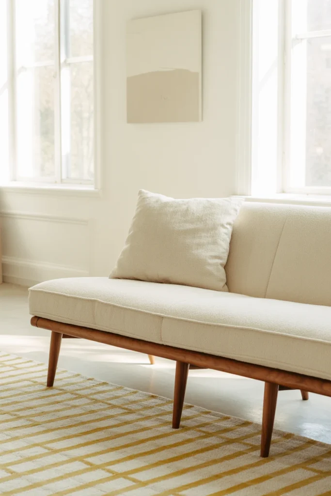
Picture a bright, airy living room anchored by a low-slung walnut sofa with tapered legs and cushions upholstered in crisp off-white boucle. The walls are a warm white — not stark, but creamy. A geometric wool area rug in ivory and tan grounds the seating area. Above the sofa, a simple abstract canvas print adds visual interest without overwhelming the space.
Design Breakdown
This is the foundational MCM living room look, and it works because of contrast. Warm walnut wood against cool white walls creates a balance that feels inherently calm. The key is keeping the palette restrained — no more than three or four colors — with wood tones doing most of the heavy lifting.
The low-profile furniture is non-negotiable here. One of the defining characteristics of MCM design is furniture that seems to float just above the floor. It makes ceilings feel higher and rooms feel larger.
Expert Tip
Don’t cheap out on the rug. In an MCM room, the rug anchors everything. Look for geometric patterns with muted tones — think warm ivories, caramels, and dusty terracottas. A good rug ties the room together better than almost any other single purchase.
Why It Works
White and walnut is the MCM equivalent of a little black dress. It’s endlessly versatile, it photographs beautifully (hello, Pinterest), and it works in virtually any size room. The restraint of the palette also makes it easier to switch out accent pieces seasonally without overhauling the whole look.
Best For
- Large and medium spaces
- Luxury homes
- Renters (use removable art hooks)
Common Mistake to Avoid
Choosing a sofa that’s too high off the ground. If the legs are more than 8 inches, it reads more “contemporary” than “mid-century.” Look for legs in the 4–6 inch range.
Quick Wins
- Paint walls in Benjamin Moore White Dove or similar warm white
- Look for sofas with tapered solid wood legs (not chrome)
- Add a single large abstract canvas — keep it simple
- Use warm-toned Edison bulbs for lighting
2. The Eames Chair Moment
What You’re Seeing
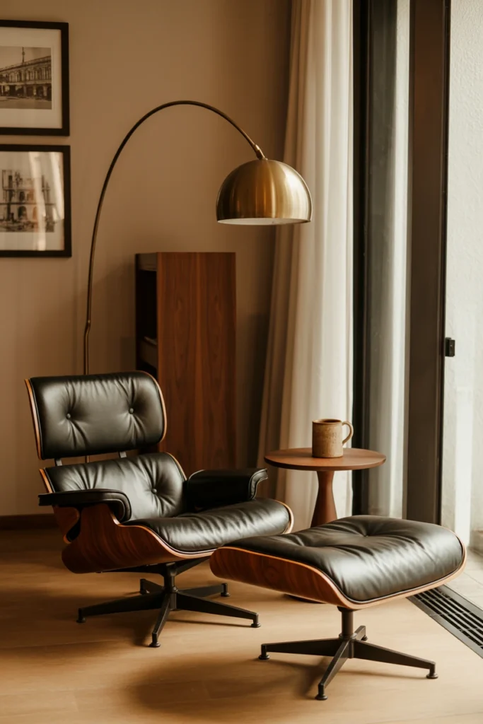
Imagine a corner of a living room that stops everyone in their tracks. An Eames Lounge Chair in rich chocolate leather sits beside a floor-to-ceiling window, paired with its matching ottoman. A sculptural arc floor lamp curves overhead. On the wall behind it: a small collection of framed architectural prints. A side table in walnut holds a single ceramic mug.
Design Breakdown
The Eames Lounge Chair is the crown jewel of MCM furniture — and for good reason. Designed by Charles and Ray Eames in 1956, it was conceived as a piece that felt like a “well-used first baseman’s mitt.” That ethos — functional luxury — is the soul of mid-century modern design.
You don’t need to buy the original Herman Miller version (though if you can, it’s worth every penny). Authentic reproductions exist at various price points, and even a well-made lookalike instantly elevates a room.
The key is giving it space to breathe. Don’t crowd this chair. Let it be the statement it’s meant to be.
Expert Tip
If budget is a concern, check Facebook Marketplace and local estate sales. Original Eames pieces from the 1960s and 70s pop up regularly, and even worn versions can be reupholstered for a fraction of the cost of new.
Why It Works
The Eames chair is aspirational without being pretentious. It signals taste and an appreciation for design history. In a living room, it functions as both furniture and art — a conversation starter that also happens to be the most comfortable seat in the house.
Best For
- Medium and large spaces
- Luxury and mid-range homes
- Anyone who loves a designated reading corner
Common Mistake to Avoid
Placing it in the center of the room. The Eames chair works best as a secondary seating option — a retreat, not a focal point. Tuck it in a corner or by a window.
Quick Wins
- Pair with a Noguchi-style coffee table for maximum MCM points
- Add a geometric side table for practicality
- Use a directional reading lamp to complete the vignette
- Stick to leather or walnut veneer — avoid fabric reproductions
Most people don’t know this: The original Eames Lounge Chair was inspired by English club chairs — Charles Eames wanted it to feel warm and inviting rather than cold and “designery.” That warmth is exactly why it still works in modern homes today. When you’re styling around it, lean into that coziness. Add a throw blanket. A good book. Make it a chair people actually want to sit in, not just photograph.
3. Statement Lighting That Does All the Work
What You’re Seeing
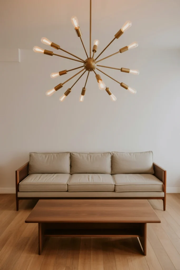
A living room with simple, understated furniture suddenly becomes extraordinary because of one thing: the light fixture. A large Sputnik chandelier in matte brass hangs above a clean-lined sofa, its multiple arms radiating outward like a starburst. The rest of the room is quiet — light wood floors, a simple sofa in oatmeal, a low coffee table — but the chandelier demands attention.
Design Breakdown
Lighting is where MCM design truly shines (pun intended). The style emerged during the Space Age, and that era’s fascination with atomic shapes, starbursts, and futuristic forms influenced some of the most iconic light fixtures ever made.
A Sputnik chandelier is the most recognizable option, but globe pendants, arc lamps, and tripod floor lamps are all equally MCM-appropriate.
Expert Tip
Use warm-toned bulbs (2700K–3000K) in MCM fixtures. The warm light reinforces the wood tones and makes the space feel intimate rather than clinical.
Why It Works
In a room with simple furniture, a statement light fixture becomes the art. It’s an easy way to add drama and personality without changing the bones of the space — which makes it especially valuable for renters.
Best For
- All space sizes
- Renters
- Budget makeovers (a good pendant can be surprisingly affordable)
Common Mistake to Avoid
Hanging the fixture too high. In a standard 8-foot ceiling room, the bottom of a dining/living fixture should be about 7 feet from the floor. Too high and it loses its impact.
Quick Wins
- Try a brass or matte gold finish — it reads warm and elevated
- Consider a tripod floor lamp as a budget-friendly alternative
- Don’t use recessed lighting as your only source — MCM rooms need layered light
- Look for fixtures with visible bulbs for an extra vintage-modern feel
Most people waste more space than they realize.
That empty corner, the wall behind the sofa, the space above the credenza — in an MCM living room, every surface is an opportunity. The next few ideas are all about using those spaces strategically.
You May Also Like:
- Black Sofa Living Room Ideas
- High Ceiling Living Room Ideas
- Cozy Living Room Ideas
- Modern Dark Living Room Ideas
- Scandinavian Living Room Ideas
4. The Sunken Conversation Pit (Or Its Modern Equivalent)
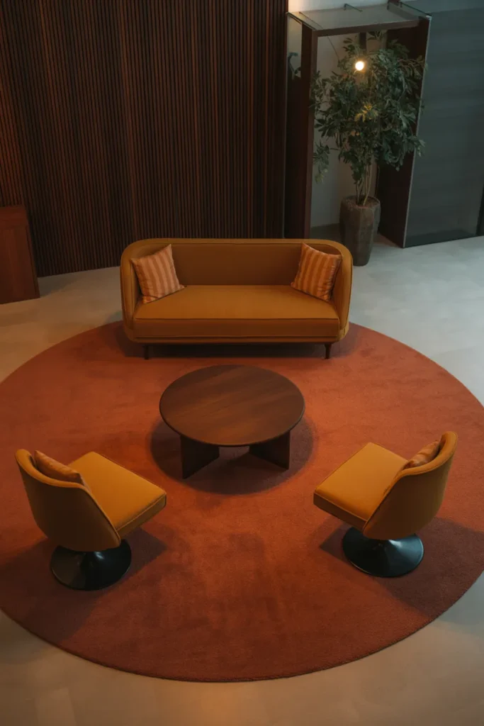
What You’re Seeing
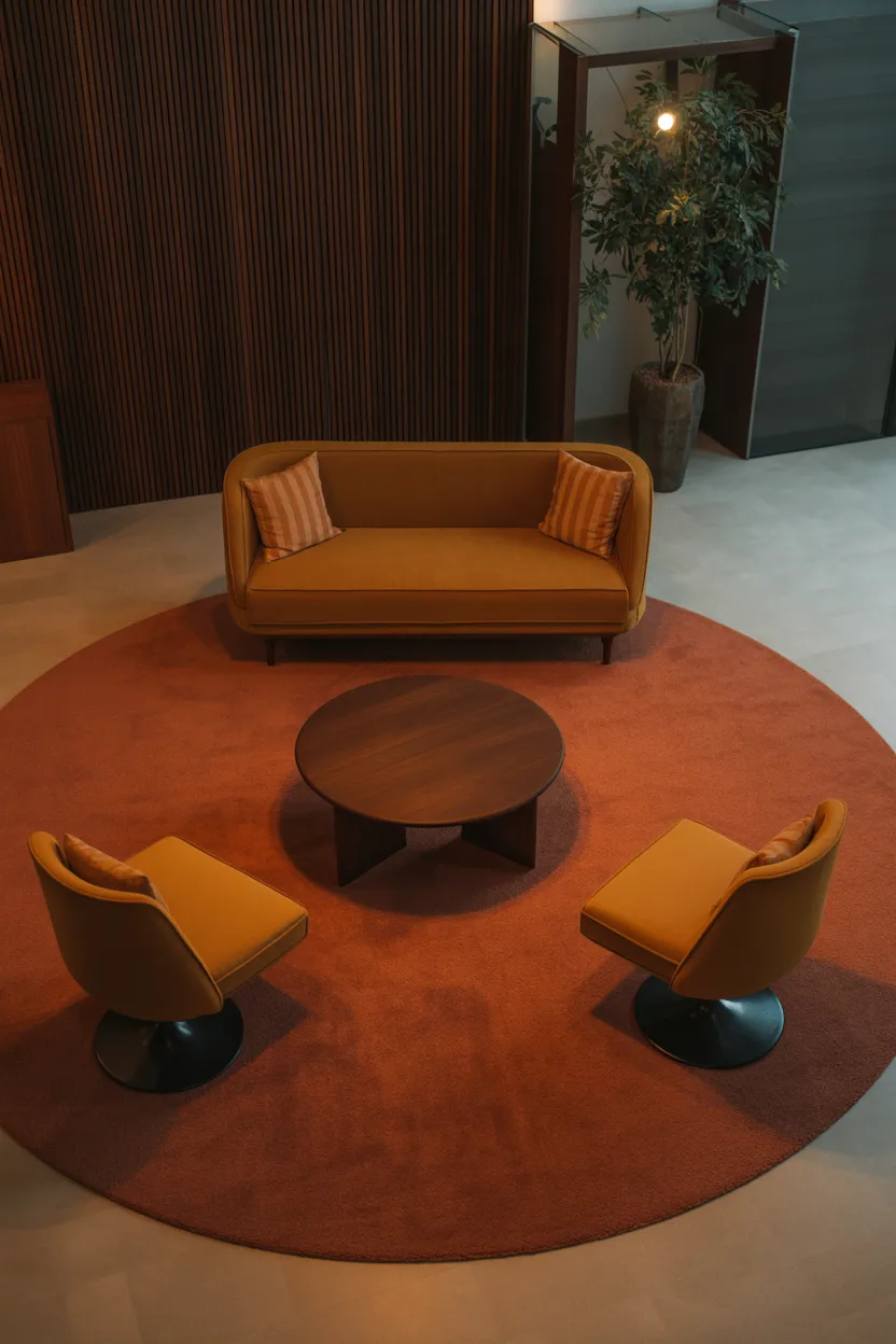
A seating area that feels intentionally defined — not sunken into the floor (though that’s the original MCM version), but created through furniture placement and a bold area rug. A large rectangular rug in a warm rust-orange defines the zone. Around it: a low sofa, two tulip-style chairs, and a round coffee table. The furniture faces inward, creating a natural gathering space that encourages conversation.
Design Breakdown
Conversation pits were one of the most distinctive architectural features of 1960s MCM homes. They were literally built into the floor — a sunken seating area that created an intimate, cave-like gathering space. Most of us aren’t about to demolish our floors, but we can recreate the same psychological effect through furniture arrangement.
The trick is to define the space clearly. A large rug — larger than you think you need — acts as the foundation. Then arrange furniture facing inward rather than toward the TV. The message is: this space is for people, not screens.
Expert Tip
Round and oval coffee tables work better in conversation-pit arrangements than rectangular ones. They’re easier to move around, less likely to create obstacles, and their organic shapes are more MCM-appropriate anyway.
Why It Works
When furniture faces inward, it psychologically encourages connection. Guests feel like they’re part of a defined gathering space rather than just scattered around a room. It’s one of the most underused tricks in interior design.
Best For
- Large open-plan living rooms
- Families and entertainers
- Anyone with a rectangular living room that feels directionless
Common Mistake to Avoid
Making the seating circle too small. You need at least 18 inches of clearance between the coffee table and the sofa, and enough space for people to walk around the arrangement without squeezing.
Quick Wins
- Use a rug that’s at least 8×10 for a standard room
- Choose chairs with organic, rounded shapes
- Keep the coffee table low — 16–18 inches is ideal
- Add a sculptural plant in one corner to soften the arrangement
5. Organic Shapes Meet Bold Color
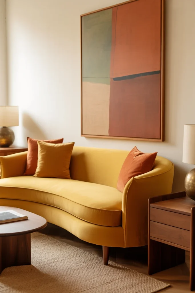
What You’re Seeing
A living room that stops you dead in your tracks: a mustard-yellow curved sofa sits against a warm white wall, flanked by a pair of walnut side tables. Above it, an abstract painting in earthy terracotta and sage pulls the colors together. A woven jute rug adds texture underfoot. The room feels bold but balanced — retro but undeniably fresh.
Design Breakdown
Color is where a lot of people get nervous with MCM design, but it’s also where the biggest personality can come through. The palette of the era was rich: avocado green, burnt orange, mustard yellow, terracotta, teal. These colors feel fresh again because they’re earthy rather than electric.
The key is to let one color be the hero. Pick one bold hue for your largest piece — usually the sofa — and build a neutral framework around it.
Expert Tip
If you’re not ready to commit to a colored sofa, use throw pillows to test a palette first. A pair of mustard and rust pillows on a walnut-frame sofa can give you the MCM color hit without the commitment.
Why It Works
Bold color in an otherwise restrained room creates visual tension in the best way. It gives the eye something to land on and prevents the space from feeling like a hotel lobby. MCM color choices also happen to be extremely Pinterest-friendly — earth tones photograph beautifully in natural light.
Best For
- Anyone who wants personality without maximalism
- Medium and large rooms
- Renters (throw pillows and rugs are easy to change)
Common Mistake to Avoid
Using too many bold colors at once. Pick one hero hue. Everything else should support it, not compete with it.
Quick Wins
- Test the color in the room before buying — lighting changes everything
- Warm whites (not cool whites) work best alongside MCM earth tones
- Abstract art in the same palette ties the room together
- Use natural fiber rugs (jute, sisal) to ground the look
Here’s where it gets interesting: Most MCM color schemes that feel timeless aren’t built around trendy colors — they’re built around natural pigments. Ochre, terracotta, forest green, and rust are all colors that appear in nature, which is why they never really go out of style. When in doubt, look outside for your MCM color inspiration.
What to Invest In, What to Save On
This is where a lot of people go wrong. They spend big on the wrong things and skimp on the stuff that actually matters.
Here’s a practical breakdown of how to allocate your budget in an MCM living room — whether you’re starting from scratch or refreshing what you have.
Where to Invest
The Sofa (40–50% of your furniture budget)
The sofa is the anchor of any living room, and in an MCM space it needs to look intentional. Look for:
- Solid wood tapered legs (walnut or teak finish)
- Low profile (seat height of 15–17 inches)
- Quality upholstery — boucle, velvet, or leather all work
- A clean, simple silhouette without tufting or rolled arms
Budget range: $800–$3,000+ for a quality piece. Check West Elm, Article, and Castlery for well-priced options. For luxury, look at Design Within Reach or Room & Board.
The Rug (15–20% of your furniture budget)
A quality rug does more for a room than almost anything else. It defines the space, adds texture, and anchors the color palette. Don’t go thin or cheap — a flat rug in a living room with hard floors will feel cold and echoey.
Budget range: $300–$1,500. Look for wool or wool-blend options. Ruggable makes machine-washable options that work well for families.
Lighting (10–15%)
A great light fixture is permanent and impactful. Invest here. A Sputnik chandelier or a well-chosen arc floor lamp can last decades and instantly elevate even basic furniture.
Budget range: $150–$800 for a quality fixture. CB2 and Wayfair both carry solid MCM-inspired options.
Where to Save
Side Tables and Coffee Tables
These are easier to find at lower price points, and vintage and secondhand options are often better quality than new budget pieces. Thrift stores, Facebook Marketplace, and Chairish are goldmines for walnut side tables.
Budget range: $50–$300 each.
Throw Pillows and Accessories
These are your personality. They’re also easy to change, so don’t overspend. Target, TJ Maxx, and H&M Home regularly carry MCM-inspired textiles at accessible prices.
Budget range: $15–$60 per pillow.
Art
You don’t need expensive art for an MCM room. Abstract prints from Society6 or Etsy shops can look stunning in the right frames. Speaking of which: frames matter. A simple thin-profile black or wood frame elevates any print.
Budget range: $20–$200 for prints, $30–$100 for frames.
Common Budget Mistakes
- Buying a cheap sofa to save money — it will look cheap and wear out fast
- Skipping the rug — a bare floor in a living room always feels unfinished
- Over-accessorizing — MCM rooms breathe. Leave space between things
- Buying “MCM-inspired” sets — matching sets look showroom-y. Mix pieces for a collected, authentic feel
- Ignoring the ceiling — a statement pendant or chandelier pulls the eye up and makes rooms feel larger
Planning Your MCM Living Room Refresh: Decision Framework
Ask yourself these questions before buying anything:
- What’s my anchor piece? (Usually the sofa or a statement chair)
- What’s my dominant wood tone? (Stick to one — walnut, teak, or birch)
- What’s my hero color? (One saturated color; everything else is neutral)
- What’s my lighting plan? (Layer: overhead, task, and ambient)
- What can I source secondhand? (Side tables, art, plants, ceramics are all great thrift finds)
This framework will save you from impulse purchases that don’t fit the overall vision.
The next idea is one designers secretly love.
It looks expensive. It requires almost no budget. And most people completely overlook it.
6. The Gallery Wall, Done MCM
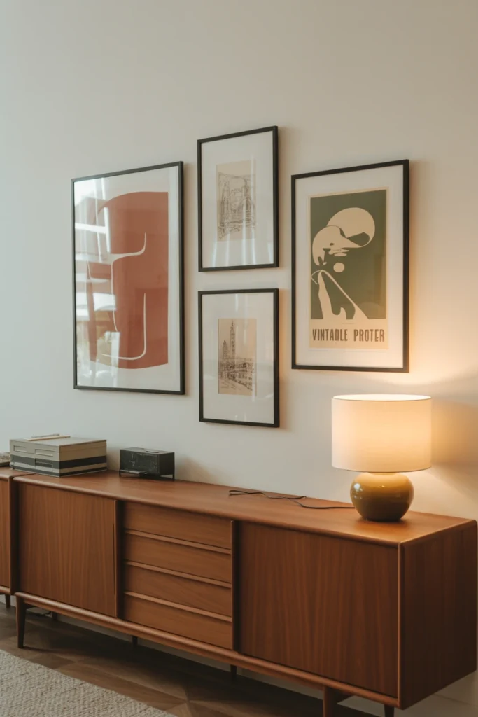
What You’re Seeing
A wall above a low walnut credenza holds a carefully arranged collection of framed art. But this isn’t a chaotic eclectic gallery wall — it’s deliberate. All frames are the same thin black metal. The prints include one large abstract in warm terracotta, two smaller architectural line drawings, and a vintage travel poster in muted olive and cream. The arrangement is balanced but asymmetrical.
Design Breakdown
Gallery walls have been overdone, but the MCM version is restrained and specific. The key differences: uniform frames, a limited palette, and a mix of abstract and graphic content. Avoid photography in an MCM gallery wall — it tends to feel too contemporary. Lean into illustrations, abstract shapes, and vintage-inspired prints.
Expert Tip
Lay your arrangement out on the floor before hanging anything. Take a photo, then use it as a reference when you’re up on the ladder. This saves a lot of unnecessary nail holes.
Why It Works
A gallery wall fills a large expanse of wall without furniture, which is especially useful above a long credenza or sofa. Done in the MCM style, it becomes a conversation piece — guests will actually look at it and ask about the individual pieces.
Best For
- Long walls
- Open-plan living rooms
- Anyone who wants to add personality without furniture
Common Mistake to Avoid
Mixing too many frame styles. In an MCM gallery wall, consistency in frames is what holds the whole thing together. Pick one frame style and commit.
Quick Wins
- Use thin black or walnut frames — avoid chunky ornate options
- Stick to 3–5 colors maximum across all prints
- Include at least one oversized piece as an anchor
- Hang the center of the arrangement at eye level (57 inches from the floor)
7. The Credenza as the Star
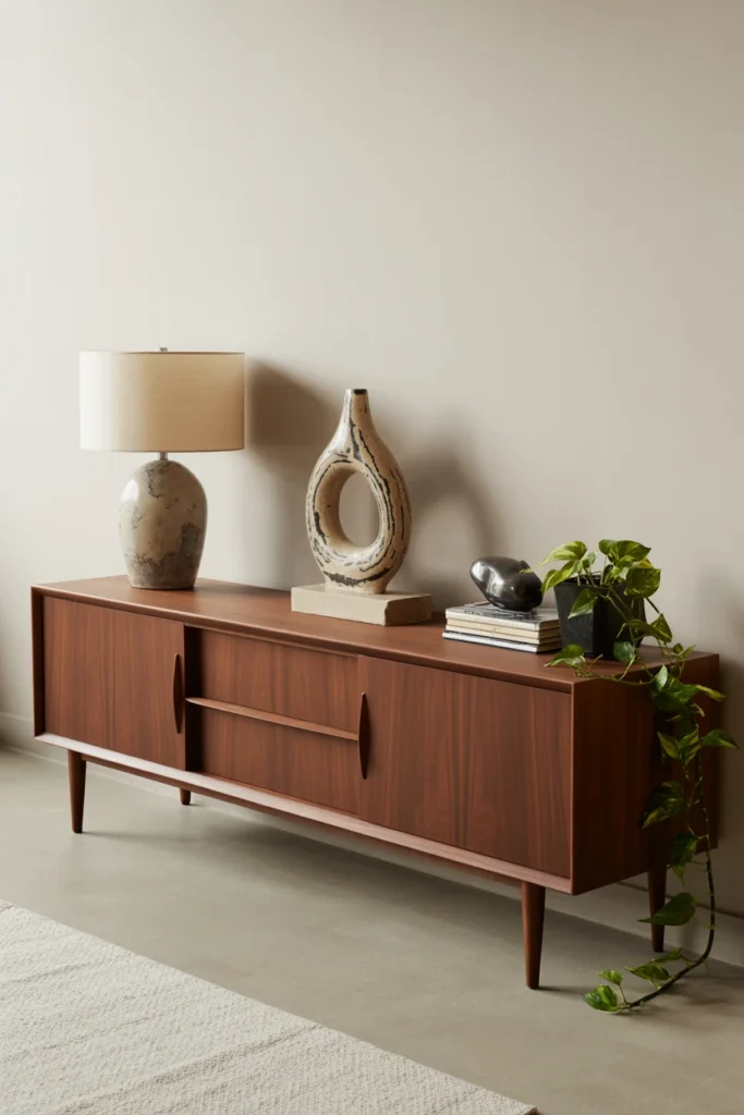
What You’re Seeing
A long, low walnut credenza sits against the main wall of the living room, its clean lines and tapered legs a textbook example of MCM design. On top: a ceramic table lamp with a drum shade, a single piece of sculptural pottery, a small stack of art books, and a trailing pothos plant. The credenza itself has sliding doors concealing media equipment and storage.
Design Breakdown
The MCM credenza might be the single most versatile piece of furniture in the style’s canon. It provides storage, display space, and a defined wall moment all in one. It also doubles as a media console — the perfect excuse to invest in a quality piece.
When styling a credenza, think in thirds. Left third: lamp for height. Center: sculptural object or plant. Right third: books or another low object. This asymmetry is more visually interesting than a perfectly centered arrangement.
Expert Tip
Don’t cover the legs. The tapered legs of an MCM credenza are part of its beauty. Avoid placing it against a wall where the legs disappear into a baseboard, and resist the urge to put things underneath it.
Why It Works
A low credenza draws the eye horizontally across the room, which makes the space feel wider. It’s also a functional storage solution that looks intentional rather than practical — a key MCM principle.
Best For
- All room sizes
- Anyone who needs storage
- Open-plan spaces where you need to define the “living room” zone
Common Mistake to Avoid
Over-styling the top. Less is always more on a credenza. If you have more than 5–6 objects, start editing.
Quick Wins
- Three objects max on the top in smaller rooms
- Mix heights: lamp (tall), pottery (medium), books (low)
- Add a single trailing plant for life and movement
- Keep the legs visible and unobstructed
You May Also Like:
- Cozy Living Room Ideas
- Living Room Remodel Ideas
- Rectangle Living Room Ideas
- Long Living Room Ideas
- Living Room and Dining Room Combo Ideas
8. Indoor Plants as Design Elements
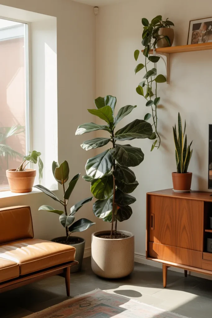
What You’re Seeing
Visualize a sun-drenched MCM living room where the plants are as intentional as the furniture. A large fiddle-leaf fig in a ceramic pot anchors one corner. A trailing pothos cascades from a high shelf. A compact rubber plant sits beside the sofa. The plants add life and color without disrupting the clean lines of the room.
Design Breakdown
Mid-century modern design has always had a close relationship with nature — the style emerged at a time when architects like Frank Lloyd Wright were obsessing over the connection between interior and exterior spaces. Plants are one of the easiest ways to bring that ethos into your home.
But MCM plant styling is specific. The pots matter as much as the plants. Look for ceramic pots in earth tones, matte finishes, and simple shapes — no terracotta, no plastic nursery pots. The container is part of the design.
Expert Tip
Group plants in odd numbers — threes and fives read more naturally than twos or fours. And vary the heights: one tall floor plant, one medium tabletop plant, and one small trailing plant create visual rhythm without visual chaos.
Why It Works
Plants add the one thing MCM furniture sometimes lacks: organic unpredictability. The clean lines and geometric shapes of MCM design can feel rigid; plants soften that without compromising the aesthetic.
Best For
- All room sizes
- Budget makeovers (plants are inexpensive)
- Anyone who wants warmth without clutter
Common Mistake to Avoid
Using plastic pots. Even a beautiful fiddle-leaf fig looks sad in a plastic nursery pot. Repot immediately or use a decorative cachepot.
Quick Wins
- Best MCM plants: fiddle-leaf fig, rubber plant, bird of paradise, snake plant, pothos
- Stick to ceramic or concrete pots in matte finishes
- Vary plant heights for visual interest
- One large plant in a corner does more than five small ones scattered around
One thing I’ve learned from styling dozens of living rooms: the plants are always the last thing clients consider and the first thing that makes a real difference in photos. A bare MCM living room looks like a showroom. The same room with three well-chosen plants looks like a home. Don’t wait until the room is “finished” to add greenery — add it early and let it influence the rest of your decisions.
9. Textural Layering Without Clutter
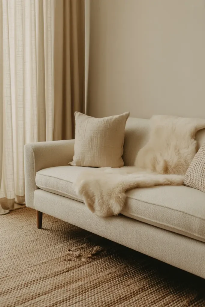
What You’re Seeing
This simple change can completely transform the room.
A neutral MCM living room that initially reads as plain becomes richly textured through layering. A boucle sofa. A woven jute rug. A sheepskin throw draped casually over one arm. Linen curtains that pool slightly on the floor. Each surface has a different texture, but the palette stays unified — all creams, oats, and warm whites. The result is a room that looks interesting and feels incredibly inviting.
Design Breakdown
This is one of the most sophisticated techniques in interior design, and it’s more about restraint than addition. The idea is to create visual interest through texture rather than color or pattern.
Start with your base layer — the rug. Then build up: sofa fabric, throw blanket, pillows, curtains. Each item should have a noticeably different texture from the others. Smooth leather next to rough jute next to soft boucle creates a tactile experience that translates beautifully in photos.
Expert Tip
Limit yourself to two or three colors maximum when doing textural layering. The more colors you add, the harder it is to maintain cohesion. Let the textures do the visual work.
Why It Works
Textural contrast keeps the eye moving through the space without introducing visual chaos. It’s the reason why all-neutral rooms can look rich and complex rather than boring — the variety comes from surface quality, not color.
Best For
- Anyone who wants a sophisticated look without bold colors
- Small spaces (avoids visual clutter)
- Photography and content creation
Common Mistake to Avoid
Using too many similar textures. If your sofa is boucle and your rug is also fluffy, the room starts to look like a cloud. Contrast is key.
Quick Wins
- Smooth leather + rough jute + soft boucle is the MCM texture holy trinity
- Natural fibers always photograph better than synthetics
- One throw, casually draped — never neatly folded
- Curtains in linen or cotton — no polyester sheers
10. The Minimalist MCM Room That Proves Less Is More
What You’re Seeing
Walk into this room and the first thing you notice is the breathing room. A single low sofa. One coffee table. Two chairs. A rug. A floor lamp. That’s it. No throw pillows piled six high, no gallery wall, no credenza covered in tchotchkes. Just excellent furniture, beautifully arranged, in a room that has been ruthlessly edited.
Design Breakdown
This is the hardest MCM look to achieve, because our instinct is always to add more. But the most confident MCM interiors are the ones that know when to stop. When each piece of furniture is genuinely excellent, you don’t need accessories to prop it up.
Start by selecting one hero piece — a sofa, a chair, a light fixture — that you’re truly in love with. Then build the rest of the room around it with supporting players that don’t compete.
Expert Tip
Before adding anything new to a room, take one thing out. This edit-first approach forces you to be intentional about everything you keep. If you can’t explain why something is there, it probably shouldn’t be.
Why It Works
Minimalist MCM rooms feel luxurious because space itself is a luxury. When a room isn’t cluttered, the pieces that are there feel intentional and considered. It’s the interior design equivalent of a well-edited capsule wardrobe.
Best For
- Small spaces (minimalism makes them feel larger)
- Luxury homes
- Photographers and content creators
Common Mistake to Avoid
Mistaking empty for cold. Minimalism and warmth aren’t opposites. Warm wood tones, textured fabrics, and plants can make a minimal room feel incredibly inviting.
Quick Wins
- Start with furniture, then add only what the room needs
- Leave at least 18 inches of walkway space around all furniture
- One large plant beats ten small accessories every time
- Empty walls are okay — resist the urge to fill every surface
Related Living Room Ideas to Explore Next
Love what you’ve seen so far? Keep the inspiration going with these related articles from our archives:
- Scandinavian Living Room Ideas
- Modern Dark Living Room Ideas
- Cozy Living Room Ideas
- Quiet Luxury Living Room Ideas
- Black Sofa Living Room Ideas
- Living Room Remodel Ideas
- Living Room Chandelier Ideas
- High Ceiling Living Room Ideas
Final Thoughts on MCM Living Room Ideas
Here’s what you actually need to remember from everything above.
The best MCM living rooms are built on restraint, intentionality, and a respect for the relationship between form and function. Every piece earns its place. The palette is controlled. The furniture sits low. The lighting is warm and layered. And the plants? Always present.
If you’re starting from scratch, begin with the sofa. Get that right and everything else becomes easier. If you’re refreshing an existing space, start with lighting — a single statement fixture can transform a room that’s already close.
The most important thing is to pick one idea from this list and implement it this week. Don’t wait until you have the whole vision figured out. Start somewhere, and the room will start to reveal itself.
So — which of these 10 mcm living room ideas resonated most with you? Are you drawn to the bold color of Idea #5, or the quiet confidence of the minimalist Idea #10? Drop a comment and let me know which direction you’re heading.
And if you want to keep exploring, check out our Quiet Luxury Living Room Ideas — it shares a lot of DNA with MCM design and might just be the next rabbit hole you fall down.
Next up: we’re exploring how to style a living room when you have high ceilings — a challenge that changes everything about furniture scale, art placement, and lighting. You won’t want to miss it.