10 Bedroom Carpet Ideas Designers Use to Make Small Rooms Look Bigger and Brighter
This article was created in line with Trends Oraa’s research and content standards.
Your bedroom feels like a shoebox. You’ve tried everything — and it still feels cramped.
Here’s what nobody tells you: the floor is doing most of the damage.
The right bedroom carpet ideas can completely transform a tight space — no knocking down walls, no expensive renovations, no magic tricks. In this guide, you’ll discover exactly what interior designers quietly use to make small bedrooms look twice the size and flood them with light.
Stick with me, because idea #7 genuinely surprised me — and it’s the easiest one on the list.
You might also love our viral guide on Small Bedroom Layout Mistakes That Make Your Space Feel Smaller — thousands of readers have used it to rethink their entire room setup.
Why Your Carpet Choice Matters More Than You Think
Most people obsess over paint colors and furniture when designing a small bedroom. But designers? They start at the floor.
Your carpet covers more surface area than any other single element in the room. Get it wrong, and even a perfectly styled space will feel heavy, dark, and cluttered. Get it right, and suddenly your ceiling feels taller, your walls feel farther apart, and your whole room feels like a breath of fresh air.
The good news? You don’t need to spend a fortune. You just need to know the rules — and which ones to break.
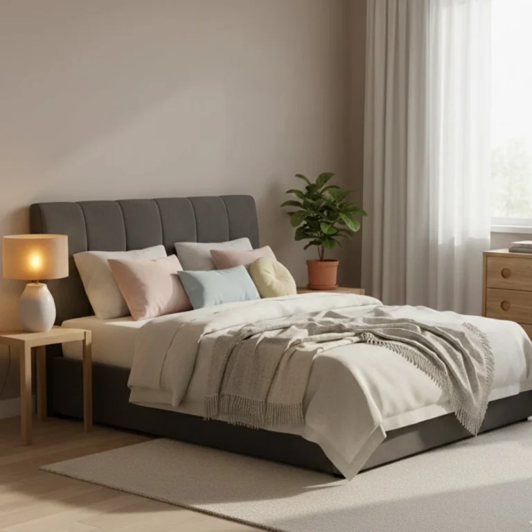
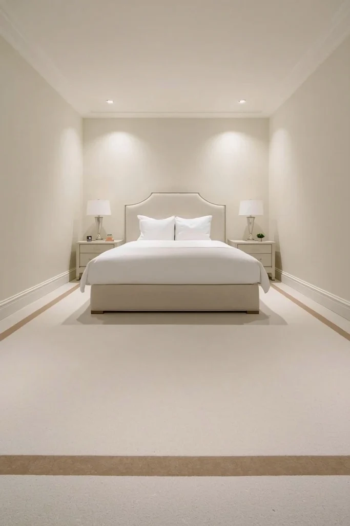
1. The Light-Colored Low-Pile Carpet: The Classic That Actually Works
What You’re Seeing
Imagine a bedroom dressed in soft ivory or warm cream carpet, barely a half-inch thick, stretching wall to wall without interruption. The light catches it evenly, bouncing brightness across the entire floor.
This is the go-to move for designers working with rooms under 150 square feet, and there’s a very clear reason why it works so consistently.
Expert Tip: Go one shade lighter than you think you need. Your eyes tend to “read” carpet as darker than the swatch in a small, dimly lit room. A barely-there blush, warm sand, or soft oat color will reflect light like a mirror and keep the space feeling open even on cloudy days.
Why It Works: Light colors push visual weight upward and outward. A pale carpet essentially acts as a second light source — it bounces natural and artificial light back into the room instead of absorbing it. Low pile keeps the texture smooth, which prevents the floor from looking choppy or busy in photos or in person. The result is a seamless, airy feel that instantly makes the room feel more spacious.
- Best shades: Ivory, warm white, oat, blush beige, soft sand
- Best pile height: Under ½ inch
- Works especially well in: North-facing rooms that lack natural light
Which of these color palettes feels most like your personal style? Drop your answer in the comments below — I’m always curious what vibe my readers are going for!
2. Diagonal-Stripe Carpet: The Visual Illusion Nobody Talks About
What You’re Seeing
Picture a carpet with fine, subtle diagonal stripes — barely noticeable from a distance but cleverly engineered to draw the eye across the widest part of the room. The lines run at roughly a 45-degree angle from one corner to the other.
It sounds unusual. The results are undeniable.
Expert Tip: The key word here is subtle. You don’t want bold, obvious stripes that scream “statement.” Look for tone-on-tone textures — a slightly darker stripe woven into a matching background color. From a distance it reads as texture; up close it reads as detail.
Why It Works: Diagonal lines fool the brain into measuring the room at its longest point — the diagonal. In a 10×12 room, the diagonal is over 15 feet. Your eye follows the lines and your brain interprets that as the room’s perceived size. It’s a genuinely clever optical trick that costs nothing extra. Pair this with a lighter colorway and you’ve doubled the effect.
- Best for: Rectangular rooms that feel narrow or long and skinny
- Best tone combos: Taupe on taupe, greige on cream, soft grey on white
- Avoid: High-contrast stripes in bold colors — they shrink a room instead of expanding it
But here’s the important part… the direction matters. Stripes running toward the door make the room feel longer as you walk in. Stripes running parallel to the longest wall make it feel wider. Choose intentionally.
3. Monochrome Carpet That Matches the Walls: The Designer’s Secret Weapon
What You’re Seeing
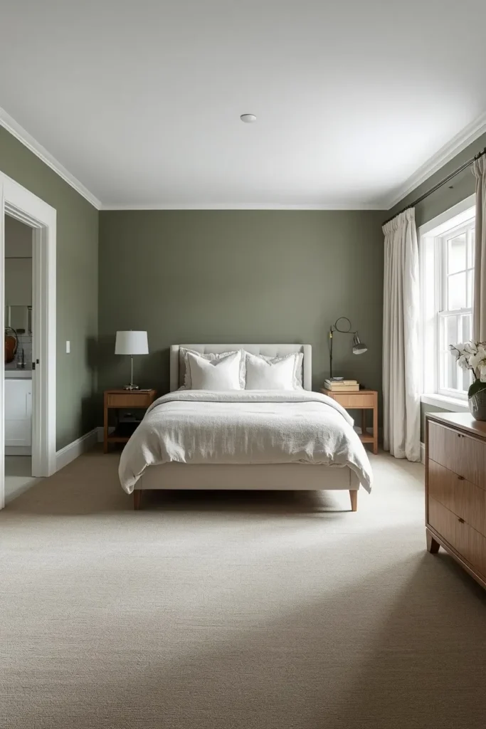
A bedroom where the carpet is almost the exact same color as the lower walls and baseboards. The floor, the trim, and the lower walls blur together into one continuous tone. It feels almost like the room was carved from a single piece of material.
This technique — sometimes called “color drenching” at floor level — is having a massive moment in interior design right now.
Expert Tip: You don’t have to match them perfectly. Getting within one or two shades on the same color family achieves the effect without looking like a mistake. Try a warm greige wall with a slightly deeper taupe carpet, or a dusty sage wall with a muted sage-green carpet.
Why It Works: When the eye can’t find a hard visual boundary between the floor and the wall, it stops “measuring” where one ends and the other begins. The room appears to expand because there’s no line saying “here is where the floor stops.” It’s the same reason all-white kitchens feel larger — the absence of contrast removes visual barriers.
- Color families that work beautifully: Warm neutrals, dusty blues, muted greens, earthy terracottas
- Pairs perfectly with: White or off-white ceiling (to create contrast at the top instead)
- Avoid: Matching a very dark color — this creates a cave effect instead
Speaking of color: check out our guide on Blue Bedroom Ideas for gorgeous real-room inspiration using this exact technique.
4. Plush Cut-Pile Carpet in Warm Neutrals: Luxury That Doesn’t Crowd the Room
What You’re Seeing
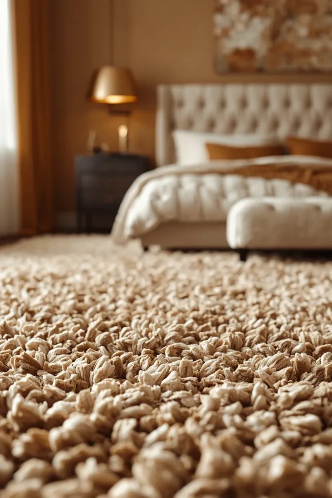
A thick, velvet-soft carpet in a warm stone or oat color. The kind that your feet sink into. The pile is cut evenly so it has a smooth, consistent sheen rather than a loopy or patterned texture.
It looks luxurious. It feels luxurious. And — surprisingly — when done in the right tone, it doesn’t shrink the room at all.
Expert Tip: Choose a warm neutral over a cool one. Cool-toned carpets (think grey-white, icy beige) can feel clinical and actually make a room feel colder and smaller in low light. Warm oats, creamy taupes, and sandy tones add a softness that makes the room feel cozy rather than cramped — a crucial distinction.
Why It Works: The even, smooth surface of cut-pile in a warm tone reflects light softly and consistently across the entire floor. It doesn’t create shadows the way heavily textured or looped carpets can. The room feels soft, warm, and welcoming — which your brain translates as “comfortable and spacious.”
- Pile height sweet spot: ¾ inch to 1 inch
- Best warmth range: Oat, warm cream, light caramel, sand
- Bonus: Incredibly soft underfoot — a genuine bedroom luxury upgrade
5. Geometric-Pattern Carpet in Low Contrast: Pattern Without the Visual Chaos
What You’re Seeing
A carpet with a soft geometric print — maybe a subtle diamond, hexagon, or overlapping circle pattern — in two tones that sit close together on the color spectrum. Think cream with a pale gold pattern, or soft grey with a barely-darker grey motif.
Used correctly, pattern in a small room doesn’t create chaos. It creates interest — which is very different.
Expert Tip: Keep the color contrast between the pattern and the background under 20% on the light scale. If you can notice the pattern from across the room, it’s too bold. You want something that draws the eye in as you get closer, not something that immediately jumps out from the doorway.
Why It Works: Low-contrast geometric patterns add visual depth without visual noise. They give the eye something to explore, which actually slows down how quickly the brain “processes” the room — and slower processing reads as more space. It’s counterintuitive but very effective. Designers use this trick constantly in hotel rooms and boutique spaces.
- Best pattern scales: Medium-scale for rooms under 150 sq ft; larger scale can work in rooms 150–200 sq ft
- Best pattern types: Geometric, trellis, diamond, soft abstract
- Avoid: Floral or overly organic patterns — these often clash with furniture legs and look busy
Most people don’t know this: the scale of your carpet pattern should relate to the scale of your furniture. Large, chunky furniture pairs with medium-scale patterns. Small, delicate furniture can handle a slightly more intricate pattern. Mismatch the scale and the room will feel “off” without anyone knowing why.
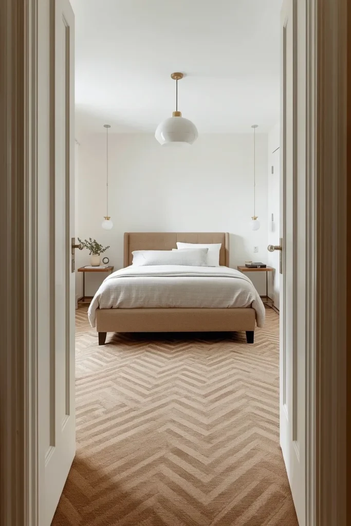
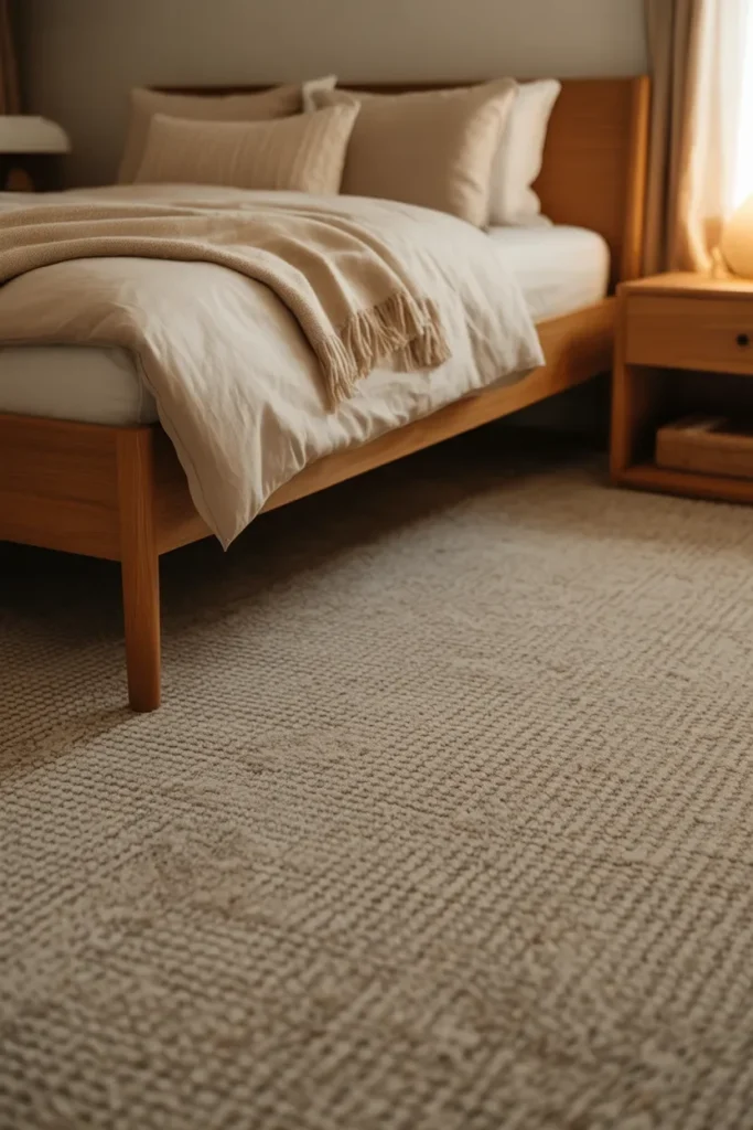
6. Sisal-Look Carpet: Natural Texture That Adds Warmth Without Weight
What You’re Seeing
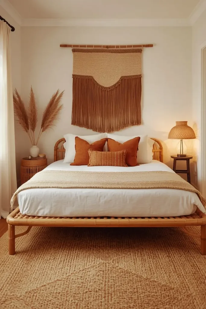
A carpet that mimics the look of natural sisal or jute weaving — textured, organic, woven-looking — but with the softness and practicality of synthetic fiber. The color is almost always a natural, warm neutral: honey, warm tan, or flaxen beige.
It brings the outside in, and it does it beautifully.
Expert Tip: True natural sisal is rough and not ideal for bedrooms. Look for “sisal-look” or “nature-inspired” synthetic carpets that give you the aesthetic with actual underfoot comfort. Many brands now offer incredibly convincing versions that feel soft but look authentically organic.
Why It Works: The woven, organic texture absorbs sound and adds warmth without adding visual weight. The natural colorway works as a perfect neutral backdrop — it doesn’t compete with furniture, bedding, or wall art. It also photographs beautifully, which matters if you’re staging a room or keeping a styled space for guests.
- Color range: Honey, warm sand, flax, natural tan
- Best for: Boho, coastal, farmhouse, Japandi, and earthy bedroom aesthetics
- Care tip: Choose a tightly woven version — loose weaves catch more debris
Carpet Buying Guide: What to Know Before You Shop
Before we get to the next five ideas, let’s pause and talk practically. Because choosing the wrong carpet — even a beautiful one — will undo all the visual tricks we’ve covered.
What Pile Height Should You Choose for a Small Bedroom?
For small rooms, stick to low-to-medium pile (¼ to ¾ inch). Anything higher creates a heavy visual texture that makes the room feel smaller and harder to maintain. Save the deep shag for larger spaces where it reads as luxurious rather than cramped.
What Material Is Best?
- Nylon: The gold standard for durability and softness. Holds color well, resists staining, easiest to clean. Best for master bedrooms and high-use spaces.
- Polyester: More affordable, very soft, available in beautiful colors. Less durable long-term but great for guest rooms or low-traffic spaces.
- Wool: Naturally beautiful, incredibly durable, temperature-regulating. Higher price point but lasts 20–30 years with care. Worth it for a master bedroom.
- SmartStrand/Triexta: A newer option with exceptional stain resistance — great for homes with kids or pets.
What About Padding?
Never skip the pad. A good carpet pad (⅜ to ½ inch thick for low-pile carpet) makes a significant difference in feel, insulation, and longevity. It also helps your carpet lie flatter and look better over time.
Budget Breakdown
| Carpet Type | Cost Per Sq Ft (Material Only) | Best For |
|---|---|---|
| Basic polyester | $1–$3 | Guest rooms, rentals |
| Mid-range nylon | $3–$6 | Primary bedrooms |
| Premium nylon/wool | $6–$15+ | Luxury master bedrooms |
| Sisal-look synthetic | $3–$7 | Natural-style rooms |
Installation typically adds $1–$3 per square foot. Always get at least two quotes.
How to Measure
Measure the room’s length and width in feet, multiply them together, and add 10% for cuts and waste. A 12×14 room needs approximately 185 square feet of carpet material.
Are you shopping for a primary bedroom or a guest room? Knowing your budget upfront makes these decisions so much easier — tell me in the comments!
7. Two-Tone Bordered Carpet: Frame the Space Like a Work of Art
What You’re Seeing
A carpet with a contrasting border — imagine a soft beige center field with a thin, slightly darker border running along the perimeter of the room. Like a rug, but wall to wall. Like a frame, but on the floor.
This is one of those ideas that sounds extra but looks completely polished in person.
Expert Tip: Keep the border width proportional. In a small room, a 4–6 inch border is plenty. A border that’s too wide will visually “eat” into the floor space. The contrast between the field and the border should be subtle — not dramatic. Two shades of the same color family is the sweet spot.
Why It Works: The border creates a visual frame that gives the eye a clear edge to follow. This actually makes the room feel more intentional and defined — almost like a defined living area within a larger space. Framed floors also draw the eye inward, toward the center of the room, which makes the space feel like it has a clear focal point rather than bleeding into the walls haphazardly.
- Best border combos: Cream field + warm greige border; pale sage field + medium taupe border
- Ask for: “Custom border inlay” from your carpet installer — most can do this with standard carpet
- Best room shapes: Square rooms benefit most from this technique
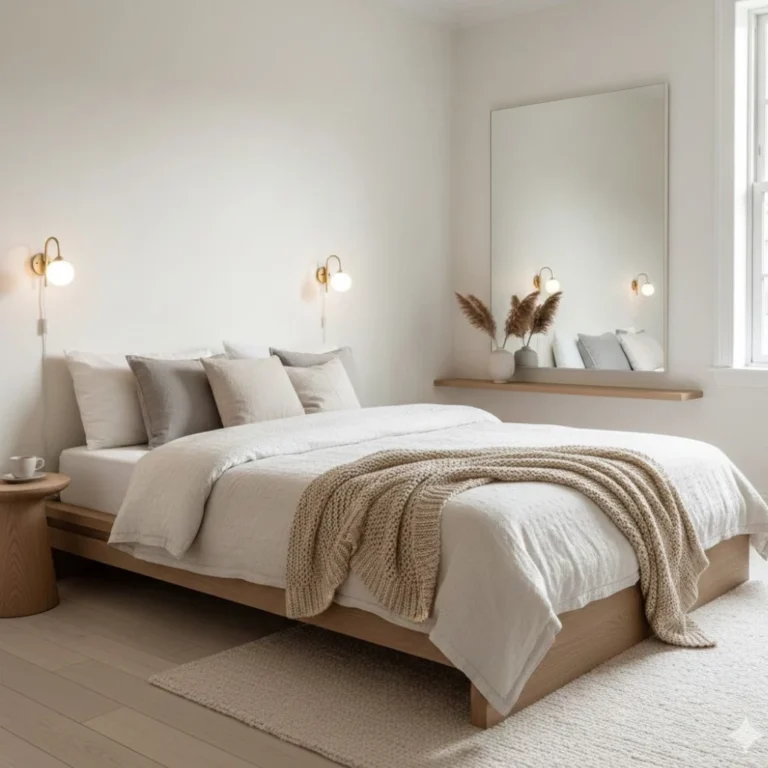
8. Pale Grey Carpet With Cool Undertones: The Modern Minimalist Play
What You’re Seeing
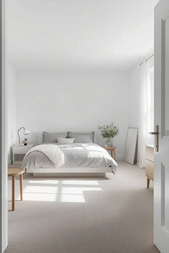
A smooth, pale grey carpet — somewhere between silver and light stone — installed in a bedroom with white walls and minimal furniture. Everything is clean, cool-toned, and intentional.
This is a look that’s huge in Scandinavian-inspired and modern minimalist design right now, and it works brilliantly in small spaces.
Expert Tip: The undertone matters enormously here. A grey carpet with a blue or lavender undertone will make a room feel cooler and slightly larger — but also more formal. A grey with a warm (greige) undertone will feel cozier. For maximum space-expanding effect, lean into the cool blue-grey undertones and pair with very white walls.
Why It Works: Pale cool greys recede visually — they push the floor “away” from the eye rather than coming forward. Combined with white walls, the room feels airy and spacious in an almost architectural way. It also photographs incredibly well, which is why this look dominates Pinterest and Instagram bedroom content.
- Best pairs: White walls, light oak furniture, linen bedding in ivory or grey
- Color range: Silver sage, pale blue-grey, cool stone, soft slate
- Not ideal for: South-facing rooms in warm climates — can feel cold and clinical
Love clean, light bedroom spaces? Explore our Minimalist Bedroom Ideas for more inspiration on this aesthetic.
9. Textured Loop Pile in Sandy Neutrals: Hides Wear, Looks Expensive
What You’re Seeing
A carpet with a tight loop construction — sometimes called Berber or loop pile — in a warm sandy, oat, or flecked natural tone. The loops create a subtle surface texture that catches the light differently from different angles.
This is a workhorse of the carpet world, and designers love it in small bedrooms for good reason.
Expert Tip: Choose a “cut and loop” combination rather than pure loop if you want a slightly softer feel underfoot. The mix of cut and looped fibers creates a gentle patterned texture while still being kind on bare feet. Pure loop pile can feel scratchy on sensitive skin.
Why It Works: The subtle texture in a loop pile carpet adds visual interest without adding visual chaos. The flecked, multi-tonal nature of most Berber-style carpets hides everyday dirt, dust, and pet hair remarkably well — meaning the carpet looks cleaner for longer, which means the room always looks better. In small bedrooms where dirt is more visible (less floor, more scrutiny), this is a genuinely practical benefit that also looks beautiful.
- Best tones: Oat, warm sand, natural fleck, ivory mix
- Durability rating: Excellent — one of the most hard-wearing constructions available
- Works brilliantly in: Kids’ rooms, guest rooms, high-use primary bedrooms
Here’s where it gets interesting… a sandy, warm-toned loop pile carpet can make any bedroom furniture look more expensive. The neutral warmth acts like a filter — it makes wood furniture look richer, white bedding look crisper, and wall art look more curated. It’s the interior design equivalent of good lighting.
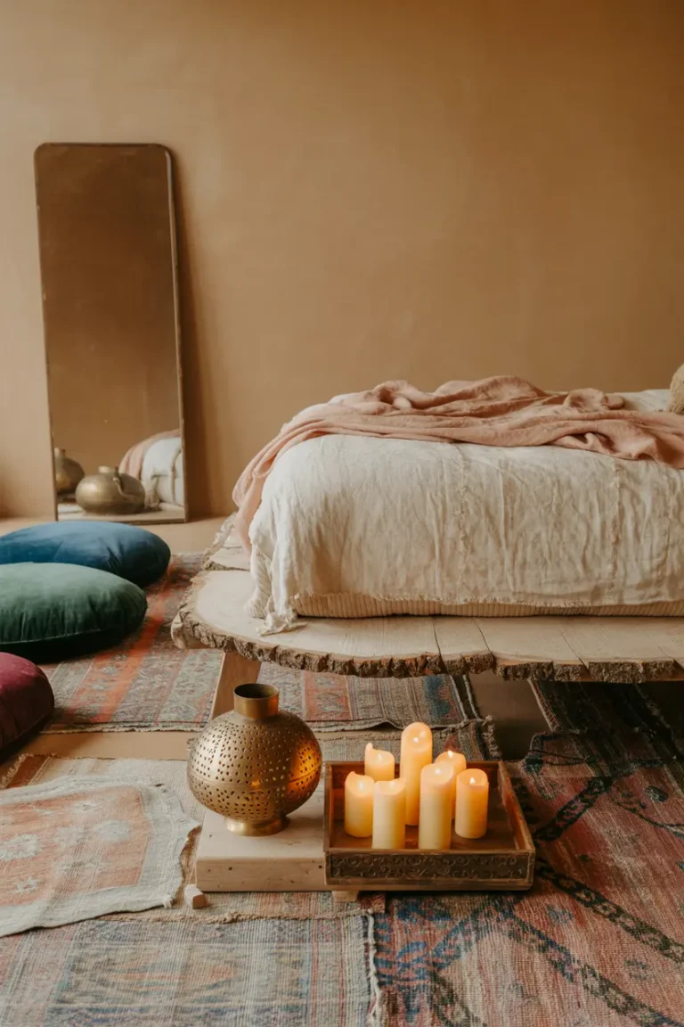
10. Wall-to-Wall Pale Blush Carpet: Feminine, Warm, and Space-Expanding
What You’re Seeing
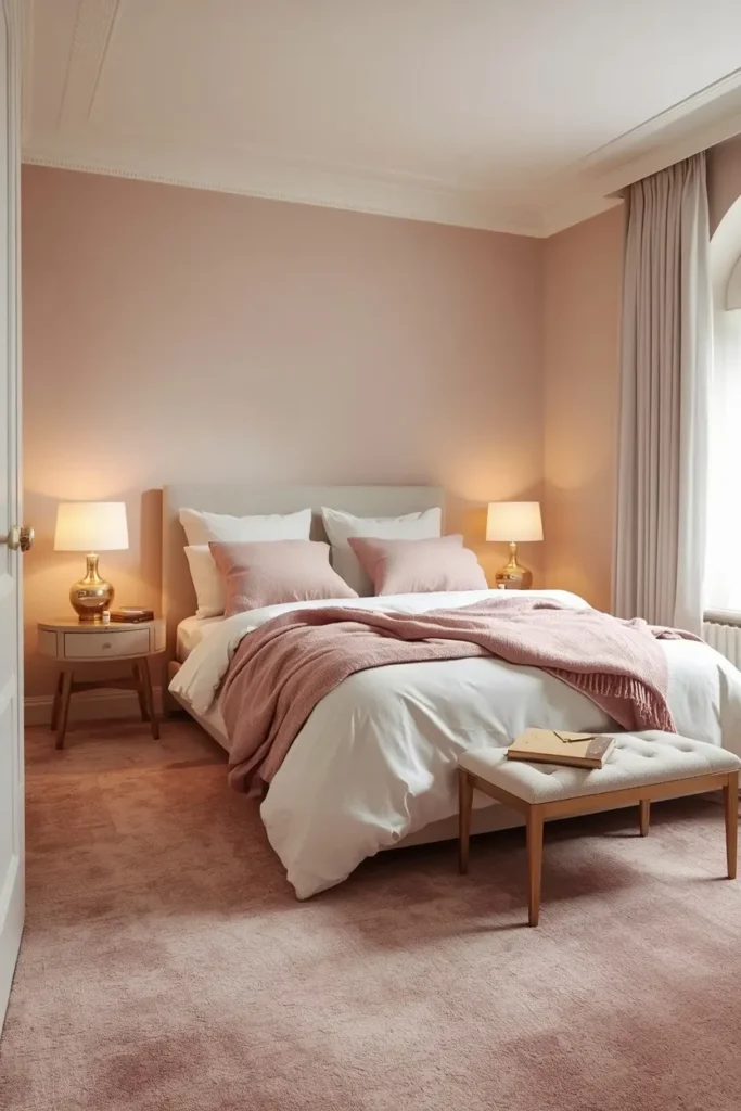
A soft, dusky blush carpet — think the faintest hint of pink mixed with a warm nude — installed wall to wall in a bedroom with light walls and natural textures. It’s not pink. It’s not beige. It’s that magical in-between that somehow works with everything.
This is the carpet color I recommend most often to people who want something with personality but don’t want to commit to anything too bold.
Expert Tip: Blush reads as a neutral in a small bedroom when paired correctly. Pair it with ivory or warm white walls, and it will look timeless rather than trendy. Pair it with bold jewel-toned accents and it becomes the perfect grounding layer for a maximalist space. It’s genuinely one of the most versatile carpet colors available.
Why It Works: The warmth of blush reflects light in the same way warm white does — it fills the room with a soft glow rather than absorbing light. The hint of pink also brings a subtle warmth that makes the room feel inviting and comfortable. Studies in color psychology consistently show that warm pinks in living spaces reduce perceived stress and increase feelings of calm — which is exactly what you want in a bedroom.
- Best for: Master bedrooms, teen girl bedrooms, feminine-aesthetic spaces
- Also gorgeous in: Nurseries and guest rooms
- Pairs beautifully with: Natural linen, warm wood tones, gold accents, dusty rose or sage green decor
If you love this color direction, you’ll also want to see our Pink and White Bedroom Ideas — some truly gorgeous rooms in there.
Now, avoid this mistake… The most common error people make with pale carpet in any shade? Choosing a carpet pad that’s too thick. A pad over ½ inch under a light-colored carpet will cause the edges to cup upward and create rippling over time. Always check the manufacturer’s pad recommendations before installing.
Putting It All Together: How to Choose the Right Idea for Your Room
Here’s a quick decision guide based on room shape and lighting:
North-facing room (low natural light): Go with warm tones — oat, blush, sandy neutrals. Avoid cool greys, which will feel cold and dark.
South-facing room (lots of light): Almost anything works. This is where you can experiment with the bolder geometric patterns or the cool pale grey.
Narrow rectangular room: Diagonal stripes or tone-on-tone color matching will do the most work to fix the proportions.
Square room: A bordered carpet or a textured loop pile will define the space beautifully.
Budget under $1,500 for the room: Pale polyester in oat or ivory — properly padded — will give you 80% of the visual result at a fraction of the price.
Which of these 10 bedroom carpet ideas are you most excited to try? Tell me in the comments — I genuinely read every single one.
The Bottom Line
Your bedroom floor has been quietly making your room feel smaller for years.
The good news is that any one of these 10 bedroom carpet ideas can start changing that — without a renovation, without a designer’s fee, and without sacrificing the style you actually want.
Start small if you’re nervous: go one shade lighter than you normally would, keep the pile low, and match your carpet tone to your lower walls. That alone will transform your room.
And if you’re ready to take the full plunge? Pick the idea that made you pause longest on this list. That gut reaction is usually right.
Ready to keep improving your bedroom? Check out our guide on Small Bedroom Storage Ideas — because a beautiful floor deserves an equally organized and stylish space above it.
And if you’re still figuring out your layout, don’t miss Where to Place Furniture in a Small Bedroom — it’s the most practical small bedroom guide we’ve ever written.
Pin this post so you can come back to it when you’re ready to shop — and share it with anyone who’s been struggling with a small bedroom that just doesn’t feel right. You might just make their week.