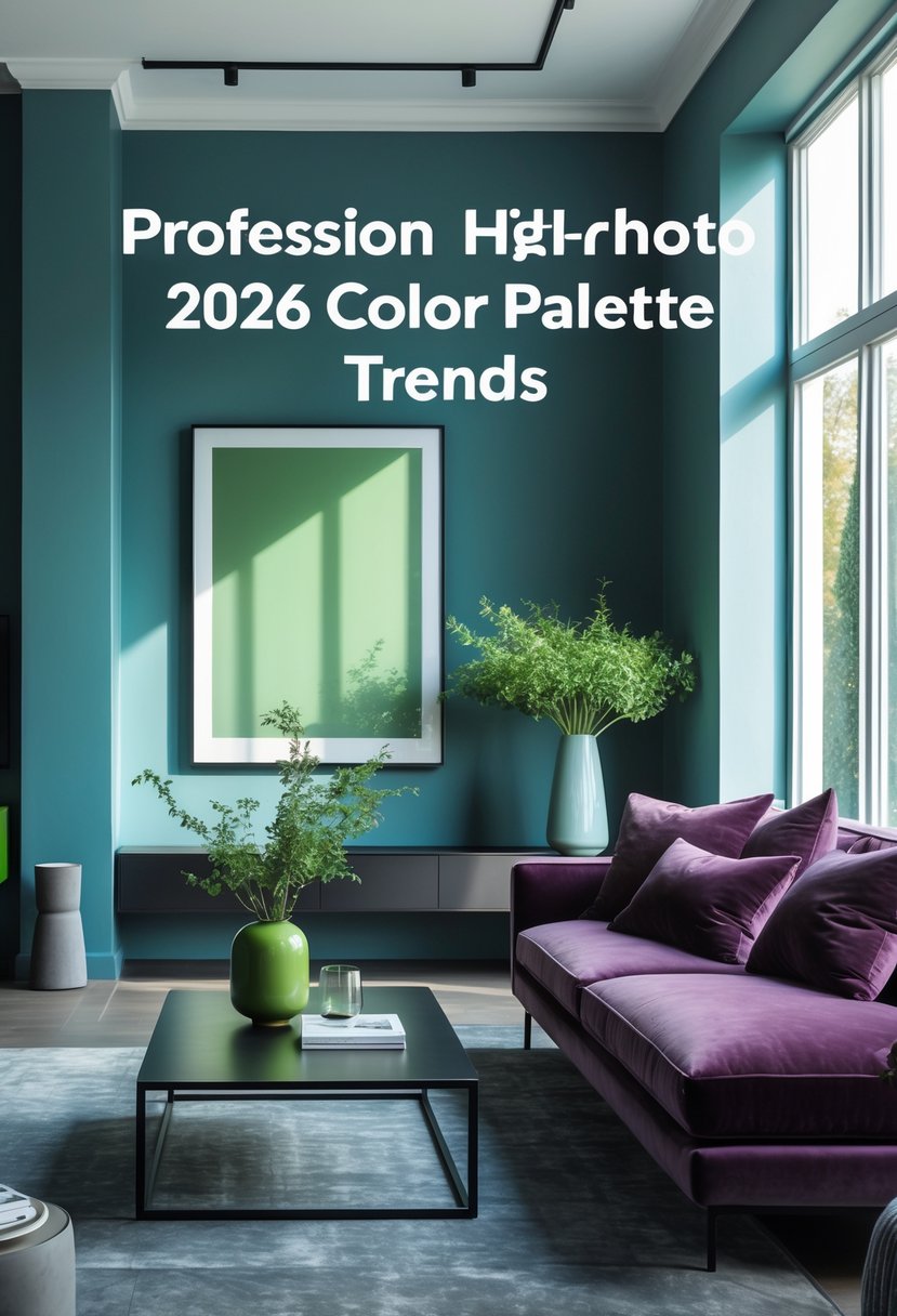
2026 Color Palette Trends How to Use Cool Blue Jade Plum Noir Wasabi
This article was created in line with Trends Oraa’s research and content standards.
Design trends for 2026 favor colors that bring calm and a sense of balance to homes. Shades like cool blue, jade, deep plum, and wasabi add depth and character while keeping rooms comfortable and easy to live in.
Designers pair these tones with warm minimalism and natural textures to build layered, thoughtful spaces. When chosen with purpose, the 2026 palette helps create interiors that feel both modern and lasting.
1. Soft Neutrals with Wasabi Green Accents
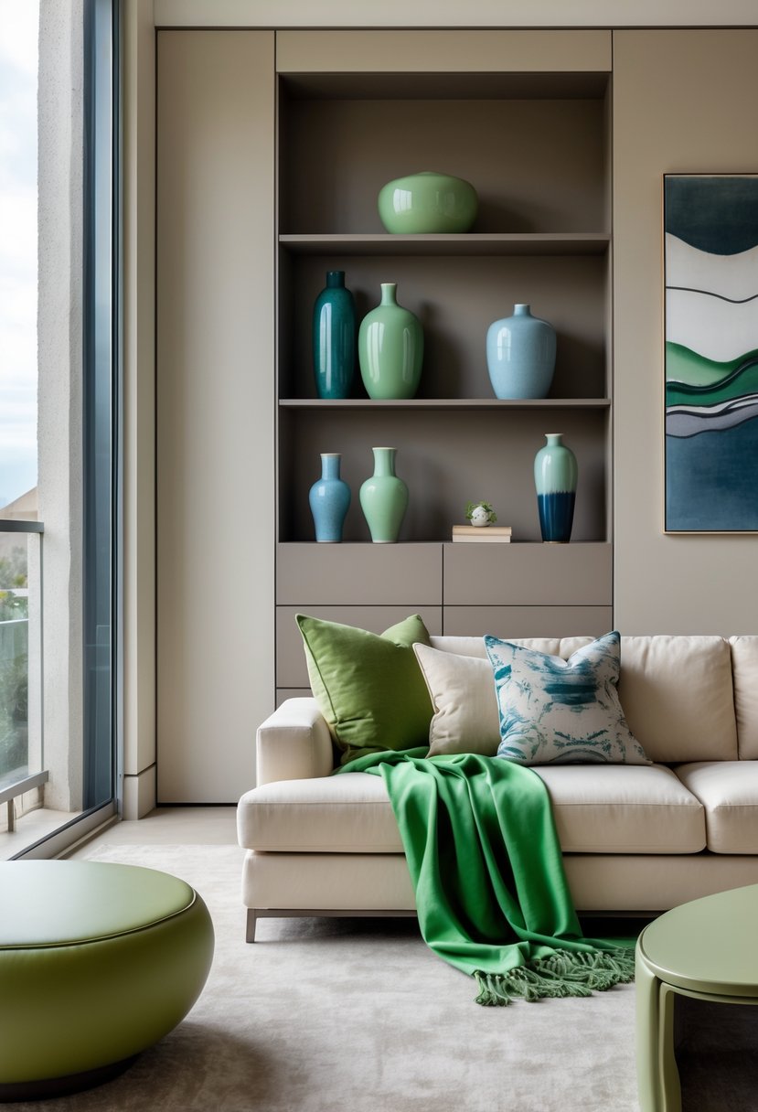
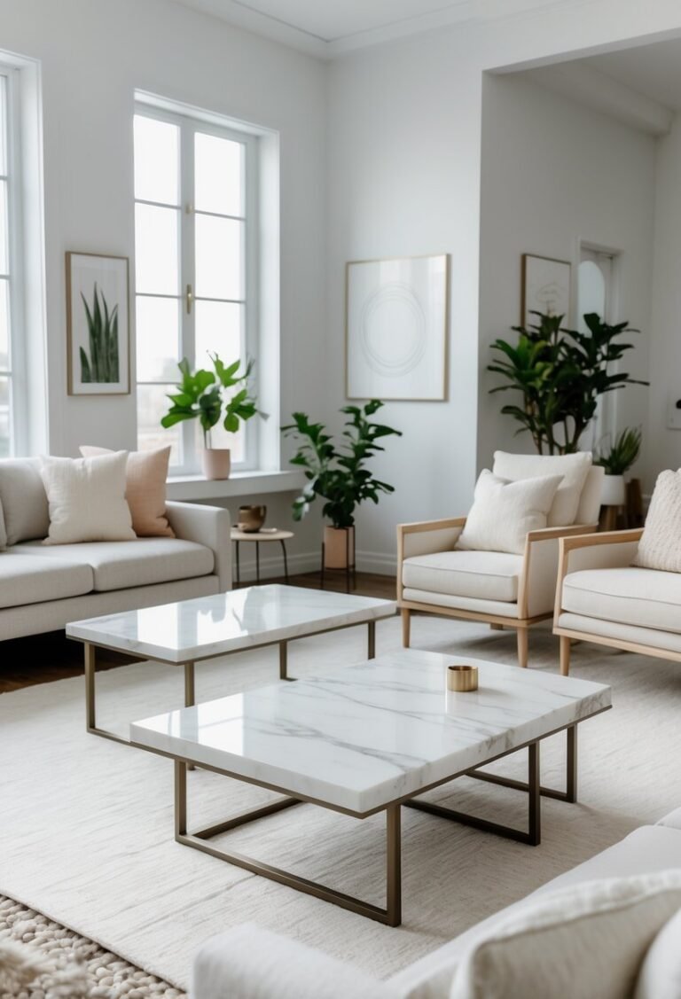
A room built on warm, layered neutrals feels calm and inviting. Cream sofas, pale walls, and light linen curtains set a soft base that lets small accents draw attention without clashing.
Wasabi green appears in small touches like throw pillows or a single chair. The tone is muted and earthy, so it gives a fresh note without being loud. Used sparingly, it deepens the palette and keeps the space feeling refined.
Natural wood pieces add weight and warmth. A wooden coffee table, open shelving, or picture frames create a grounded look and connect the room to nature. Textured items—woven rugs, ceramics, and soft upholstery—bring more interest than color alone.
Design tips:
- Keep major surfaces neutral: walls, large furniture, and curtains.
- Add wasabi green in 2–4 small accents to avoid overpowering the scheme.
- Use mixed textures (wood, linen, ceramics) for visual depth.
Bold color stays minimal while materials and texture create richness. This approach balances modern style with a quiet, nature-linked mood.
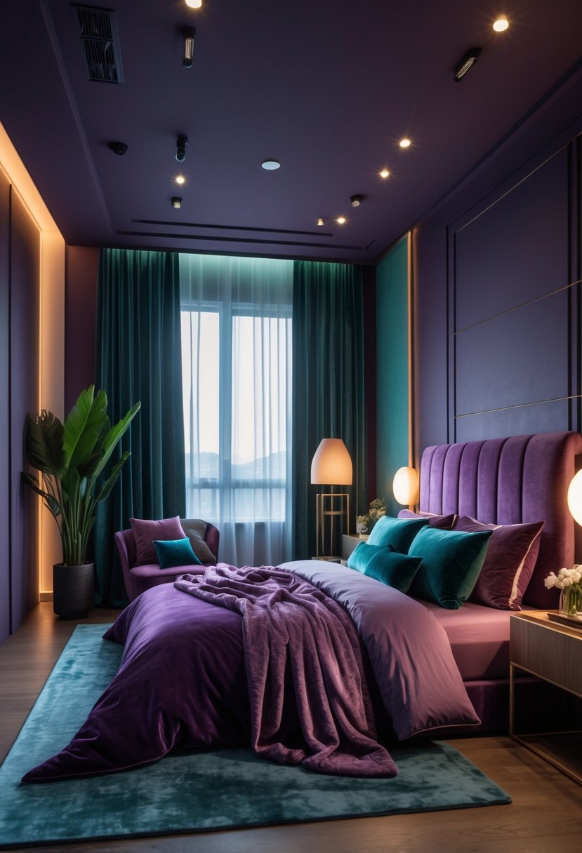
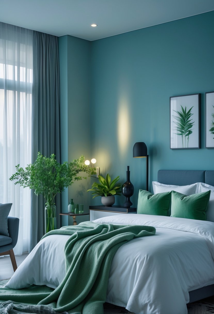
2. Cool-Blue Bedroom Layers for a Calm, Modern Home
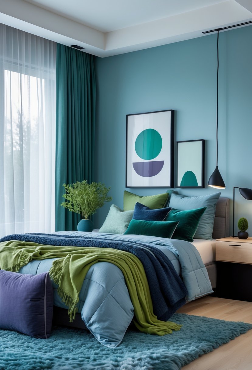
Cool blue shows up as a soft, steady color that grounds a bedroom without overpowering it. It works best as layered accents—pillows, a throw, or a painted wall—against white linens to keep the space airy and modern.
Sheer curtains let daylight diffuse gently, which boosts the blue’s soothing effect and adds a sense of movement. Warm wood floors and simple furniture balance the cool tones so the room still feels cozy and lived-in.
Textured materials stop the scheme from feeling flat. Linen sheets, woven rugs, and small tactile accents add depth and a lived-in look. These textural layers help cool blue read as timeless rather than just trendy.
Designers pair cool blue with clean lines and natural materials to keep the room calm and functional. This mix supports a wellness-focused bedroom that feels fresh yet welcoming. The result is a modern bedroom that looks composed and will age well.
3. Jade-Green Kitchens That Feel Timeless and Refined
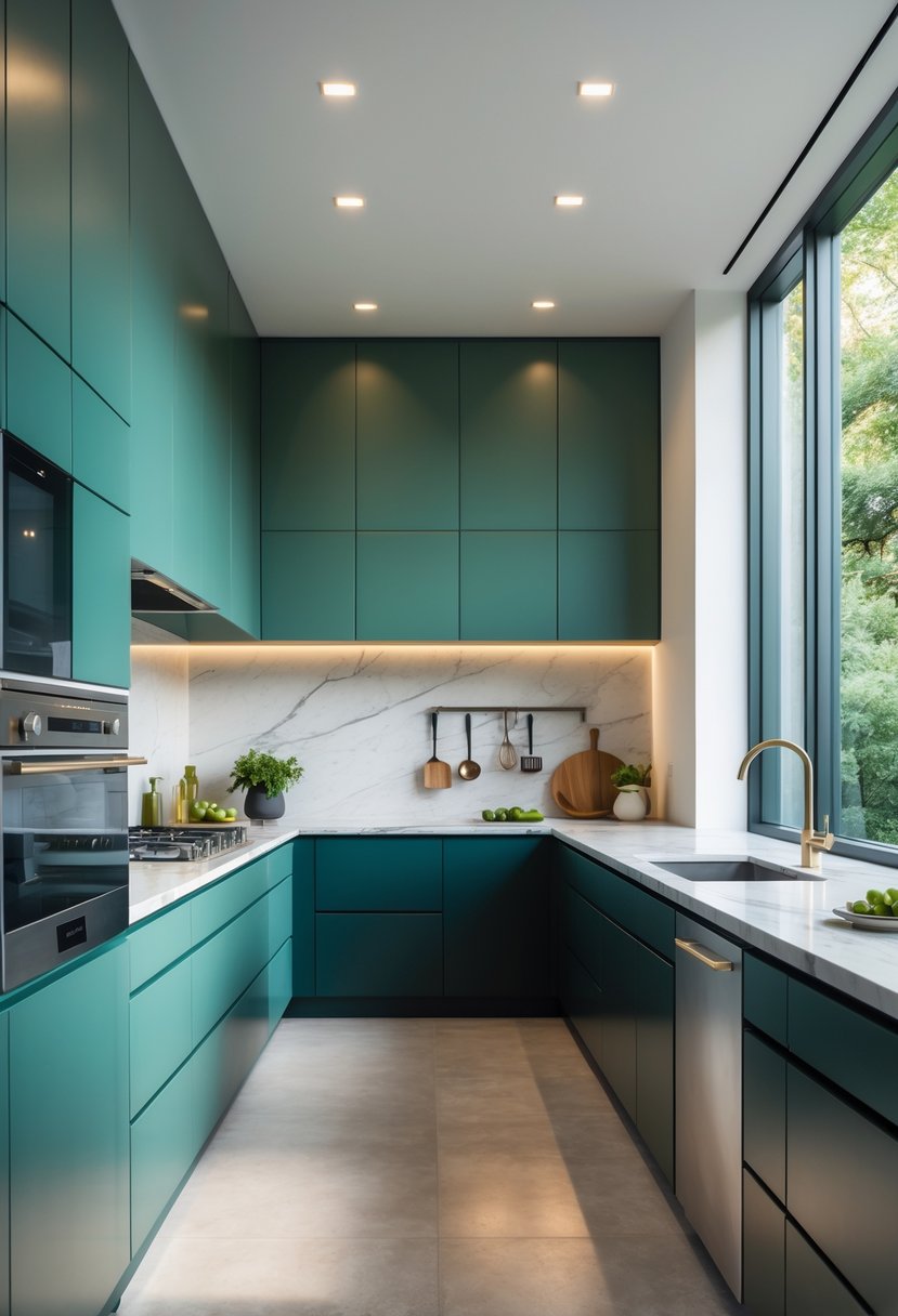
Jade-green cabinets give kitchens depth without looking heavy. They suit large surfaces and create a calm, mature look when paired with clean, modern shapes.
Warm brass knobs and pulls lift the color and add a quiet shine. Marble or light stone countertops balance the green and keep the space feeling polished but not flashy.
Natural wood shelves and accents introduce texture and warmth. Small plants or herbs soften the palette and connect the room to the outdoors.
Design tips:
- Use warm metals (brass, bronze) for hardware to create contrast.
- Keep countertops light to prevent the color from overwhelming the room.
- Add open shelving or wood elements for a casual, lived-in feel.
Why it works:
- Jade blends earthy roots with a refined finish.
- The color reads as elegant across styles, from modern to classic.
- Natural light deepens the green and keeps the kitchen welcoming.
4. Wasabi-Toned Bathrooms That Balance Boldness and Calm
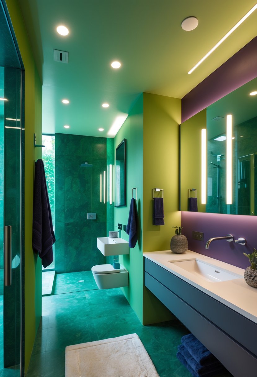
Wasabi green can give a small bathroom a strong, clear identity without overpowering it. When used on walls, the color reads as confident and modern, making a powder room feel thoughtfully designed rather than just trendy.
Pairing the green with warm brass or gold fixtures adds soft contrast and a bit of glow. These metal accents cut the intensity and make the space feel more elegant and lived-in.
Keep shapes simple and surfaces uncluttered so the color stays the focus. A floating wood vanity or other natural materials helps anchor the palette and brings warmth and texture.
Design tips:
- Use warm metals for taps, mirrors, and lighting to balance the green.
- Choose a single statement wall or paint the whole room, depending on light and size.
- Add wood or stone elements to prevent the color from feeling too flat.
- Limit decor to a few well-chosen items to maintain a refined look.
This approach shows how a bold hue can still read as calm, mature, and timeless.
5. Cool Blue Statement Walls with Wasabi Accents
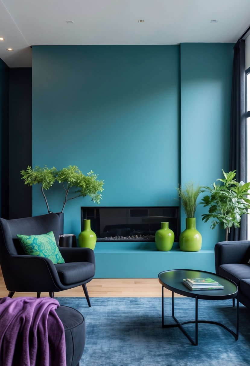
Deep cool blue wall panels add shape and calm to a living room. They create a clear focal point that feels both modern and timeless. The panels give the walls a crafted look without needing extra trim or busy decor.
Wasabi-green throw pillows and small accessories lift the mood. These bright accents stop the blue from feeling too heavy and add a fresh, lively contrast. Placing the wasabi pieces in small doses keeps the palette balanced and controlled.
Warm wood furniture and neutral sofas temper the bold colors. Natural textures—like woven rugs and linen cushions—soften the room and make it feel lived-in. Layering these finishes helps the space feel cohesive rather than staged.
Practical tips:
- Use one wall or a set of panels for the blue to avoid overwhelming the room.
- Add wasabi in cushions, a lamp, or plants for pops of color.
- Choose medium-tone wood and off-white upholstery to bridge cool and warm elements.
This approach shows how strong color choices can read as calm, curated, and comfortable for everyday use.
6. Jade Green Outdoor Living Spaces That Feel Elevated
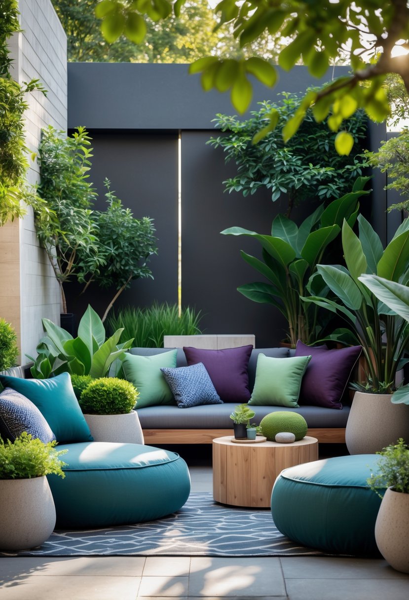
Jade green cushions and fabrics give patios a calm, polished look that blends with plants and trees. They make seating feel intentional and pulled together without clashing with garden colors.
Pairing jade tones with warm wood furniture softens the look and keeps the space from feeling heavy. Wood and stone textures add contrast and a natural touch that complements the green.
Layering plants, potted trees, and vertical greenery strengthens the peaceful vibe. These living elements reinforce a connection to nature and make the area feel more relaxed.
Structured furniture—clean lines and simple shapes—keeps the design feeling modern and organized. Mixing soft textiles like cushions and throws with firmer materials such as wicker or teak balances comfort and durability.
Use a limited palette: jade green, warm wood, and neutral accents. This helps the eye rest and creates a cohesive, elevated feel.
Quick styling tips:
- Add a few textured throws in neutral tones.
- Place plants at varying heights for depth.
- Choose weatherproof fabrics for low maintenance.
This approach makes outdoor living feel like an extension of the home—stylish, comfortable, and in tune with its natural setting.
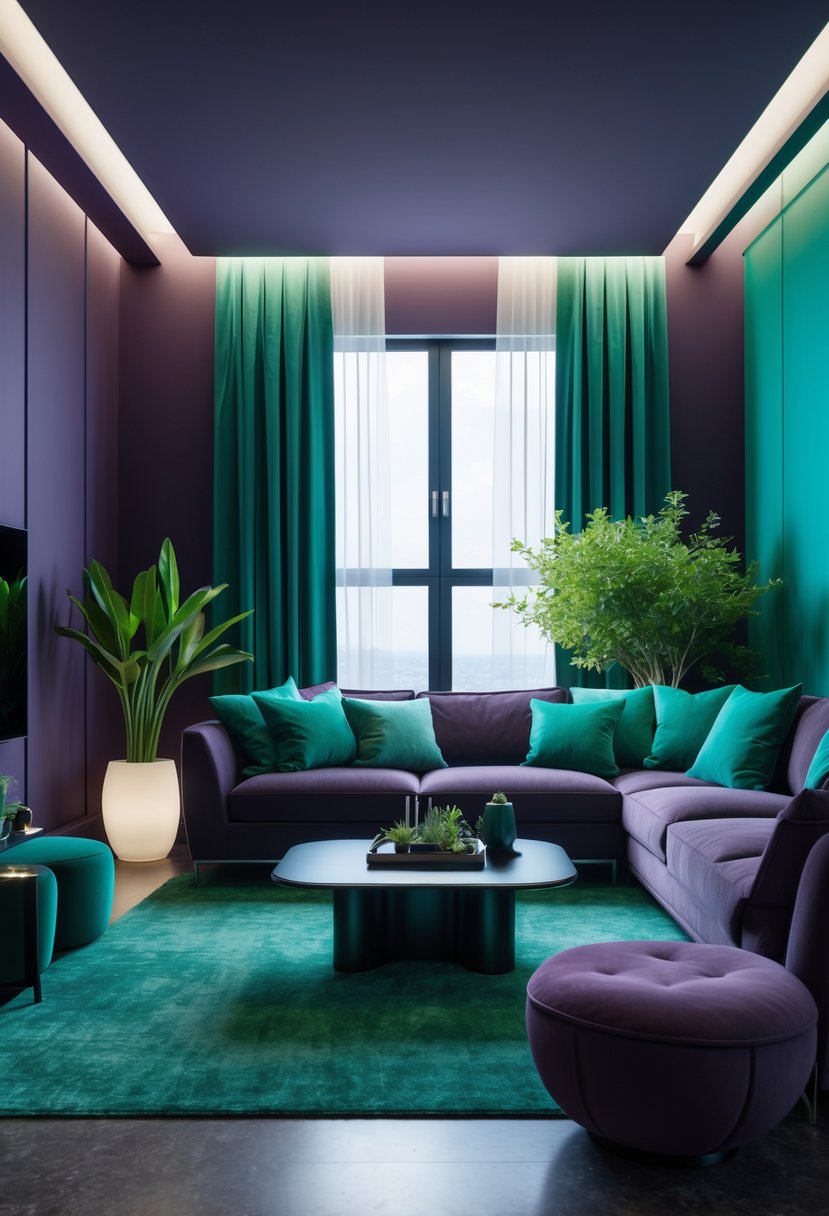
7. Plum Noir Living Rooms That Feel Rich and Sophisticated
Plum noir walls give living rooms a deep, warm backdrop that reads as elegant rather than heavy. Soft seating in light, creamy shades lifts the space, creating contrast that keeps the room feeling open and comfortable.
Textured fabrics like bouclé and rounded, sculptural furniture add a tactile, modern touch. Layered throws and cushions soften the intensity of the dark walls and make the room feel lived-in and cozy.
Warm metals and gentle lighting bring out depth in the plum tones. Brass lamps, muted metallic accents, and ambient light reflect softly and create subtle highlights along walls and textiles.
A simple palette—plum, creamy neutrals, warm metal—keeps the look refined. Natural materials such as wood and woven fibers add organic balance and prevent the scheme from feeling too staged.
Attention to scale and placement matters: place seating where light hits textiles, and use rugs to define seating zones. Small decorative pieces in warm tones tie the scheme together without competing with the rich wall color.
8. Jade Tiles and Plum Noir Vanities for a Spa-Like Bath
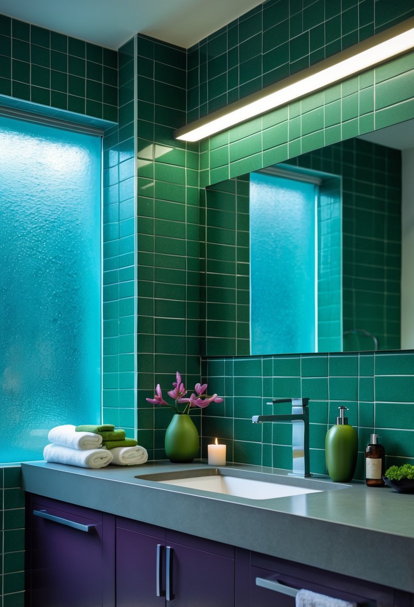
Jade-green tiles bring a deep, jewel-like color that makes the room feel calm and rich. Their glossy surface catches light and adds subtle movement, turning walls into a soothing backdrop.
Plum noir vanities anchor the space with a dark, warm tone that balances the green. This contrast keeps the palette from feeling too bright and adds a refined, modern edge.
Combine these colors with brass fixtures for a soft metallic glow. Brass warms the cool green and pairs well with plum to create visual harmony.
Add marble or a light stone countertop to introduce a neutral, timeless surface. The stone keeps the design grounded and prevents the color mix from feeling heavy.
Use soft, layered lighting to enhance the spa mood. Task lighting by the mirror and indirect ambient light will highlight tile sheen and cabinet texture without glare.
Key elements:
- Bold jade tile for color and depth
- Plum noir vanity for contrast and warmth
- Brass accents and stone counters for balance
- Layered lighting to keep the feel relaxed and refined
9. Cool Blue Tile Bathrooms That Feel Fresh and Minimal
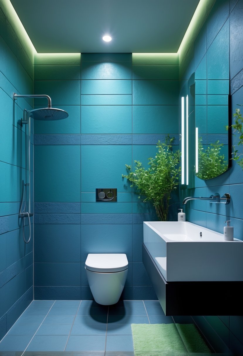
Blue tile sets a calm tone without overpowering the room. Using soft, cool blues on walls or floors makes the bathroom feel larger and more peaceful. They work well where people want a spa-like vibe.
Keep furnishings simple so the color stays the focus. A floating wood vanity or a slim shelf adds warmth and stops the blue from feeling cold. Matte fixtures and clean lines maintain a modern, uncluttered look.
Natural light changes the blue throughout the day, adding subtle depth. Choose tiles with a slight texture or varied glaze to catch light and avoid flat color. Limit patterns and heavy trim to preserve the minimalist feel.
Practical tips:
- Pair cool blue tiles with warm woods for balance.
- Use matte metal finishes for a soft, timeless touch.
- Let daylight do the work—avoid heavy curtains.
- Keep storage built-in or hidden to reduce visual clutter.
This restrained approach makes blue tiles feel both modern and lasting, fitting a wellness-focused, simple design.
10. Jade-Green Sleeping Spaces That Feel Grounded and Calm
Painted walls in a soft jade tone give the room a quiet, steady mood. The color reads rich but not heavy, helping the space feel restful without looking dull.
They pair jade with warm wood furniture to soften the cool green. Built-in nightstands and simple decor keep the room tidy and easy to live in.
Layered neutral bedding brightens the palette and makes the bed inviting. Linen textures and small metallic touches add subtle polish without clutter.
Lighting stays soft and warm to enhance the soothing effect. Minimalist accents and thoughtful proportions keep attention on comfort and balance.
Quick styling checklist:
- Wall color: muted jade
- Furniture: warm wood, clean lines
- Bedding: layered neutrals, linen textures
- Lighting: soft, warm bulbs
- Accents: small warm metals, restrained decor
This scheme shows how a bold color can still feel timeless by focusing on natural materials, gentle contrasts, and calm styling.
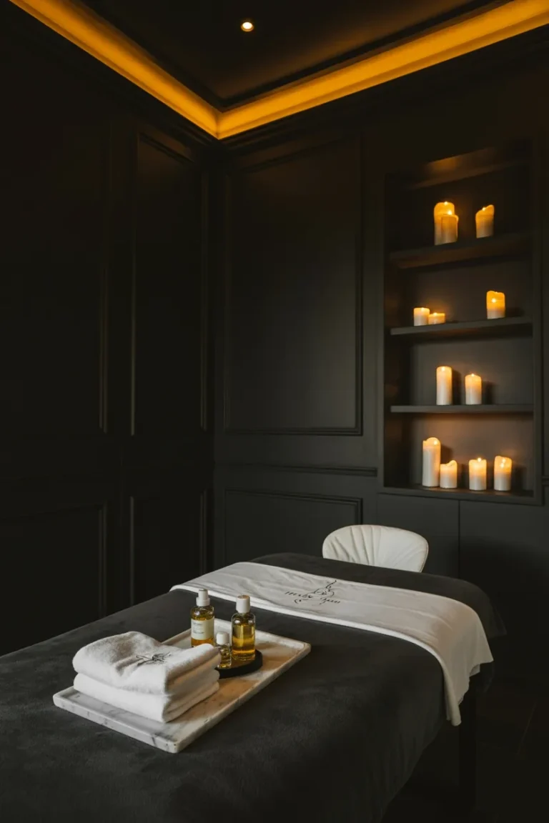
11. Plum Noir Bedrooms That Feel Warm, Intimate, and Luxurious
Plum noir walls can make a bedroom feel cozy without choking light. The deep, muted purple wraps the room in softness while still reading as refined rather than heavy.
Balance the rich color with light bedding and soft fabrics. A neutral duvet, layered throws, and a plush rug add texture and keep the space from feeling closed in. These tactile layers invite touch and improve comfort.
Choose warm wood furniture to bring natural tones into the palette. Nightstands, a bench, or a low dresser in walnut or oak ties the room to the earth and warms the plum. Simple, clean-lined pieces prevent the look from becoming fussy.
Use gentle, layered lighting to highlight depth and mood. Pendant lights, table lamps, and dimmable overheads create pools of light that soften shadows. Aim for warm bulbs to strengthen the intimate feel.
Keep decor restrained and thoughtful. A few curated accents in brass, muted gold, or soft beige lift the space and add a light, luxurious touch without clutter.
12. Plum Noir Bedrooms with Architectural Depth
Plum noir walls give a bedroom a strong, layered look without feeling cold. Paneled walls add structure and shadow, making the color read as rich and dimensional rather than flat.
They balance bold paint with clear architectural lines, creating a room that reads as intentional and well-designed. Soft bedding and neutral fabrics prevent the space from feeling heavy, while warm woods and brass fixtures bring a cozy counterpoint. Ambient, layered lighting softens deep tones and highlights texture on walls and furniture.
Designers often mix tactile materials—wool throws, linen sheets, and matte plaster—with the dark hue to keep the room tactile and inviting. A simple list shows key elements to include:
- Paneled or molded walls for depth
- Plush, neutral bedding for contrast
- Warm wood furniture to add warmth
- Brass or warm-metal lighting for highlights
- Soft, layered ambient lighting to reduce harshness
These choices help plum noir read as modern and sophisticated. The room feels intimate and curated, combining strong color with human-centered materials and light.
13. Serene Jade Entrances That Feel Curated
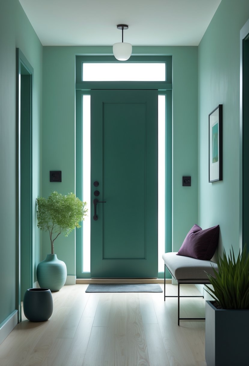
Jade green walls give a foyer a calm, confident look without feeling dull. The color reads as rich but soothing, setting a quiet tone that still feels purposeful.
Pairing the paint with warm wood floors and sculptural furniture prevents the space from feeling cold. Natural textures and rounded shapes add warmth and keep the green grounded.
Keep accessories simple to let color and form lead. A few ceramic vases, a small plant, and one modest piece of art add interest without clutter.
Use a limited palette and tactile materials to maintain coherence. This approach makes the entry feel modern and collected, creating a clear first impression that ties into the home’s overall style.
14. Plum Noir Reading Nooks That Feel Intimate and Elevated
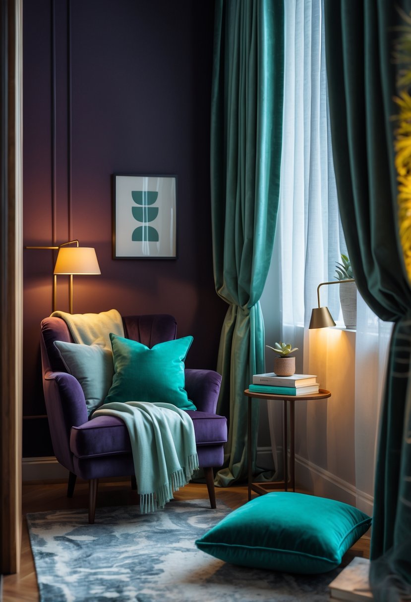
A plum noir corner turns a small area into a calm, private spot. The deep wall color adds depth and makes the nook feel purposeful without overpowering the room.
They pair built-in shelves with layered lighting to mix function and mood. Accent lights shine on books and objects while soft lamps warm the space and cut through the darkness.
Soft seating and textured fabrics keep the nook cozy and balanced. A neutral chair, woven throw, and patterned rug stop the color from feeling heavy and add touchable comfort.
Warm wood, plush textiles, and subtle metallics lift the palette and make it feel refined. These elements make the nook look curated and lived-in, fitting modern trends that use moody tones thoughtfully.
Quick tips:
- Use accent lighting on shelves to highlight books.
- Choose one neutral seating piece to contrast deep walls.
- Add a textured rug and a throw for warmth and pattern.
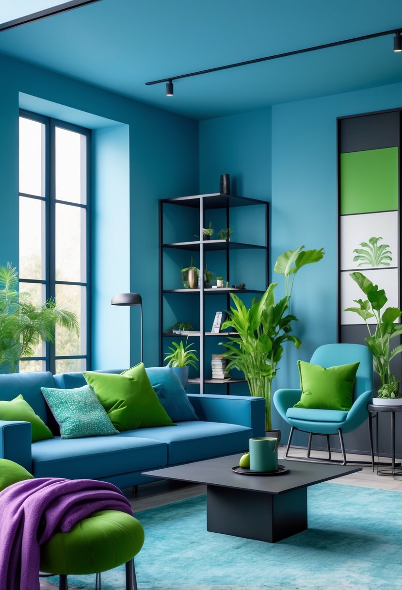
15. Cool-Blue Living Areas with Gentle Architectural Flair
Cool blue shades layered through walls, furniture, and fabrics create a calm, unified room that reads modern without feeling stark. Small shifts in tone—dusty sky, pale teal, and deep slate—add depth instead of sharp contrast, so the space feels balanced and restful.
Architectural details like arches, rounded niches, and sculpted moulding gain subtle emphasis when painted in cool blue. The hue softens edges and brings out light and shadow, helping forms read clearly while staying understated. This makes blue a strong choice where structure matters more than bold color pops.
Natural textures and soft neutrals keep the room warm and inviting. Woven pillows, ceramics, and cozy throws introduce tactile variety and prevent the palette from feeling flat. Gentle, layered lighting enhances material tones and supports a serene atmosphere.
Design tips:
- Use three blue tones: light, mid, and dark for layered depth.
- Pair with off-white or beige accents to warm the palette.
- Highlight curves and openings with a slightly different blue to show form.
This approach keeps the space timeless, calm, and thoughtfully composed.
16. Plum Noir Dining Rooms That Feel Dramatic and Refined
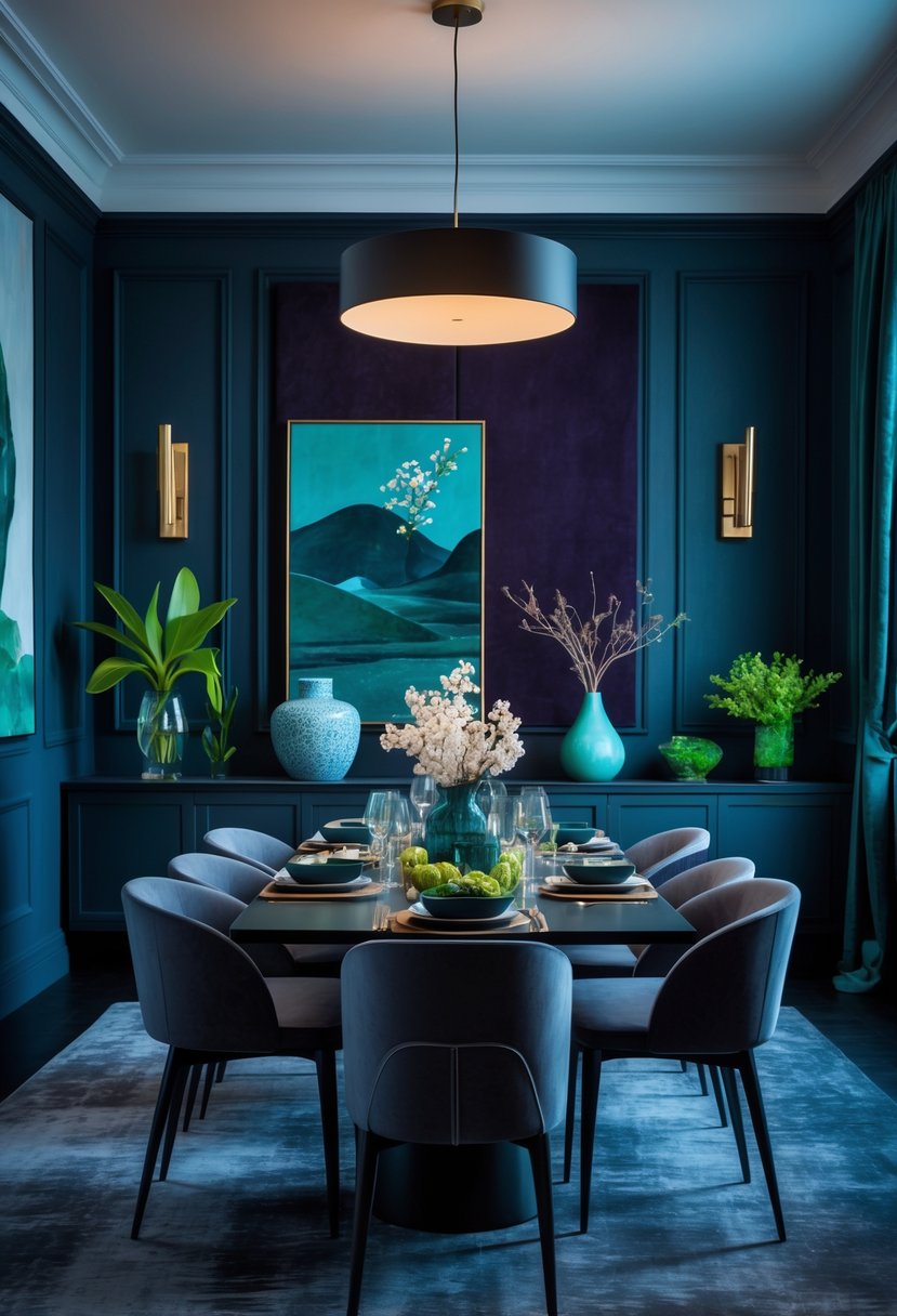
Plum noir paint gives dining rooms a deep, cozy feel that suits quiet meals and long conversations. It makes the room feel rich without needing many bright accents.
Dark wood tables and chairs match the wall tone for a layered, calm look. This keeps the space from feeling stark and makes each piece blend into a unified design.
Brass or warm-metal light fixtures add a gentle shine and break up the dark surfaces. Small light sources like candles and low pendants soften the mood and make the room feel welcoming.
Matte dishes, plush upholstered seats, and textured linens keep the room comfortable and lived-in. These elements prevent the space from feeling too formal while keeping a polished vibe.
A simple styling approach—limited decor, focused color story, and quality materials—lets plum noir stand out without overwhelming the room. This balance produces a dining area that feels both dramatic and quietly elegant.
17. Wasabi-Hued Sofas That Bring Life Without Taking Over
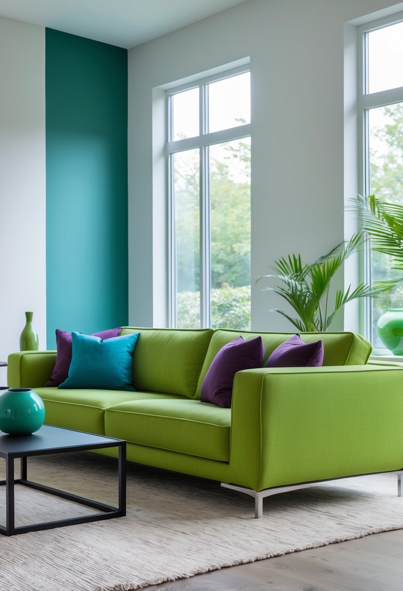
A wasabi-green sofa can act as a lively focal point while staying tasteful. It sits between bold and soft, so it adds character without overwhelming other elements in the room.
Pairing the sofa with neutral cushions—cream, taupe, or warm gray—tones down its brightness. This creates depth and keeps the space feeling calm and layered.
Natural materials and warm lighting help the color feel grounded. Wood finishes, stone accents, and subtle art make the green look intentional and refined.
Use wasabi green sparingly on major pieces rather than across many items. This focused approach lets the sofa stand out while the rest of the room remains understated.
Quick tips:
- Choose simple shapes to avoid visual clutter.
- Add one or two neutral textiles to soften contrast.
- Match with warm wood or stone for an organic look.
This balance makes the color feel modern and livable instead of loud or faddish.
18. Cool Blue Sofas for a Calm, Comfortable Room
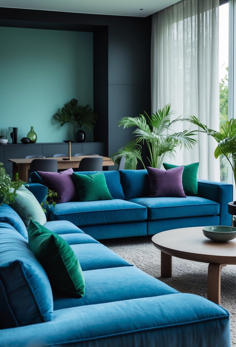
A cool blue sofa can ground a living area while keeping it fresh and modern. It reads as familiar and soothing, not overly coastal or formal, so it works well for daily life.
Layered throw pillows and textured blankets add warmth and depth. These tactile pieces stop the blue from feeling flat and create a cozy, lived-in look.
Soft neutral accents and subtle patterns help balance the cool tone. Pale wood floors and simple decor keep the space light and let the sofa be the focal point without overwhelming the room.
Natural light boosts the airy, inviting feel. When sunlight hits the upholstery, the blue looks brighter and the whole space feels more open.
Styling tips:
- Mix chunky knits with smooth fabrics for contrast.
- Use three or fewer neutral tones to support the blue.
- Add one small pattern to avoid visual sameness.
This approach makes the room feel effortless, welcoming, and suited to everyday comfort.
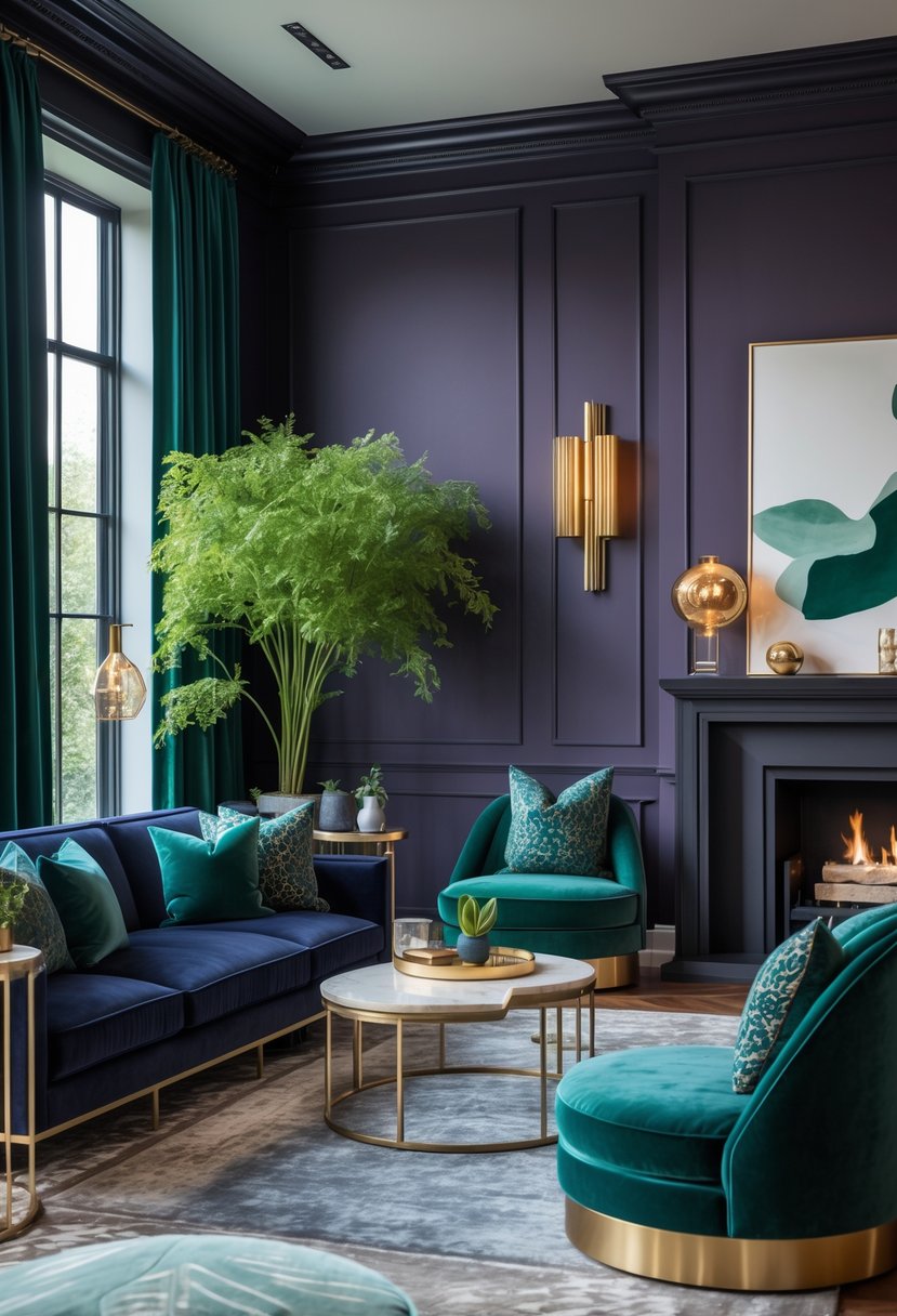
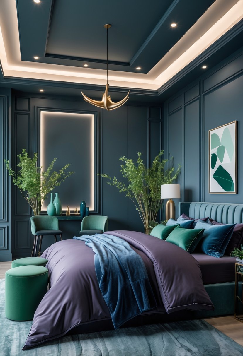
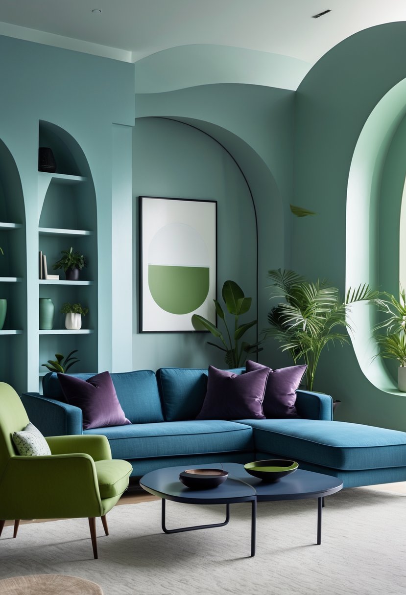
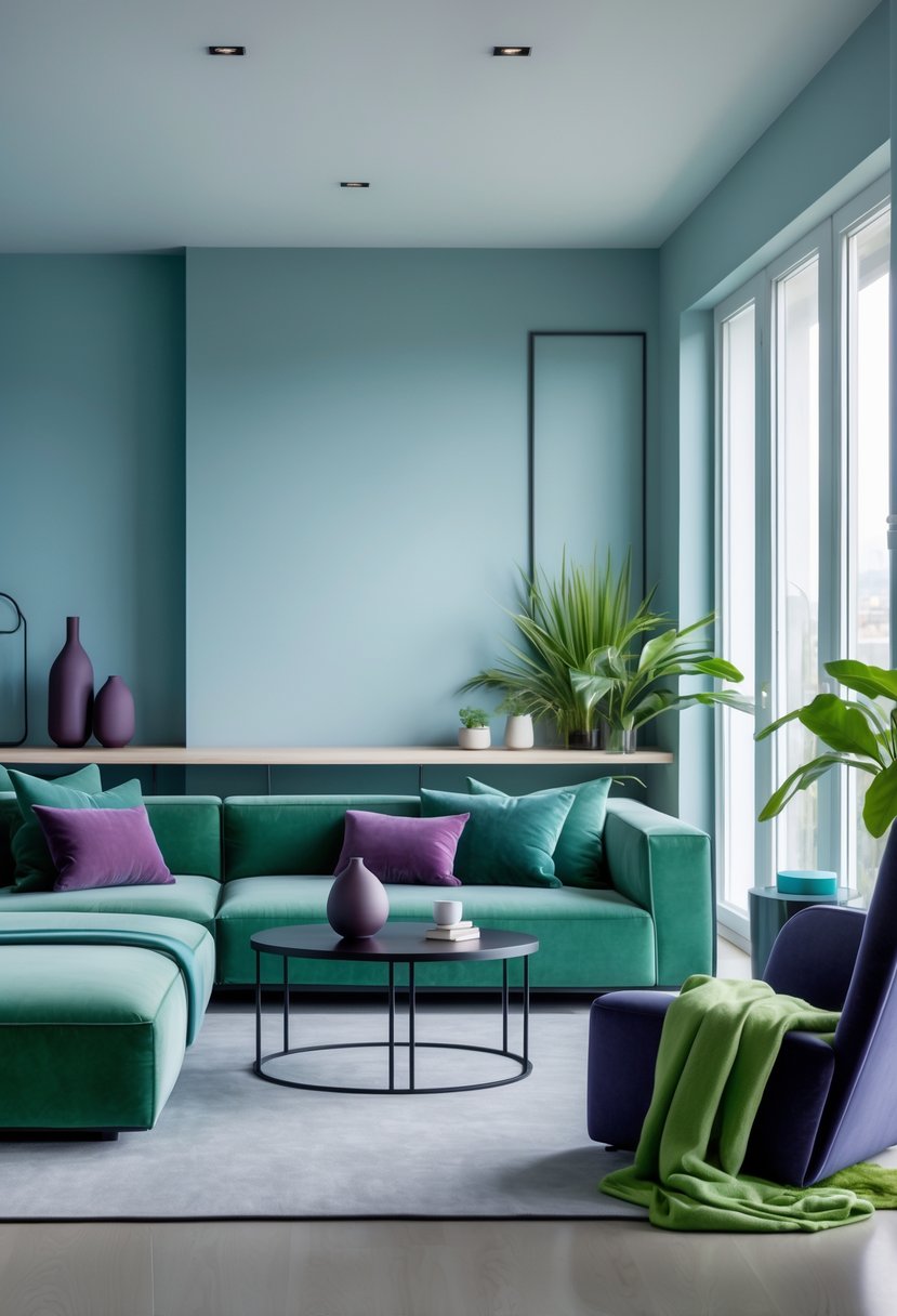
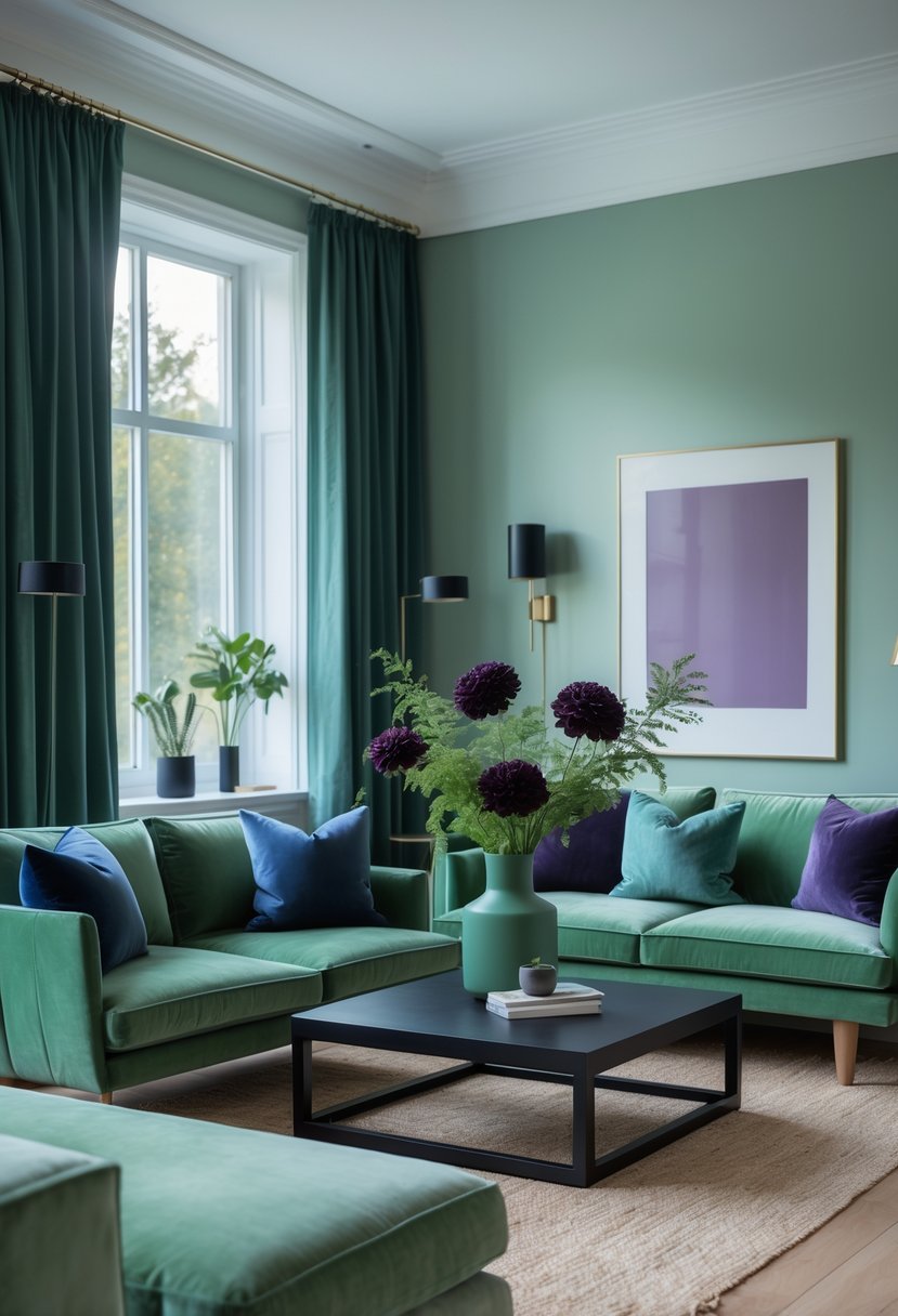
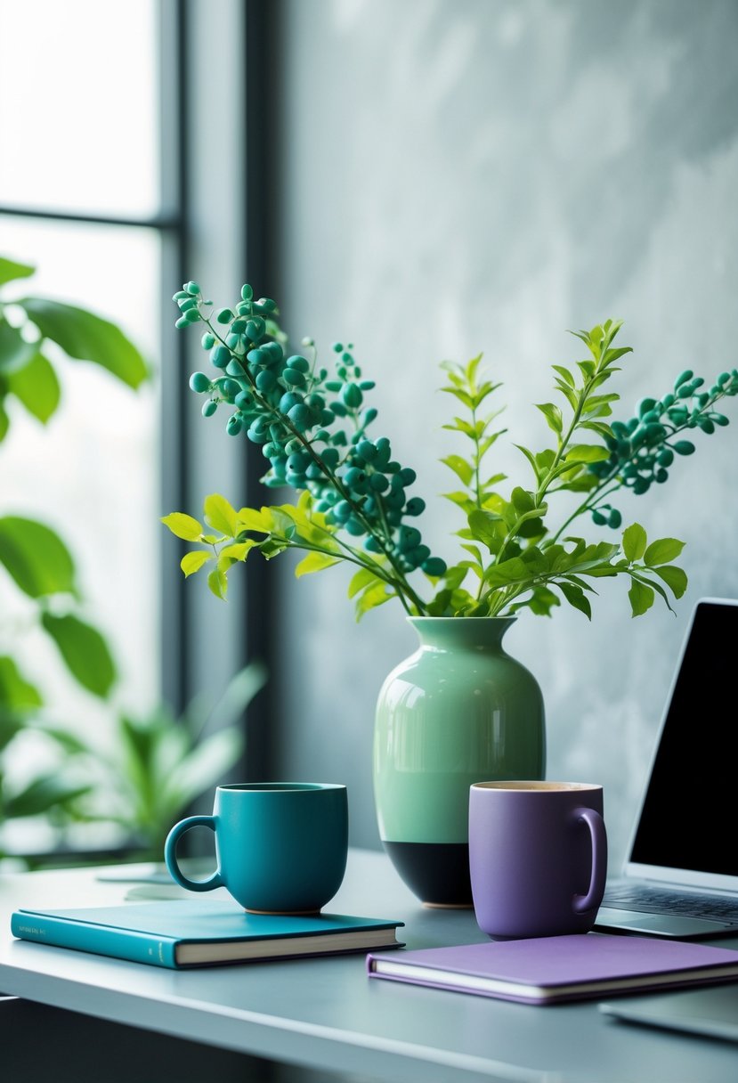
19. Layering Cool Blue, Jade, Plum Noir, and Wasabi Together
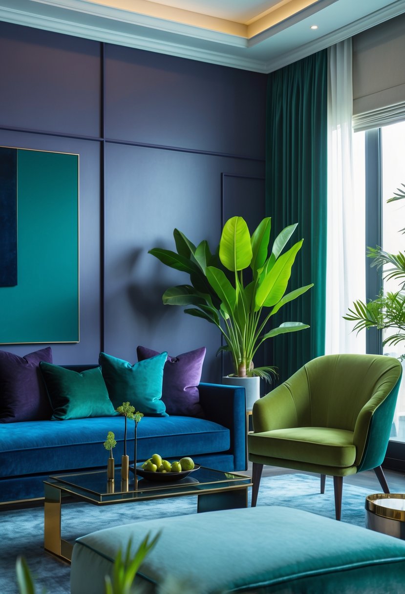
This room pairs cool blue walls with a deep plum sofa to create a calm yet rich backdrop. The blue gives structure, while the plum adds warmth and visual weight.
Jade and wasabi appear in pillows, throws, and small decor pieces to brighten the scene. These accents break up darker tones and keep the palette lively without clashing.
Materials and finishes make the mix feel deliberate: velvet upholstery, warm wood furniture, and matte ceramics add texture. Soft lighting highlights those surfaces and keeps the space inviting.
Practical tips:
- Use cool blue on large surfaces to anchor the room.
- Place plum in one or two major pieces to avoid visual clutter.
- Add jade and wasabi in small doses—textiles, vases, or art.
- Balance with natural wood and tactile fabrics for warmth.
This method builds depth by repeating related saturated colors across different elements. It creates a cohesive, modern interior that feels both expressive and comfortable.
20. Wasabi-Inspired Dining That Feels Fresh and Modern
Wasabi green brightens the room when used on chairs and accents. It adds warmth and personality without dominating the space. Natural light keeps the shade airy and welcoming.
Pairing wasabi tones with a warm wood table and neutral dinnerware creates calm contrast. The color feels grounded and optimistic, which suits places where people eat and talk. Using color on furniture rather than walls makes the room easier to update.
Keep lines clean and styling minimal so the color stands out. Simple place settings, organic shapes, and clear surfaces help the space feel relaxed and elegant. This restrained approach shows how a bold hue can still read fresh and lived-in.
Bullet points for quick tips:
- Use wasabi on movable pieces like chairs or cushions.
- Combine with warm wood and neutral textiles.
- Maximize natural light to soften the green.
- Limit accessories to maintain a calm look.
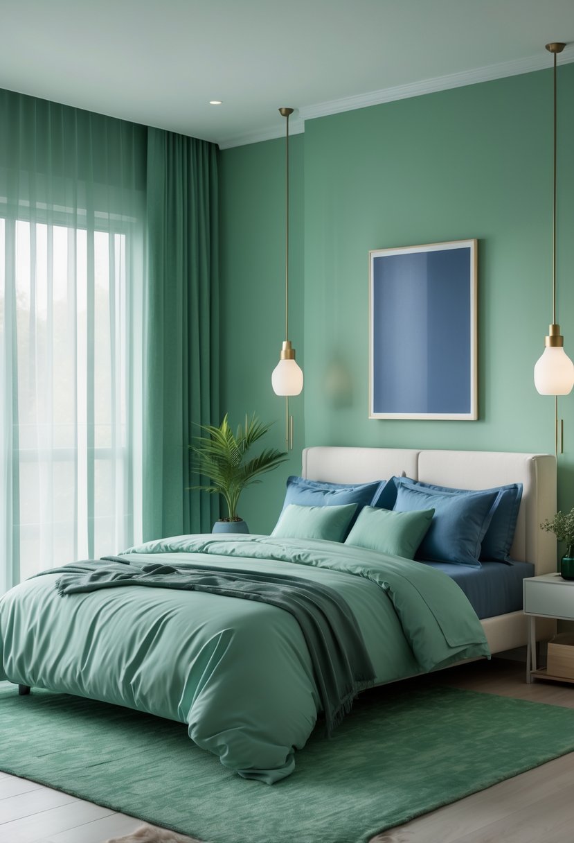
21. Cool Blue and Wasabi Bedrooms That Feel Soft and Serene
They use cool blue as a calm base and add wasabi green in small doses to bring warmth without shouting. Natural light helps the colors shift gently, so the room never feels flat.
Texture plays a big role: linen sheets, a soft upholstered headboard, and warm wood furniture add depth and keep the space cozy. This mix makes the bedroom feel livable and personal rather than staged.
Designers layer color quietly instead of using strong contrasts. The wasabi accents—pillows or a headboard—create subtle interest while the blue bedding keeps the mood restorative.
- Color formula: cool blue base + wasabi accent
- Key elements: natural light, mixed textures, warm wood
- Effect: calm, modern, and comfortable
This approach favors long-term comfort over fast trends, offering a fresh yet steady look that supports rest and everyday life.
22. Fresh Wasabi-Green Touches for a Modern Kitchen
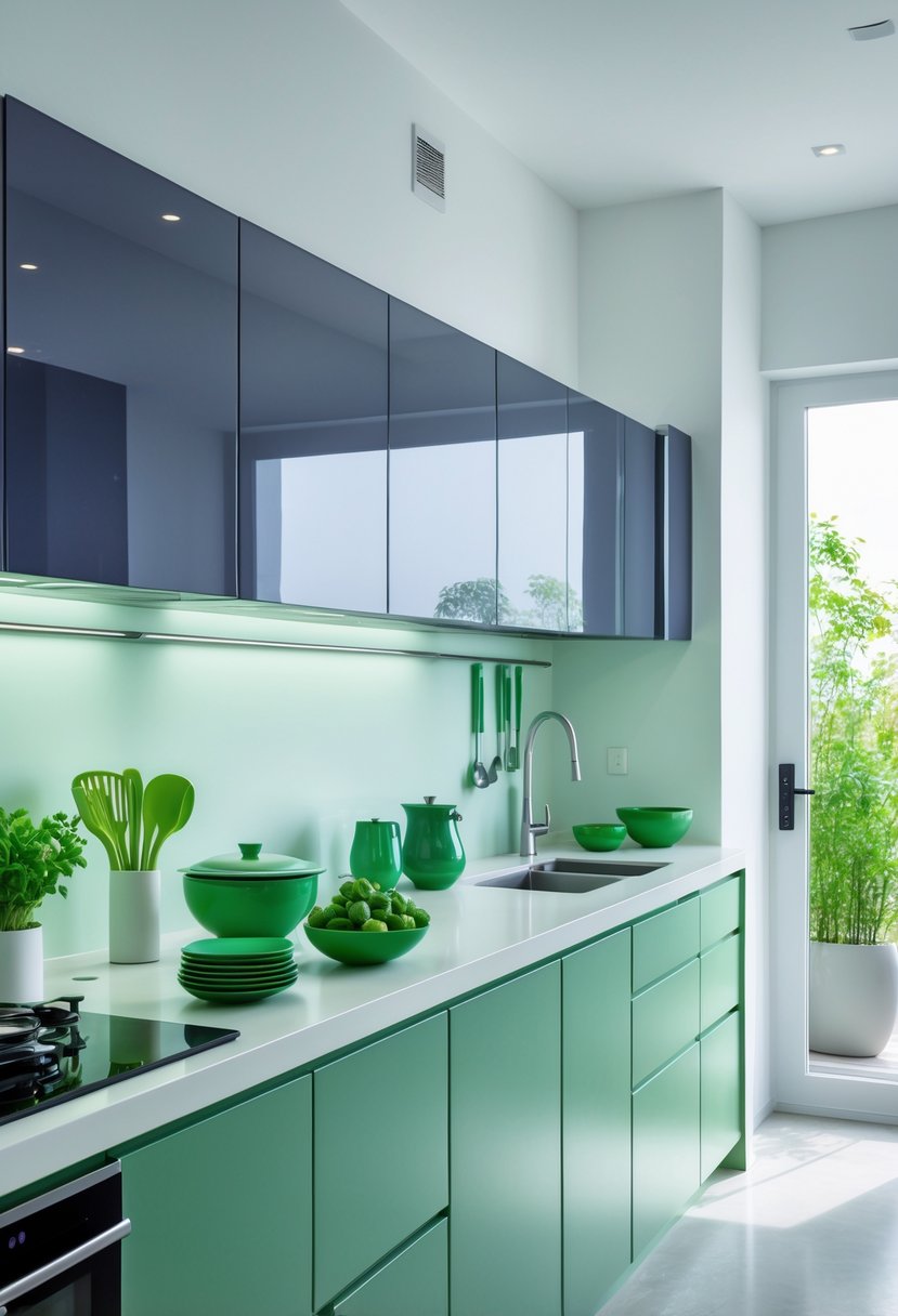
Wasabi green works best as a small, bold touch rather than a room-wide color. When used on items like stools or small appliances, it brings energy without dominating the space.
Wood tones and natural light help calm the vibrancy. Warm wood counters and exposed beams soften the green, while neutral cabinets let it stand out in a controlled way.
Keep the palette simple and let textures do the work. Open shelving, clay or linen accents, and matte finishes balance the color and add a lived-in feel.
Practical placement matters. Choose moveable pieces so the color can change with trends or moods. This makes the choice both stylish and flexible.
Quick tips:
- Use wasabi green on furniture or fixtures that can be swapped out.
- Pair with warm wood and soft neutrals to reduce contrast.
- Add organic materials (rattan, stone, linen) to keep the look grounded.
This approach keeps the kitchen modern and approachable while letting color feel intentional and lasting.
23. Plum Noir Workspaces That Read Polished and Powerful
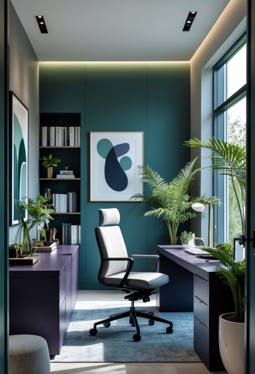
Plum noir wraps a home office in a deep, focused color that feels deliberate, not heavy. Paneled walls or built-ins painted this shade give the room instant structure and a calm, private vibe.
Pairing plum noir with warm metals and wood keeps the space lively. Brass lamps, leather chairs, and walnut or oak surfaces add brightness and texture against the dark backdrop.
Layered lighting matters. Soft shelf lighting and task lamps prevent shadows and let the plum tone show its depth. Reflective accents — a mirror, glossy frames, or a polished desk surface — bounce light and avoid a closed-in feel.
Use simple, high-quality furnishings to match the color’s confidence. Clean lines, minimal clutter, and a few rich materials make the office feel curated and useful. A single bold artwork or a sculptural lamp becomes a focal point without competing with the walls.
A plum noir office supports focus and a sense of quiet luxury. It works for those who want a modern, refined workspace that reads intentional and composed.
24. Cool Blue Baths with Warm Metal Highlights
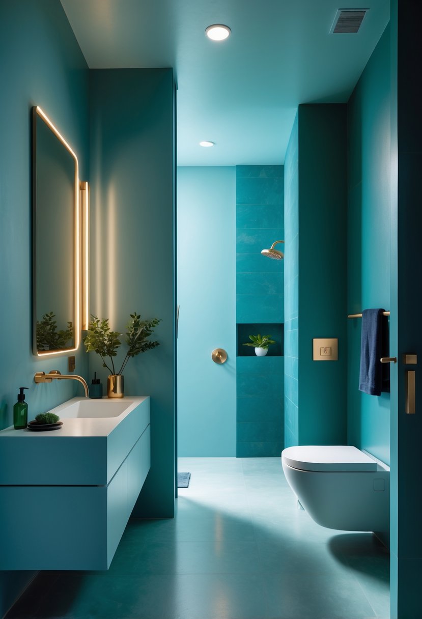
Cool blue paint or cabinetry gives a bathroom a calm, tailored look. It reads more like a designed room than a beach theme, especially when used on paneled walls or built-in storage.
Warm metals like brass and soft gold bring a gentle glow that balances the blue. Fixtures, pulls, and light fittings add warmth and make the space feel welcoming instead of chilly.
Mixing in marble or stone tops adds texture and quiet luxury. Under-cabinet or niche lighting boosts depth and shows off both the blue and the metal tones.
Design tips:
- Use blue on larger surfaces (walls or vanities) to create a cohesive base.
- Choose warm metal finishes for taps, knobs, and sconces to offset cool tones.
- Add natural stone for contrast and a richer palette.
- Use layered lighting to highlight materials and create mood.
This combination works in modern and traditional settings, offering a fresh but lasting look that stays versatile over time.
25. Wasabi-Toned Touches That Warm Quiet Neutral Rooms
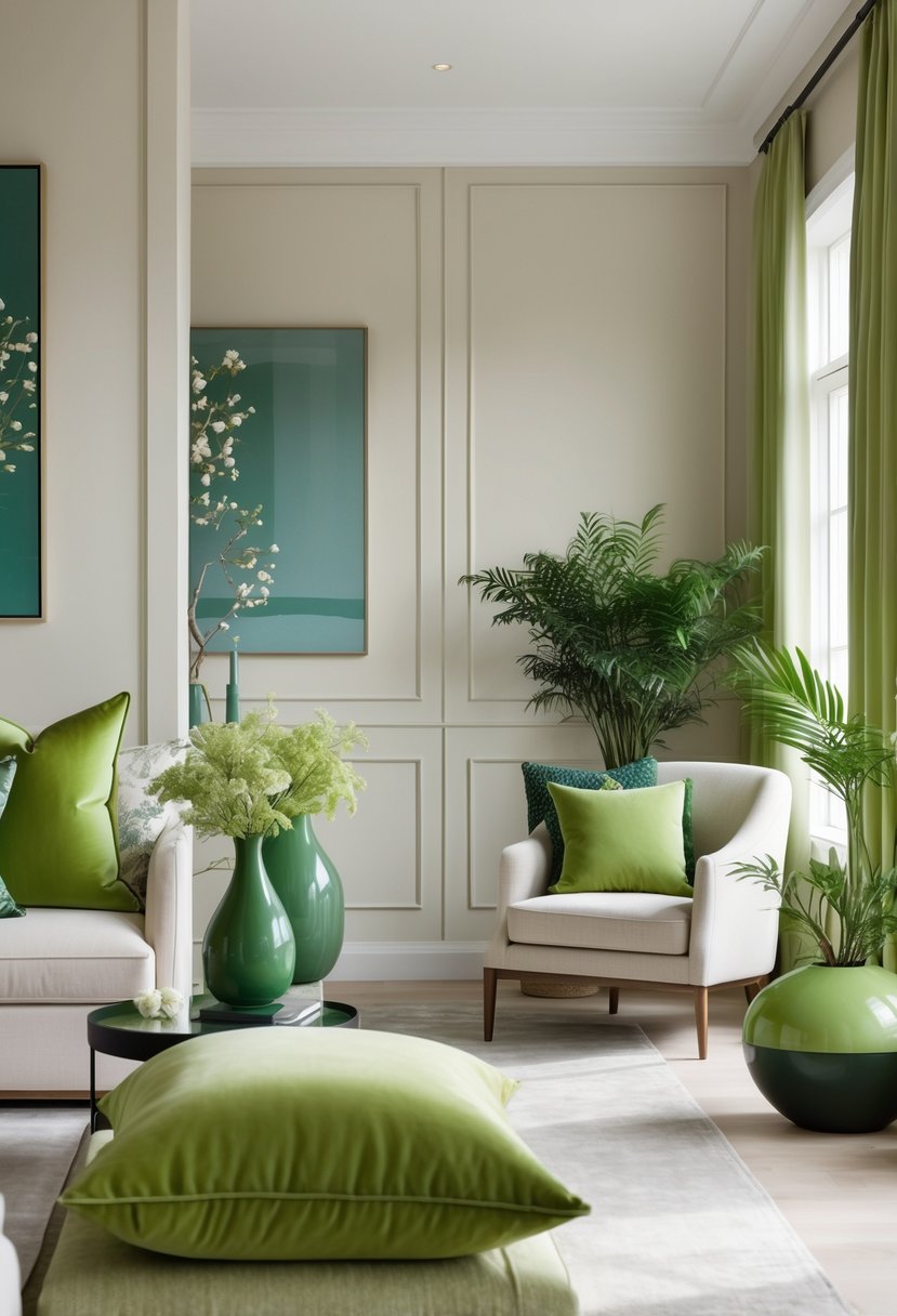
Wasabi green works best as a small accent that brings soft warmth to neutral rooms. It sits between muted chartreuse and earthy olive, so it reads fresh without being bright.
Use it in tactile pieces: glazed pottery, stone objects, woven baskets, and cloth-bound books make the color feel layered and natural. These textures help the shade blend into minimalist settings and add quiet depth.
Pair wasabi accents with creamy whites, warm wood finishes, and gentle blues to keep the palette calm. Limit the color to a few spots—shelves, a console vignette, or a reading nook—to avoid overwhelming the space.
Simple groupings work well:
- One glazed vase + two linen books
- Small stone tray + framed photo
- Wasabi throw pillow on a neutral chair
These small additions make a room feel lived-in and grounded. They introduce color without stealing focus, giving neutral interiors a subtle, natural energy.
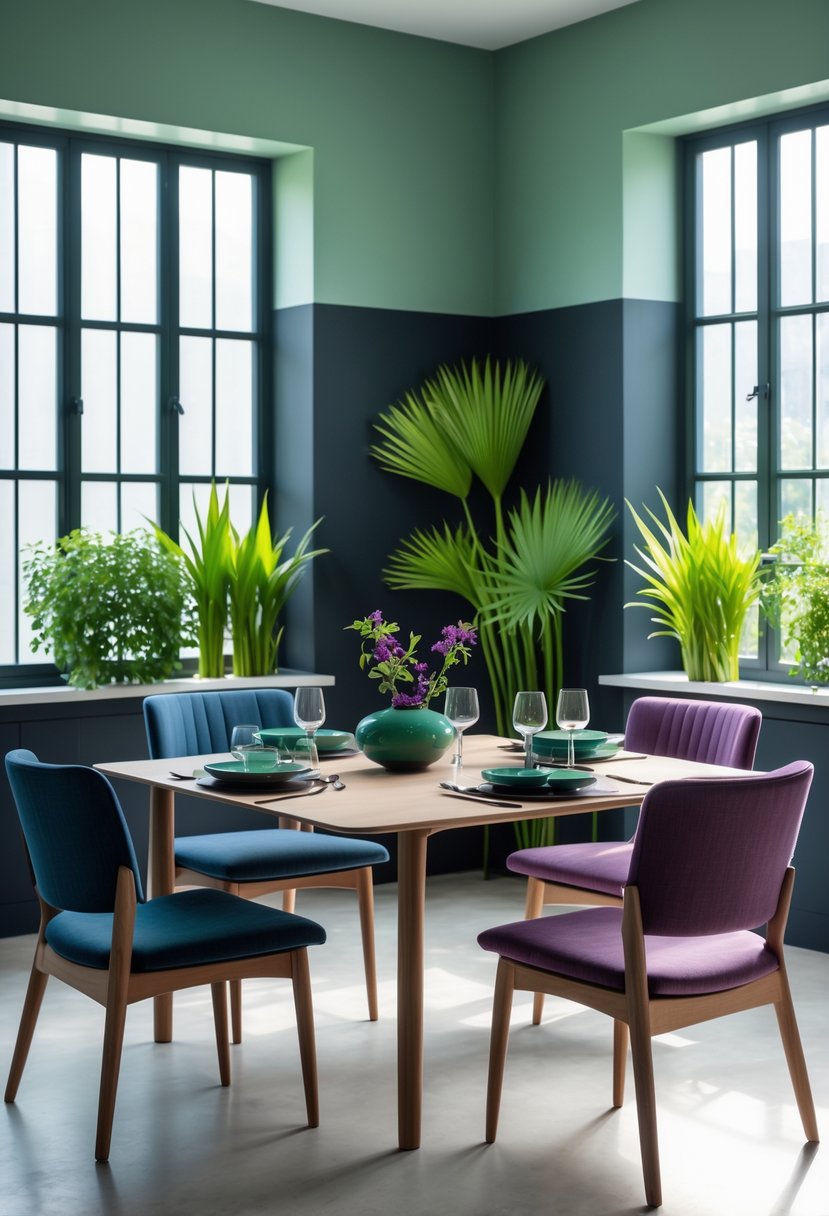
26. A Complete 2026 Color Story: Cool Blue, Jade, Plum Noir & Wasabi in Harmony
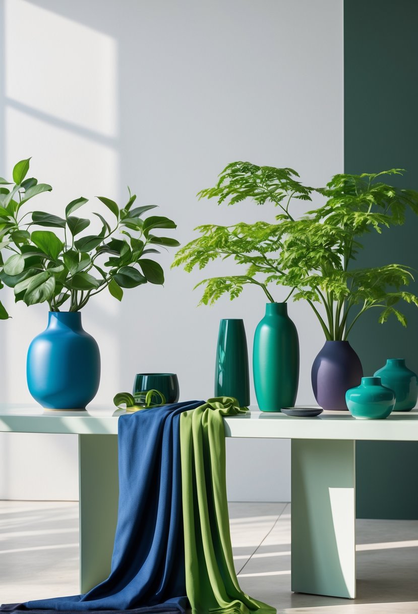
This palette uses four strong colors to give each room its own mood while keeping the whole house united. Cool blue creates quiet, restful bedrooms and bathrooms with soft tiles and layered fabrics. Jade green warms living rooms and dining areas, working well with wood tones and curved furniture.
Plum noir provides depth for studies and intimate corners, encouraging focus and a sense of drama. Wasabi sparks kitchens and hallways with a bright, modern lift that feels fresh but controlled. The scheme relies on repeated materials — brass, stone, warm woods, and gentle neutrals — to carry color from one room to the next.
- Key pairings:
- Cool Blue + Soft Textiles = calm, spa-like spaces
- Jade + Natural Wood = grounded, friendly rooms
- Plum Noir + Matte Finishes = moody, focused areas
- Wasabi + Ceramic/Gloss = energetic accents
Design choices favor transitions over sharp contrast. Rooms change tone gradually through shared surfaces and accents, so the house reads as a coherent whole. This approach supports long-term style by prioritizing atmosphere and personal expression rather than fleeting trends.
27. Jade Green Living: A Calm, Modern Palette for 2026 Homes
Jade green moves into homes as a soft, modern color that ties rooms together without feeling heavy. It works as a main shade or a subtle backdrop, lending warmth and balance to open layouts.
In shared rooms, jade pairs well with warm wood, stone surfaces, and linen fabrics. These combos keep spaces inviting and polished, adding depth while keeping sightlines calm. Small shifts in green tones across furniture and finishes create a layered, lived-in look.
In private rooms, jade shifts toward rest and comfort. Bedrooms with jade textiles or upholstery feel cozy and collected. Bathrooms dressed in green convey a quiet, spa-like feel that helps with relaxation.
Designers favor restraint: jade gets softened with creamy neutrals, light stone, and natural textures. This prevents the color from dominating and keeps interiors feeling intentional. A few practical ideas follow.
- Use jade-painted cabinets or an accent wall to anchor a room.
- Add textured linens and warm wood to soften the green.
- Mix pale stone tiles or countertops for contrast.
- Choose varying green accents to create visual depth.
These choices help a home feel cohesive, calm, and current while keeping each room distinct and comfortable.
28. Plum Noir Interiors: Moody Elegance for a Bold 2026 Home
Plum noir brings deep purple shades that add drama without feeling heavy. Designers use it across living rooms, bedrooms, dining areas, and home offices to create intimate, polished spaces.
They pair plum tones with warm woods and sculptural lighting to add texture and warmth. Soft creams, pale stone, and muted grays provide contrast so rooms stay balanced and airy instead of dark.
In living and dining areas, plum on walls or upholstery creates a cocoon-like, editorial feel. In bedrooms, the color promotes a restful, luxurious vibe. Home offices gain focus and a refined look when darker hues are used.
Bathrooms benefit from plum cabinetry or accents when combined with marble and warm brass for a hotel-like finish. Small metallic touches and subtle highlights prevent the palette from appearing flat.
Quick style guide:
- Pairing: plum + warm wood + cream or stone
- Metals: warm brass or brushed gold
- Lighting: sculptural fixtures to add depth
- Textiles: velvet and matte weaves for contrast
This approach keeps bold color choices feeling timeless, livable, and confident.
29. Jade-Green Interiors: A Calm, Modern Nature Palette
Jade green takes on a central role in 2026 interiors, offering a strong link to nature while staying sleek and modern. It works across rooms, tying entryways, living areas, kitchens, bedrooms, and baths into a unified look.
Designers pair jade with soft neutrals and light wood to keep spaces feeling airy and timeless. Upholstery and painted walls in jade add warmth without dominating the room. Layered textures — linen, wool, ceramic — add depth and stop the color from feeling flat.
In private rooms, deep jade tones create a cozy, restful atmosphere for sleeping and relaxing. Kitchens and bathrooms use jade in tiles, cabinets, or vanities to add richness and visual interest. Small metallic accents like brass and natural materials such as marble or warm wood introduce contrast and refinement.
Practical tips:
- Balance jade with pale creams and beiges to prevent heaviness.
- Use varied textures to add dimension.
- Add metal hardware or stone surfaces for a polished look.
Jade green reads as both grounded and refined. It suits people who want a nature-inspired palette that still feels current and carefully designed.
30. Cool Blue Interiors: The New Neutral for 2026 Homes
Cool blue moves into a steady, calm role in 2026, acting like a neutral that ties rooms together. It appears on walls, cabinets, tiles, and textiles to create a consistent look across living rooms, kitchens, bedrooms, and work areas.
Designers mix cool blue with warm woods, marble, and soft neutrals to keep spaces from feeling cold. Brass or warm metal accents add small contrasts that bring depth without breaking the calm tone. Blue tiles give texture in baths and backsplashes, creating subtle interest.
In bedrooms and home offices, cool blue supports rest and focus. Pale blue walls, layered bedding, and natural wood furniture make rooms feel intentional and lived-in. Simple decor and soft fabrics keep the look warm and welcoming.
Practical tips:
- Use blue cabinetry in kitchens to anchor the space.
- Add brass hardware or warm wood to balance cool tones.
- Choose textured blue tile for backsplashes and bathrooms.
- Layer textiles—rugs, throws, pillows—to soften the palette.
A consistent cool-blue scheme helps a home feel unified while still allowing room-specific choices. It works with both modern and classic pieces, offering a calm backdrop that stays fresh without overwhelming the eye.
Final Thoughts
Designers find strength in subtle, layered color rather than loud statements. They combine Cool Blue, Jade, Plum Noir, and Wasabi to build rooms that feel calm, grounded, moody, or fresh depending on balance and placement.
Texture and natural materials help these hues read as warm and lived-in instead of cold or stark. Thoughtful use of warm accents and layered textiles keeps spaces inviting while maintaining a modern edge.
This approach favors lasting choices over fast trends. The result is a home that reads as intentional, comfortable, and ready to adapt over time.