10 Bathroom Paint Colors Ideas That Make Your Space Feel Fresh and Bright Without Remodeling
This article was created in line with Trends Oraa’s research and content standards.
Your bathroom feels drab. Tired. Like it belongs to someone else’s life.
And the worst part? You don’t have the budget — or the energy — to gut it and start over.
Here’s the good news: a single can of paint can completely transform how your bathroom feels. Not next year. This weekend.
These 10 bathroom paint colors ideas are the exact ones interior designers reach for when they want maximum impact for minimum cost. I’ve rounded up the shades that work in small spaces, large spaces, no-window spaces, and everything in between.
You might also love our complete guide on → Bathroom Tub Ideas That Turn Your Tub Into a Spa Moment
Stick with me through all 10 — because the color I saved for last? It’s the one nobody talks about, and it might be the most stunning of the bunch.
Why Paint Is the Most Underrated Bathroom Upgrade
Before we dive in, let me say this clearly: most people spend money on the wrong things first.
New fixtures. New tiles. New vanity. All of that costs thousands.
But color? Color is pure psychology. It’s the thing your brain processes first when you walk into a room. Get the color right and suddenly your old fixtures look intentional. Your existing tile looks curated. Your whole bathroom feels like a decision was made — a good one.
That’s the power of the right bathroom paint colors ideas. Now let’s get into it.
Color #1: Soft Sage Green — The Calm You’ve Been Craving
What You’re Seeing
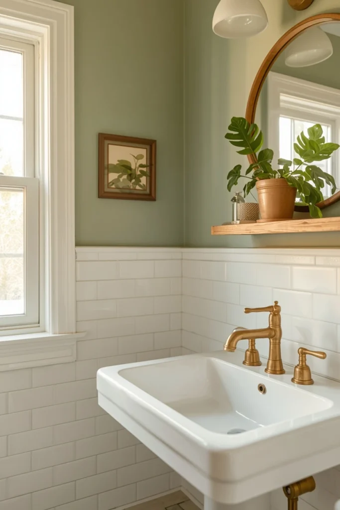
Imagine walls washed in a hushed, muted sage — not too green, not too gray. The kind of color you’d find in a Scandinavian spa or a wellness retreat. It pairs effortlessly with white trim, natural wood accents, and brushed brass fixtures.
Why It Works
Sage green sits in that sweet spot between warm and cool. It’s earthy enough to feel grounding but light enough to keep the room from feeling heavy. In smaller bathrooms especially, it creates the illusion that the walls are breathing.
It also photographs beautifully — which matters if you ever list your home or just want a Pinterest-worthy space for yourself.
Expert Tip
Go with a matte or eggshell finish rather than satin. Matte hides imperfections in older walls and gives the color more depth. Look for shades with gray undertones (not yellow) to keep the palette sophisticated — try Benjamin Moore’s Saybrook Sage or Sherwin-Williams’ Rosemary.
Why It Works for You
- Works beautifully in both small powder rooms and full bathrooms
- Pairs with warm metals (brass, copper) and cool metals (chrome) alike
- Easy to update accessories without repainting (white, cream, terracotta all work)
- Feels trendy now but has enough classic quality to age well
Color #2: Creamy Off-White — The “Do Everything” Neutral
What You’re Seeing
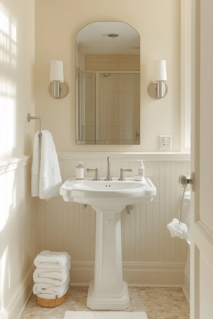
This isn’t plain white. It’s warmer. Softer. Think fresh cream, warm linen, or the color of afternoon light. The kind of white that makes your tile look intentional and your grout look less obvious.
Why It Works
Pure white can feel clinical in a bathroom — especially under harsh lighting. Off-white adds warmth without adding color, making the space feel inviting rather than sterile.
It’s also one of the most forgiving bathroom paint colors ideas for resale. Buyers can project their own style onto a warm neutral far more easily than onto a bold color choice.
Expert Tip
The secret is in the undertone. Pull your existing tile and fixtures into the room before choosing a shade. Look for off-whites with a pink, beige, or yellow undertone — avoid anything that pulls green or blue unless your tile leans that direction. Benjamin Moore White Dove and Sherwin-Williams Alabaster are both consistently stunning.
Why It Works for You
- Instantly makes grout and fixtures look cleaner
- Reflects light in north-facing or windowless bathrooms
- Pairs with literally every style: farmhouse, modern, traditional, boho
- One of the safest choices for rental properties and resale value
Which of these first two palettes matches your bathroom’s existing fixtures? Drop your answer in the comments — I’d love to help you narrow it down!
Color #3: Dusty Blue — The Color That Makes Everyone Look Good
What You’re Seeing
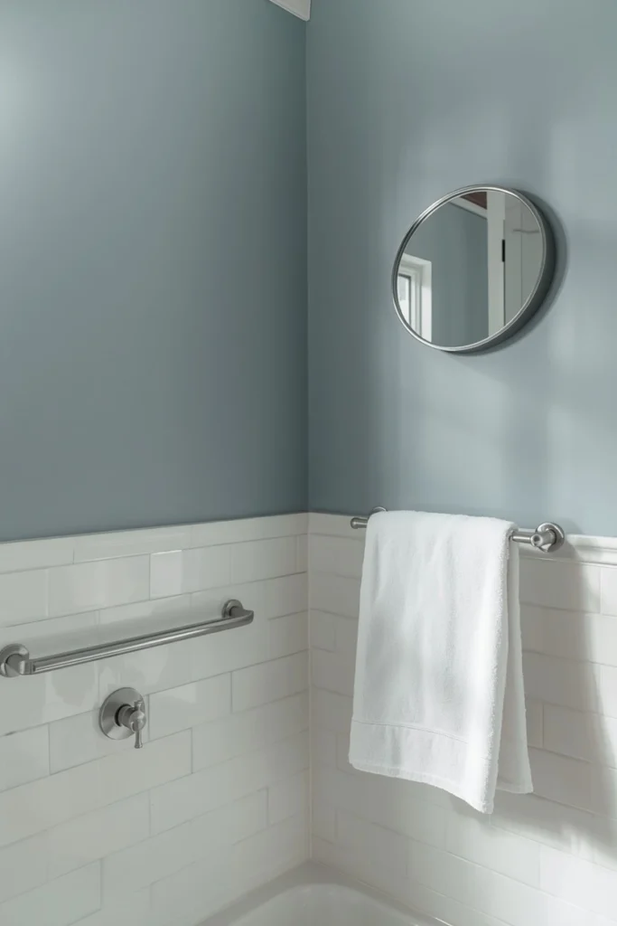
A soft, slightly grayed blue — not baby blue, not navy. Think the inside of an oyster shell. Walls in this shade feel quiet and collected. The kind of color that makes the whole room exhale.
Why It Works
Blue is the most universally flattering color in a bathroom. It mimics natural light, which is why it’s been used in spas and high-end hotels for decades. When you walk in and see dusty blue walls, your nervous system responds — it literally slows down.
That’s not a coincidence. It’s color psychology working for you.
Expert Tip
This color is particularly powerful when paired with white subway tile and chrome or nickel fixtures. The contrast is clean and timeless. For a warmer twist, pair it with unlacquered brass and aged wood shelving. Try Farrow & Ball Borrowed Light or Benjamin Moore Buxton Blue — both are incredibly livable shades.
Why It Works for You
- Flattering under most lighting conditions
- Works especially well in bathrooms with white or gray tile
- Creates a spa-like atmosphere without a single renovation
- Feels fresh year-round — not seasonal
But Here’s the Important Part…
The finish you choose matters just as much as the color.
Most people pick the perfect shade and then ruin it with the wrong sheen.
Here’s the quick breakdown:
- Matte/Flat: Beautiful depth, hides wall imperfections. Not ideal for high-humidity zones unless you use a bathroom-specific formula.
- Eggshell: The sweet spot for bathrooms. Slight sheen, more washable, still soft-looking.
- Satin: Easy to wipe clean, slightly shinier. Great for kids’ bathrooms or high-traffic half baths.
- Semi-gloss: Very shiny, very washable — best saved for trim and cabinets rather than walls.
For most bathrooms, eggshell is your best friend. Now, back to the colors.
Color #4: Terracotta — Warm, Bold, and Surprisingly Versatile
What You’re Seeing
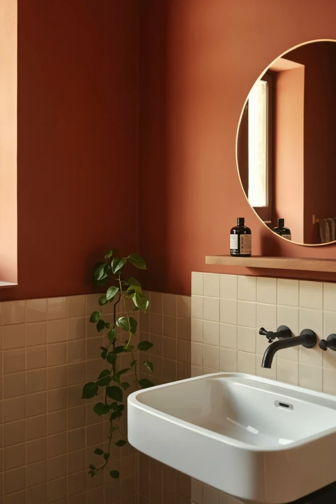
Rich, earthy terracotta walls — the color of clay pots and Moroccan tiles. In a bathroom, it wraps around you like warmth. It’s unexpected. It’s confident. And in the right space, it’s absolutely stunning.
Why It Works
Terracotta is one of those bathroom paint colors ideas that sounds risky but performs beautifully. It adds warmth to cold tile, grounds a space that feels too white or too bright, and creates an instant sense of intentionality.
It’s the color that makes people walk into your bathroom and say, “Wait — did you renovate?” You didn’t. You just painted.
Expert Tip
This color works best in bathrooms with warm-toned tile (beige, cream, ivory) or even dark charcoal tile for high contrast drama. Pair it with matte black fixtures and a simple round mirror for a look that’s currently all over design magazines. Avoid cool-toned whites on the trim — go warm. Clare Spice Market and Benjamin Moore Canyon Clay are both gorgeous starting points.
Why It Works for You
- Deeply on-trend but rooted in ancient, timeless color history
- Pairs beautifully with plants (hello, trailing pothos!)
- Creates a cozy, boutique-hotel feeling in even the smallest bathrooms
- Works well in bathrooms with little natural light — it generates warmth
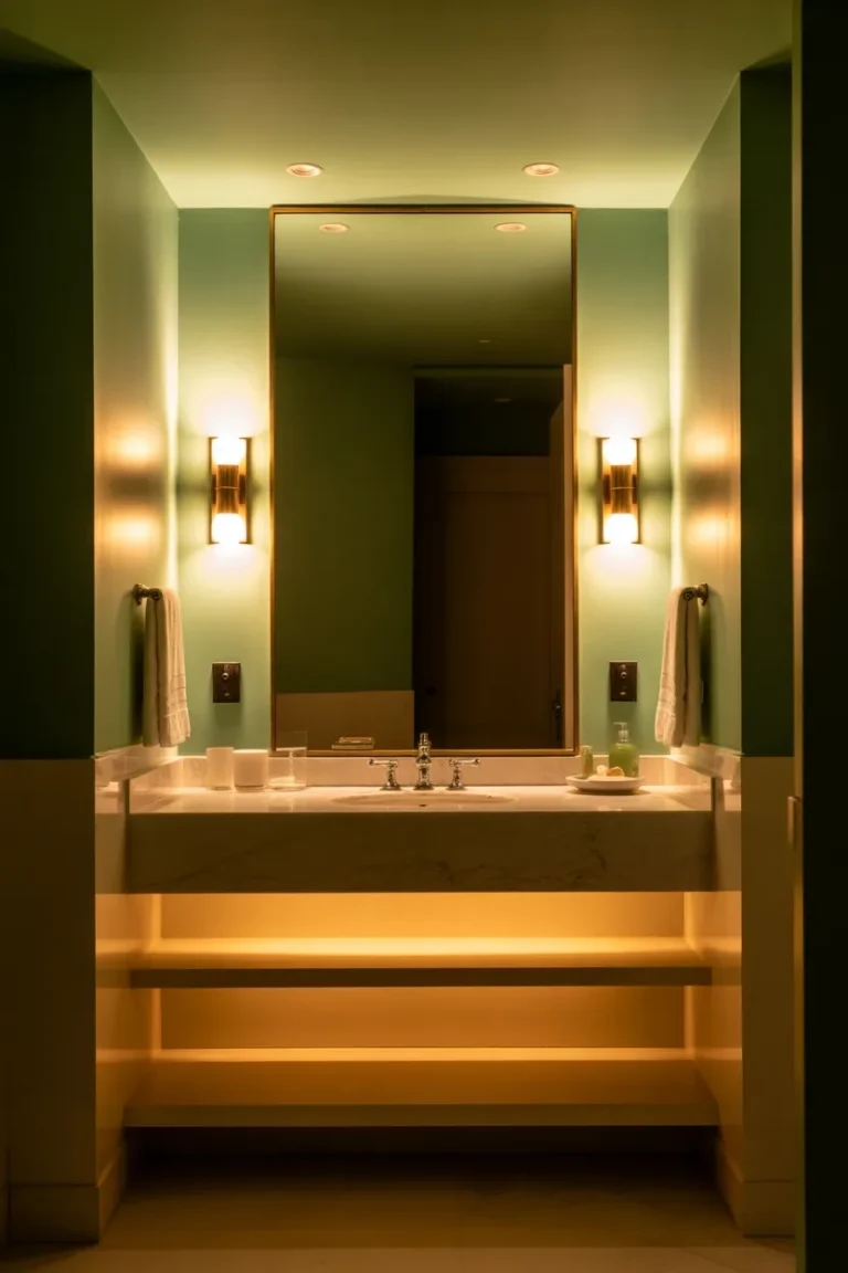
Color #5: Charcoal Gray — Dark, Dramatic, Totally Unexpected
What You’re Seeing
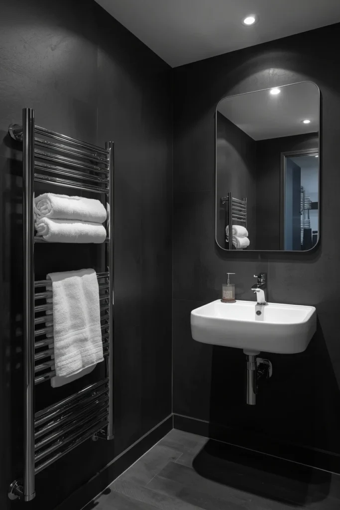
Deep, moody charcoal walls that turn your bathroom into something closer to a sanctuary than a utility room. This isn’t “dark and depressing” — it’s dramatic and rich, especially when paired with high-gloss white fixtures and polished chrome.
Why It Works
Here’s where it gets interesting — dark colors in small spaces don’t always make them feel smaller. When done right, they make the space feel intentional and defined. The walls recede. The fixtures pop. The whole room feels like it was designed by someone who knew exactly what they were doing.
Charcoal is one of the most underused bathroom paint colors ideas, and honestly, that’s exactly why you should consider it. Your bathroom will stand out.
Expert Tip
If you’re nervous, start with just one accent wall — the wall behind your vanity or bathtub. Dark paint on a single wall paired with lighter walls everywhere else creates a beautiful focal point without overwhelming the room. Try Sherwin-Williams Peppercorn or Farrow & Ball Off-Black — both have depth and complexity that flat charcoal lacks.
Why It Works for You
- Creates the look of a high-end boutique hotel
- Hides water spots and soap residue far better than white
- Makes white fixtures and towels look brilliantly crisp by contrast
- Ideal for bathrooms with some natural light
Deep Dive: Bathroom Paint Buying Guide — What You Actually Need to Know Before You Buy
Let’s talk money and practicality, because nobody wants to repaint a bathroom twice.
How Much Paint Do You Actually Need?
A standard bathroom (around 50–80 sq ft of wall space) will typically need about one quart to one gallon for two coats. Most designer shades run $40–$70 per quart, $60–$90 per gallon.
Budget tip: Buy a quart first and do a large test swatch (at least 12×12 inches) on your actual wall. Live with it for 48 hours and see how it looks in your lighting at different times of day.
Best Bathroom-Specific Paint Brands
Not all paint is created equal for bathrooms. High humidity, temperature swings, and moisture make bathroom paint a specialized product:
- Benjamin Moore Aura Bath & Spa — mold-resistant, matte finish that’s incredibly durable. Worth the premium.
- Sherwin-Williams Emerald Interior — excellent coverage, moisture-resistant, beautiful in eggshell.
- Behr Premium Plus — best budget option at Home Depot. Solid mildew-resistant formula.
- Clare Paint — ships directly to your door, great color curation, eggshell is beautiful.
Budget Breakdown for a Weekend Bathroom Paint Project
| Item | Estimated Cost |
|---|---|
| 1 quart (test + small bath) | $40–$70 |
| 1 gallon (full bath, 2 coats) | $60–$90 |
| Painter’s tape | $8–$15 |
| Rollers + tray + brushes | $15–$25 |
| Drop cloth | $10–$20 |
| Total | $133–$220 |
Compare that to a partial bathroom renovation starting at $3,000+. Paint wins every time for pure return on investment.
One More Thing Most People Skip
Prime the walls first — especially if you’re going from a light color to a dark one, or covering old builder-grade paint. A coat of primer adds maybe $15–$20 to your budget but can save you from needing a third coat of your expensive paint.
While you’re upgrading your bathroom, check out → Small Bathroom Ideas That Make Every Inch Count
Color #6: Warm Blush — Soft, Romantic, and Way Less Scary Than It Sounds
What You’re Seeing
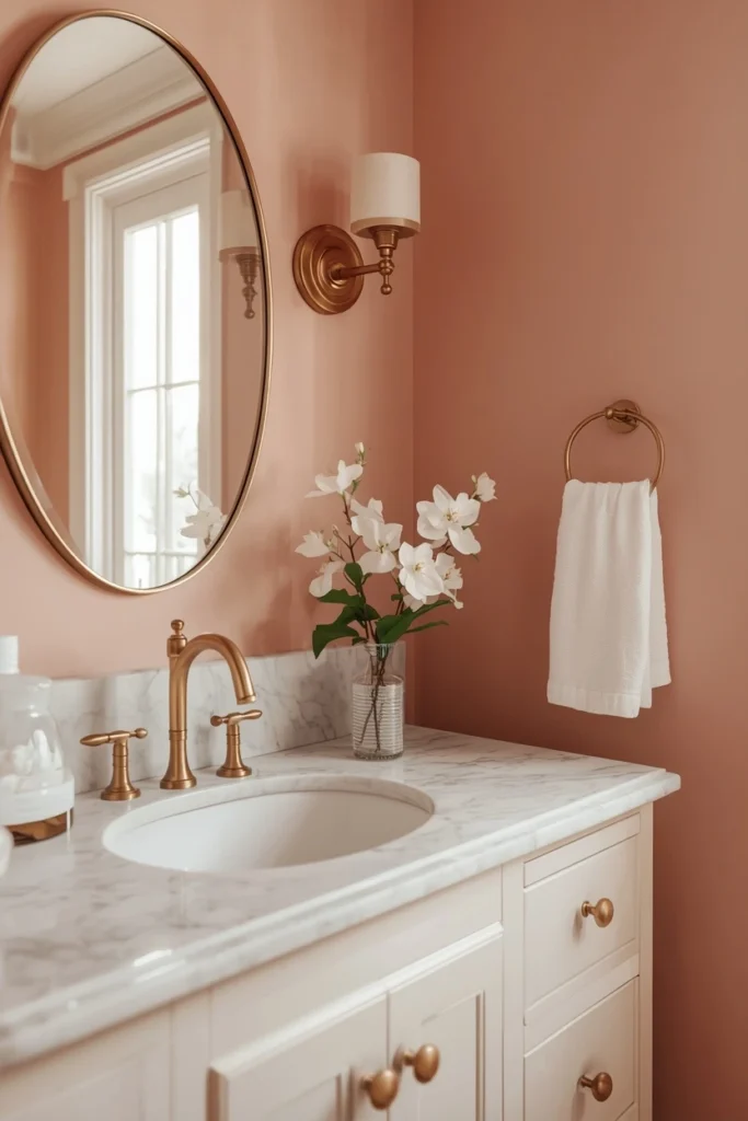
A barely-there pink — so muted and warm it almost reads as a peachy beige until the light catches it. Blush in a bathroom feels romantic without being juvenile. It’s the color of candlelight and fresh flowers.
Why It Works
Blush works because it’s incredibly skin-friendly. Under this color, everyone looks a little warmer, a little softer. It’s not accidental that beauty brands and spas reach for this palette constantly.
It also pairs beautifully with white and warm wood tones, making your existing fixtures look intentionally chosen rather than builder-basic.
Expert Tip
The key is choosing a blush that reads warm, not cool. Cool pinks look lavender in certain lighting and can veer into “little girl’s room” territory. Stick to blushes with a peach or sand undertone. Farrow & Ball Setting Plaster is the holy grail of this shade — sophisticated, warm, and endlessly flattering. Benjamin Moore Pale Blush is a more budget-accessible alternative.
Why It Works for You
- Universally flattering, especially in bathrooms with natural light
- Makes a space feel instantly softer and more curated
- Works beautifully with gold or brass fixtures
- A perfect choice if you want something unexpected but not polarizing
Now, Avoid This Mistake…
Most people who try bold or dark colors in their bathroom do everything right — choose a great color, buy quality paint — and then forget to update their lighting.
Old, yellowy light bulbs can completely kill a beautiful paint color. They turn crisp sage green muddy. They make blush look orange. They flatten charcoal into a forgettable gray.
Before you paint, swap in daylight-balanced LED bulbs (look for 4000K–5000K color temperature). It costs under $20 and will make your new paint color look exactly the way it did in your inspiration photos.
Color #7: Classic Navy — Timeless, Tailored, Never Wrong
What You’re Seeing
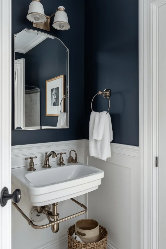
Deep, rich navy walls that feel like the inside of a classic yacht or a tailored library. Navy in a bathroom is the intersection of traditional and contemporary — it works in farmhouse bathrooms, modern bathrooms, transitional bathrooms. It simply works.
Why It Works
Navy has been a staple of sophisticated interior design for decades because it hits the rare combination of bold and safe. It’s a statement that almost everyone likes. Your guest will walk in and feel like they’ve stepped into something considered.
Expert Tip
For the most elevated look, pair navy walls with white or cream trim painted in semi-gloss — the contrast is striking. Brushed nickel or polished chrome fixtures look spectacular against navy. Avoid matte black with this color unless you want very high drama. Sherwin-Williams Naval is considered by many designers to be the definitive navy for interiors. Benjamin Moore Hale Navy is a close, slightly lighter alternative.
Why It Works for You
- Works in virtually every home style
- Easy to accessorize (white towels, natural wood, green plants all look perfect)
- Photography-ready for listing photos
- One of the highest-performing colors for resale impressions
Color #8: Warm Greige — The Upgrade from Beige Nobody Can Argue With
What You’re Seeing
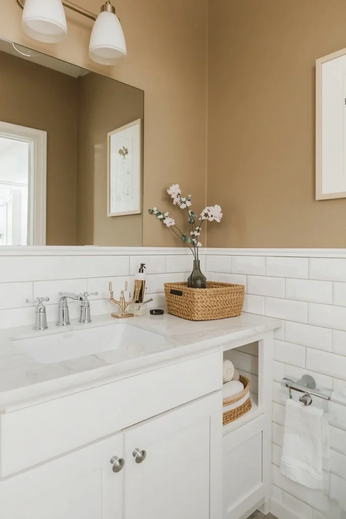
A perfectly balanced gray-beige — not too cool, not too warm, not too anything. Just right. This is the Goldilocks of neutral bathroom paint colors ideas.
Why It Works
If you’re not ready for a bold move but you’re also completely over stark white or flat beige, greige is your answer. It reads as a color in the sense that it has personality and depth, but it’s inherently harmonious with nearly every fixture and tile combination you’ll encounter.
Interior designers use it as a background canvas because it lets everything else — your towels, your plants, your art — take center stage.
Expert Tip
The magic of greige is in its undertones. Too gray and it feels cold; too beige and it feels dated. Look for shades with a very slight warm undertone. Sherwin-Williams Accessible Beige, Benjamin Moore Revere Pewter, and Behr Sculptor Clay are all tested, designer-approved options that photograph beautifully and live even better.
Why It Works for You
- The most versatile of all bathroom paint colors ideas
- Works with cool tile (white, gray marble) and warm tile (cream, beige, terracotta)
- Universally appealing — great for rentals and resale
- Deepens and warms as the light changes throughout the day
Most people don’t know this: Greige is one of the few neutral colors that can actually make small bathrooms look larger. Because it doesn’t have the starkness of pure white or the weight of pure gray, it creates a gentle depth that makes walls feel like they’re softly receding.
Color #9: Pale Lavender — Unexpected, Airy, and Absolutely Beautiful
What You’re Seeing
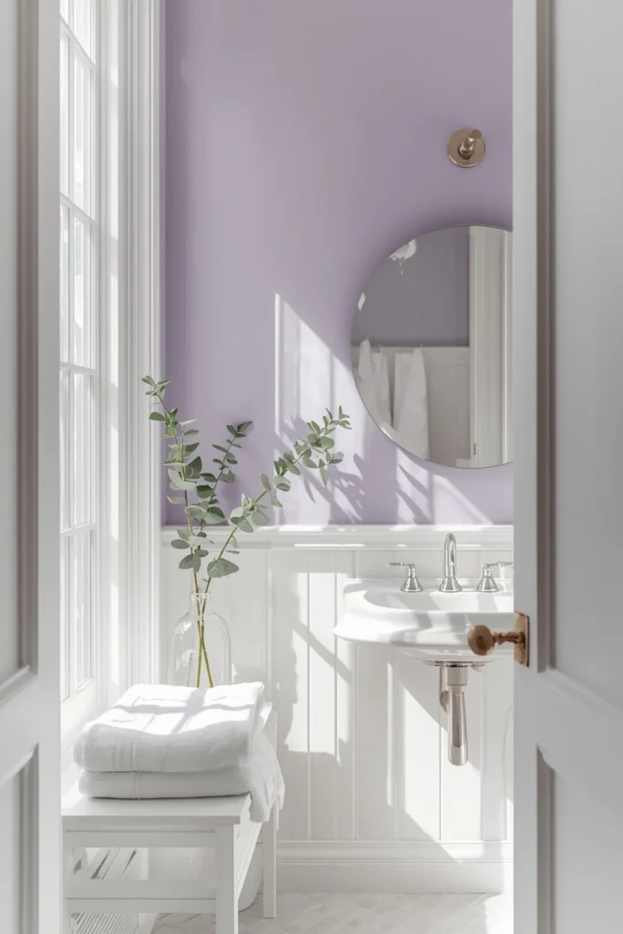
A whisper of lavender — so soft it almost reads as a tinted white. Think early morning light through sheer curtains. It’s delicate but not precious. Sophisticated but not cold.
Why It Works
Lavender is the most underused of all the bathroom paint colors ideas on this list. People are intimidated by it because they imagine something too purple, too little-girl, too much. But pale lavender is none of those things.
At its softest, lavender reads as a tinted neutral — it adds light and dimension without announcing itself. It also pairs beautifully with both warm and cool metals, making it incredibly easy to work with existing fixtures.
Expert Tip
Go lighter than you think you need to. A shade that looks purple on the chip will often look barely-there on four walls, which is exactly what you want. Benjamin Moore Morning Sky and Sherwin-Williams Misty are both pale enough to read as sophisticated rather than sweet. White trim is essential here — it grounds the lavender and keeps the palette crisp.
Why It Works for You
- Creates a genuinely unique bathroom that feels designed, not default
- Works especially well in bathrooms with lots of natural light
- Calming and spa-like without being predictable
- Pairs beautifully with eucalyptus, white marble, and natural linen textures
Color #10: Forest Green — The One Everyone Is Talking About
What You’re Seeing
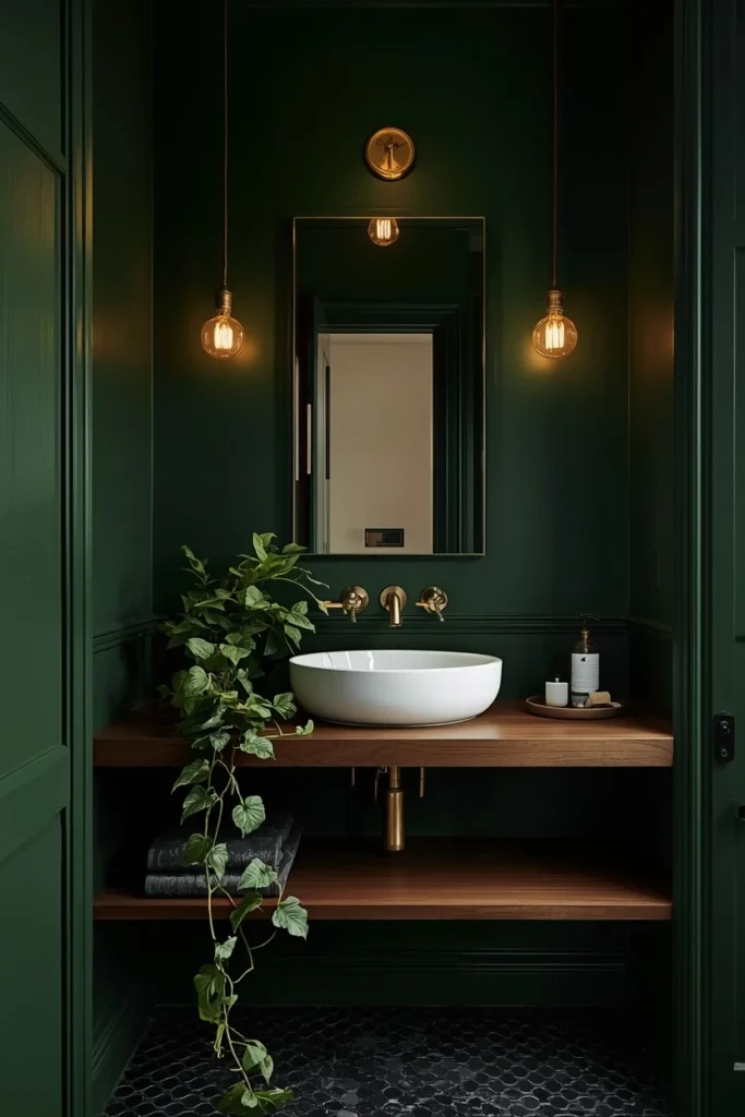
Rich, deep forest green — think emerald meets olive, like the inside of a greenhouse or a Victorian conservatory. This is the color that’s been dominating design publications, renovation accounts, and hotel lobbies for good reason.
Why It Works
Green is having a major cultural moment in interiors, and forest green in particular is the shade that feels both timeless and completely of the moment. In a bathroom, it creates an unexpected sense of nature — a place that feels like it exists slightly outside of everyday life.
It’s also, practically speaking, a spectacular backdrop for brass fixtures, which are themselves endlessly on trend.
Expert Tip
This color is bold, so commit to it fully. Half measures (one accent wall, going too light) can make it look uncertain. Paint all four walls and pair with unlacquered brass or matte black fixtures. A simple round mirror, a wooden shelf, and a trailing plant or two and you have a bathroom that looks like it cost three times what you paid.
Try Farrow & Ball Calke Green, Sherwin-Williams Cascades, or Benjamin Moore Hunter Green — each offers slightly different depth and warmth, so pull swatches and test them in your lighting.
Why It Works for You
- One of the strongest “wow” moments of any paint color in a bathroom
- Brass fixtures look extraordinary against forest green
- Feels simultaneously bold and grounded — never garish
- The color your guests will ask about every single time
Okay, I have to ask — which of these 10 bathroom paint colors ideas are you saving for your bathroom? Tell me in the comments. I genuinely want to know!
How to Choose the Right One for Your Bathroom
Now that you’ve seen all 10, here’s how to narrow it down:
Consider your light source first.
- North-facing bathroom with little natural light → Warm off-white, blush, or terracotta will prevent it from feeling dark
- South or west-facing with lots of sun → You can go bolder: forest green, navy, or charcoal look incredible in strong light
- No windows → Pale colors (sage, off-white, greige) are your friends
Look at your existing tile and fixtures.
- White or gray tile → Almost any color works; you have maximum flexibility
- Beige or cream tile → Warm tones (terracotta, blush, greige) are safest; avoid cool blues and grays
- Dark tile → Lighter wall colors (off-white, sage, pale lavender) create beautiful contrast
Think about how long you plan to stay.
If you’re selling within two years, greige, off-white, or dusty blue are your safest choices for broad buyer appeal. If this is your forever home, paint what makes you genuinely happy to walk in every morning.
Your Next Step: Don’t Just Read About It
The biggest mistake people make with bathroom updates? They research for months and then never actually start.
So here’s your challenge: pick one color from this list today. Order the tester. Do the swatch on your wall this week.
You can completely change how your bathroom feels — and how you feel in it — for under $100 and a Saturday afternoon. That’s a better return on your time than almost anything else you could do for your home.
Ready for more transformation ideas? Don’t miss → Bathroom Interior Ideas That Designers Actually Use
And if you’re already thinking about what else you can upgrade without a full renovation, you’ll love our guides on Small Bathroom Ideas, Apartment Bathroom Decor Ideas, and Funky Bathroom Ideas — all designed to give you maximum impact for minimum spend.
Your bathroom is waiting. All it needs is a little color.