

This article was created in line with Trends Oraa’s research and content standards.
Most people don’t realize this.
Their plain orange pots are quietly making their whole porch look unfinished.
The good news? Fixing it takes a paintbrush, an afternoon, and almost no money.
If you’ve ever scrolled past a gorgeous plant display and wondered why yours never looks that polished, it’s probably not your plants. It’s the pots sitting underneath them.
You might also love our guide on front porch flower pot ideas if you want to take this even further once your pots are painted and ready to style.
Here’s the truth nobody tells you about terra cotta: that classic orange-brown color was never meant to be permanent. It’s just unfinished clay. A blank canvas. And once you start painting terra cotta pots ideas into your routine, you’ll never look at a bare clay pot the same way again.
This post is packed with 8 painting terra cotta pots ideas that range from five-minute weekend projects to showstopping statement pieces. Stick around, because idea #6 is the one most people skip — and it’s the one that gets the most compliments.
Why Painting Terra Cotta Pots Ideas Are Taking Over Pinterest Right Now
There’s a reason this trend isn’t slowing down.
Terra cotta pots are cheap, classic, and everywhere — which means they’re also a little boring on their own.
Painting them solves three problems at once:
- They become unique instead of generic
- They match your exact color scheme instead of fighting it
- They cost a fraction of what designer planters charge
But here’s the important part: not all paint methods work the same way on porous clay. Get the prep wrong, and you’ll be repainting in a month. Get it right, and these pots will outlast the plants inside them.
Let’s get into the ideas.
1. Ombre Dip-Dye Pots
What You’re Seeing
Picture a row of terra cotta pots lined up on a sunny windowsill, each one fading from deep terra cotta at the base into a soft, chalky white near the rim. The transition is smooth, almost watercolor-like, with no harsh lines.
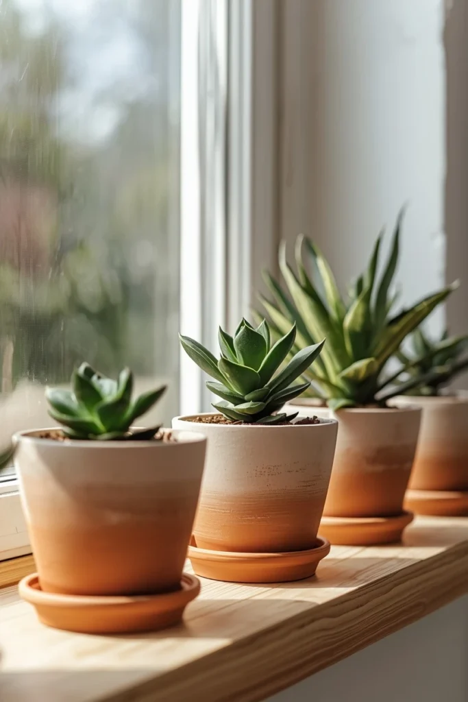
Design Breakdown
Ombre painting works by diluting your paint into three or four shade levels and blending them upward on the pot. You start with the most saturated color at the bottom and gradually water it down as you move toward the top.
Expert Tip
Use a damp sponge instead of a brush for the blending zones. It softens the line between shades so there’s no visible stripe where one color meets the next.
Why It Works
Ombre pots feel curated without trying too hard. The gradient draws the eye upward, which makes shelves and windowsills feel taller and more intentional.
Best For
- Small spaces
- Renters
- Budget makeovers
Common Mistake To Avoid
Rushing the drying time between layers. If you blend wet paint into wet paint, the colors muddy instead of fading cleanly.
Quick Wins
- Works with leftover craft paint you already own
- No stencils or tape required
- Looks different in every batch, so no two pots match exactly
- Pairs beautifully with trailing plants like pothos or ivy
2. Geometric Color-Block Pots
What You’re Seeing
Imagine a cluster of pots, each painted in bold, clean blocks of color — mustard yellow on one half, terracotta left bare on the other, divided by a crisp diagonal line.
Design Breakdown
This is one of the easiest painting terra cotta pots ideas to execute because it relies on painter’s tape, not freehand skill. You mask off a shape, paint inside it, peel the tape, and you’re done.
Expert Tip
Press the tape down firmly with the back of a spoon before painting. Paint bleeding under loose tape edges is the #1 reason this technique goes wrong.
Why It Works
Color blocking gives a modern, almost architectural feel to an otherwise rustic material. It’s the contrast between rough clay and sharp lines that makes it pop.
Best For
- Small spaces
- Budget makeovers
- Families
Common Mistake To Avoid
Choosing two colors that are too close in value. You want contrast, not a muddy blend.
Quick Wins
- Takes under 20 minutes per pot
- Easy to redo if you get bored of the colors
- Great beginner project for kids to help with
- Looks intentional even when slightly imperfect
Most people don’t know this: sealing your color-blocked pots with a matte spray sealant (not gloss) keeps the rustic texture of the clay visible through the paint. Gloss sealant makes budget paint jobs look plasticky, while matte keeps that handmade, boutique-store feel. I learned this the hard way after a gloss-coated pot looked like a toy rather than a planter. One extra can of matte sealant changes the entire perceived value of the project.
Would you choose the bold color-block look, or something softer like the ombre style above? Either way, let’s keep going — because the next idea solves a problem almost everyone has.
Most people waste more space than they realize.
3. Mini Painted Pot Garden Walls
What You’re Seeing
Visualize a vertical wall-mounted rack holding a dozen small painted terra cotta pots, each one a different muted color, planted with herbs like basil, thyme, and mint.
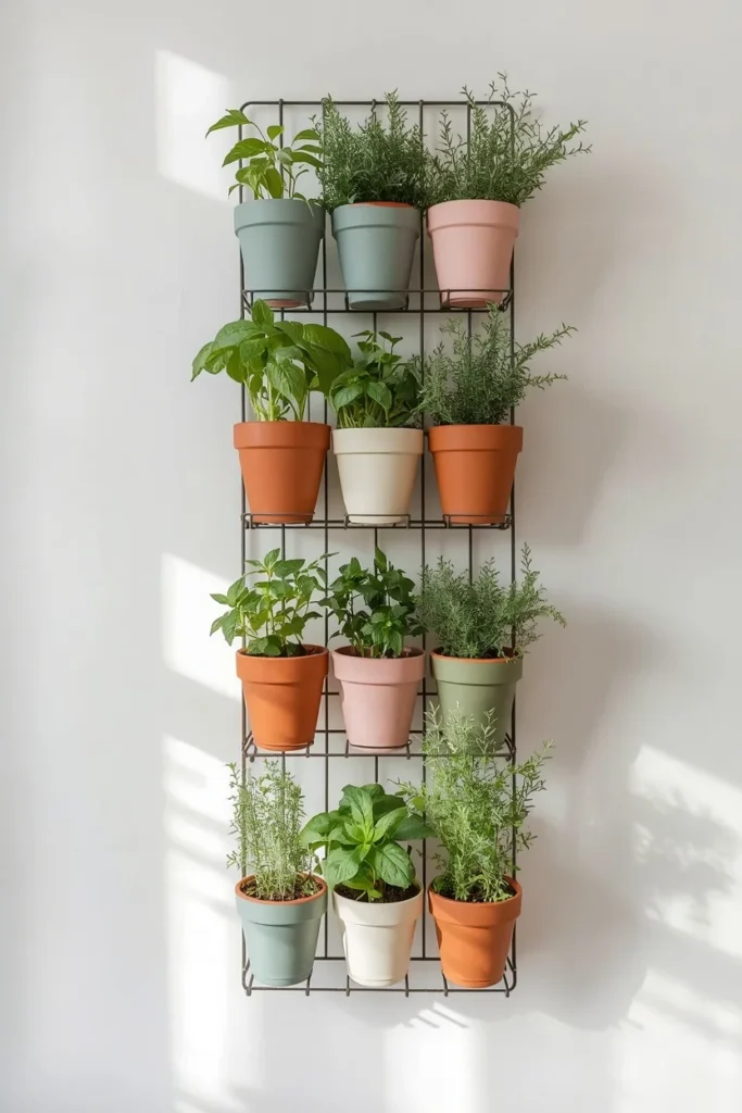
Design Breakdown
Instead of painting one statement pot, this idea treats a whole collection as a single design feature. You pick a cohesive palette — think sage, dusty blue, blush, and cream — and paint each pot a slightly different shade within that family.
Expert Tip
Limit your palette to four colors max. More than that, and the wall starts to look chaotic instead of curated.
Why It Works
Grouped color creates a sense of order even in a small footprint, which is exactly why this idea works so well for tight kitchens or balconies.
Best For
- Small spaces
- Renters
- Budget makeovers
- Families
Common Mistake To Avoid
Hanging pots that are too heavy for the mounting hardware once filled with damp soil. Always test weight before final installation.
Quick Wins
- Maximizes vertical space in small kitchens
- Keeps herbs within arm’s reach for cooking
- Painted pots hide soil splatter better than bare clay
- Easy to swap out individual pots without redoing the whole wall
You May Also Like:
- Garage Organization Ideas
- Small Console Tables Ideas
- Indoor House Plants Aesthetic Ideas
- Indoor Hydroponic Gardening Ideas
- Apartment Organization Ideas
This is where many homeowners make a mistake: they assume small pots need small ideas. Actually, the opposite is true — tighter spaces benefit the most from a strong, repeated color theme.
The Complete Budget Breakdown for Painting Terra Cotta Pots
Let’s pause the idea list for a second, because this is the part most blog posts skip — and it’s the part that actually matters when you’re standing in the craft aisle wondering what to buy.
Here’s where it gets interesting: terra cotta painting can cost you $3 or $35 depending on the products and techniques you choose. Let’s break it down so you don’t overspend on the wrong things.
The Bare Minimum Setup (Budget: $8–15)
- Acrylic craft paint (2–3 bottles): $1–2 each
- Foam brushes or sponge: $2–4 for a pack
- Painter’s tape: $3–4
- This setup covers 4–6 small pots comfortably
The Mid-Range Setup (Budget: $20–35)
- Outdoor-rated acrylic paint: $6–9 per bottle
- Matte spray sealant: $7–10
- Fine detail brushes: $5–8
- This is the sweet spot for anyone planning to keep pots outdoors year-round
The Investment Setup (Budget: $40+)
- Specialty paints like chalk paint or metallic finishes: $10–15 per bottle
- Stencils or vinyl decals: $5–12 each
- Multiple sealant coats plus primer: $15–20
- Best for statement pieces meant to last for years
Decision-Making Tips:
- If your pots stay outdoors, always choose outdoor-rated or exterior acrylic paint. Indoor craft paint chips and fades fast in sun and rain.
- If you’re painting more than 5 pots, buy paint in larger bottles. Cost per pot drops significantly.
- Spray sealants apply faster, but brush-on sealants give better control on detailed designs.
- Primer isn’t always necessary on terra cotta, but it helps colors stay true if you’re using pale or pastel shades over the naturally orange clay.
Common Mistakes in the Budgeting Process:
- Buying glossy sealant for a matte, rustic look (mismatch in finish expectations)
- Skipping the sealant entirely, which leads to paint flaking within a season
- Not buying enough paint to do a second coat, which almost every pot needs
Think about how much easier your next project gets once you know exactly what to buy the first time. No wasted trips back to the store, no guessing.
Which of these budget tiers fits your project best? Keep that number in mind as we move through the rest of these painting terra cotta pots ideas, because some techniques cost more than others.
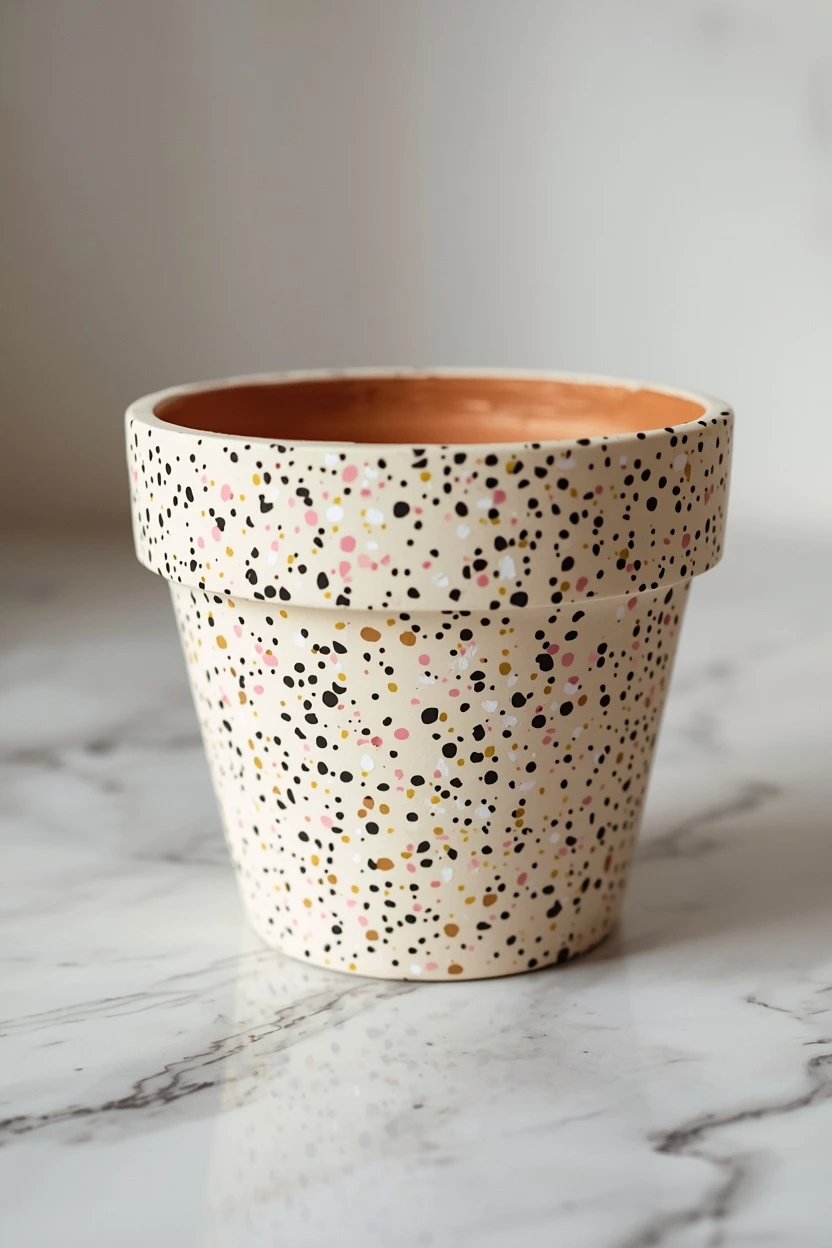
4. Speckled Terrazzo-Inspired Pots
What You’re Seeing
Picture a pot covered in tiny flecks of color — black, white, soft pink, and gold — scattered across a cream base coat, mimicking the look of polished terrazzo stone flooring.

Design Breakdown
This technique uses the flick method: load a small brush with paint, then flick it toward the pot from a few inches away using your finger or a popsicle stick.
Expert Tip
Practice the flicking motion on cardboard first. The amount of paint and distance from the pot completely changes the speckle size.
Why It Works
Terrazzo is a major design trend right now, and this lets you bring that high-end material look to an inexpensive clay pot.
Best For
- Luxury homes
- Budget makeovers
- Renters
Common Mistake To Avoid
Using too many colors at once. Three to four speckle colors max keeps it looking like terrazzo instead of a paint explosion.
Quick Wins
- Mimics an expensive material for pennies
- Hides small imperfections in the clay surface
- Works on any base color
- Looks great in clusters of varying pot sizes
5. Watercolor Floral Hand-Painted Pots
What You’re Seeing
Imagine soft, loose floral brushstrokes — a few sage leaves, a cluster of dusty pink blooms — painted freehand around the middle of a cream-washed pot, with visible brush texture that feels artistic rather than perfect.
Design Breakdown
This is a looser, more forgiving painting style. You’re not aiming for botanical accuracy — you’re aiming for movement and color.
Expert Tip
Use a round watercolor brush dipped in slightly diluted acrylic paint. The thinner consistency creates that soft, washed look real watercolor has.
Why It Works
Hand-painted detail signals craftsmanship, and craftsmanship signals value — even on a $4 pot.
Best For
- Luxury homes
- Large spaces
- Budget makeovers
Common Mistake To Avoid
Overworking the design. The charm of this style comes from looseness — too much detail and it starts looking stiff.
Quick Wins
- No artistic background required
- Each pot becomes a unique piece
- Works beautifully as gifts
- Pairs well with simple, single-stem plants that won’t compete visually
One thing I’ve learned: the biggest difference between a hand-painted pot that looks “homemade” and one that looks “boutique” isn’t skill — it’s restraint. The instinct is to keep adding more flowers, more leaves, more color. But the pots that get the most attention usually have one confident cluster of paint and a lot of empty, breathing space around it. Less really is more here.
Don’t skip the next tip, because this next idea is the one I get asked about the most.
The next idea is one designers secretly love.
6. Faux Aged Patina Pots
What You’re Seeing
Visualize a pot that looks decades old — streaks of soft green and chalky white running down weathered terra cotta, as if moss and mineral deposits built up naturally over years outdoors.
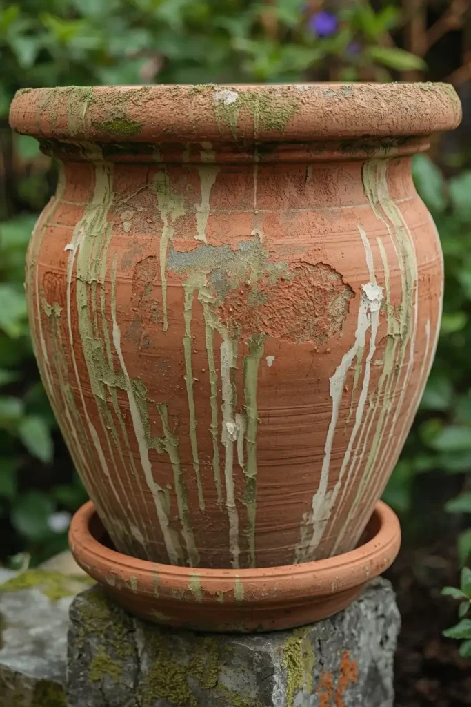
Design Breakdown
This is a dry-brushing and layering technique. You paint a base coat, let it dry, then dry-brush green and white paint downward from the rim in uneven streaks, mimicking natural weathering.
Expert Tip
Always work top to bottom and let gravity guide your streaks. Real aging happens from rain running down, so your brushstrokes should follow that same direction.
Why It Works
Aged, patinated pots read as expensive and established — the kind of detail you’d find in an old European garden, not a big-box store.
Best For
- Luxury homes
- Large spaces
- Families
Common Mistake To Avoid
Making the streaks too even or symmetrical. Real weathering is irregular, so resist the urge to make it “neat.”
Quick Wins
- Instantly ages a brand-new pot
- Disguises minor cracks or chips in older pots
- No precision required — imperfection is the goal
- Looks incredible grouped with real aged stone or concrete planters
You May Also Like:
- Vintage Garden Decor Ideas
- Modern Garden Shed Ideas
- Tiny Garden Ideas
- Garden Ideas
- Small Garden Design Ideas
What’s your biggest challenge right now — getting the colors right, or getting the technique right? Honestly, most people overthink color and underthink technique. The next idea proves that point.
7. Stenciled Pattern Pots
What You’re Seeing
Picture a clean, evenly spaced pattern — maybe a simple scallop, a row of arches, or a geometric diamond — wrapped neatly around the body of a solid-colored pot.
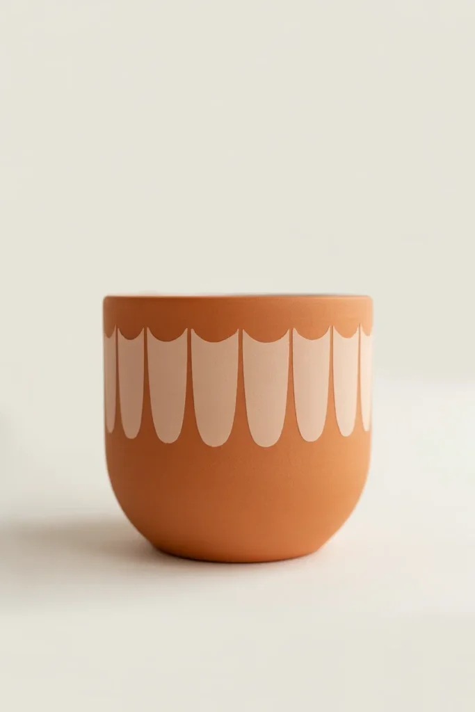
Design Breakdown
Stenciling gives you the precision of a printed pattern without any freehand drawing. You secure a stencil with tape or spray adhesive, dab paint through the openings, and peel it away once dry.
Expert Tip
Use a stippling motion (dabbing straight down) rather than brushing side to side. Brushing pushes paint under the stencil edges and ruins crisp lines.
Why It Works
Repetition is visually satisfying. A consistent pattern wrapped around a curved surface creates rhythm, which is part of why it photographs so well for Pinterest.
Best For
- Small spaces
- Large spaces
- Budget makeovers
- Renters
Common Mistake To Avoid
Using too much paint on your stipple brush. Excess paint pools under stencil edges and blurs the pattern.
Quick Wins
- Looks professionally printed, not hand-painted
- Reusable stencils mean you can match patterns across multiple pots
- Works on curved surfaces better than most people expect
- Easy to layer a second pattern color once the first dries
This simple change can completely transform the room.
8. Two-Tone Rim Dip Pots
What You’re Seeing
Imagine a pot left almost entirely in its natural terra cotta state, except for a clean, confident dip of solid color around just the rim — like the pot was dipped upside down into a can of paint.
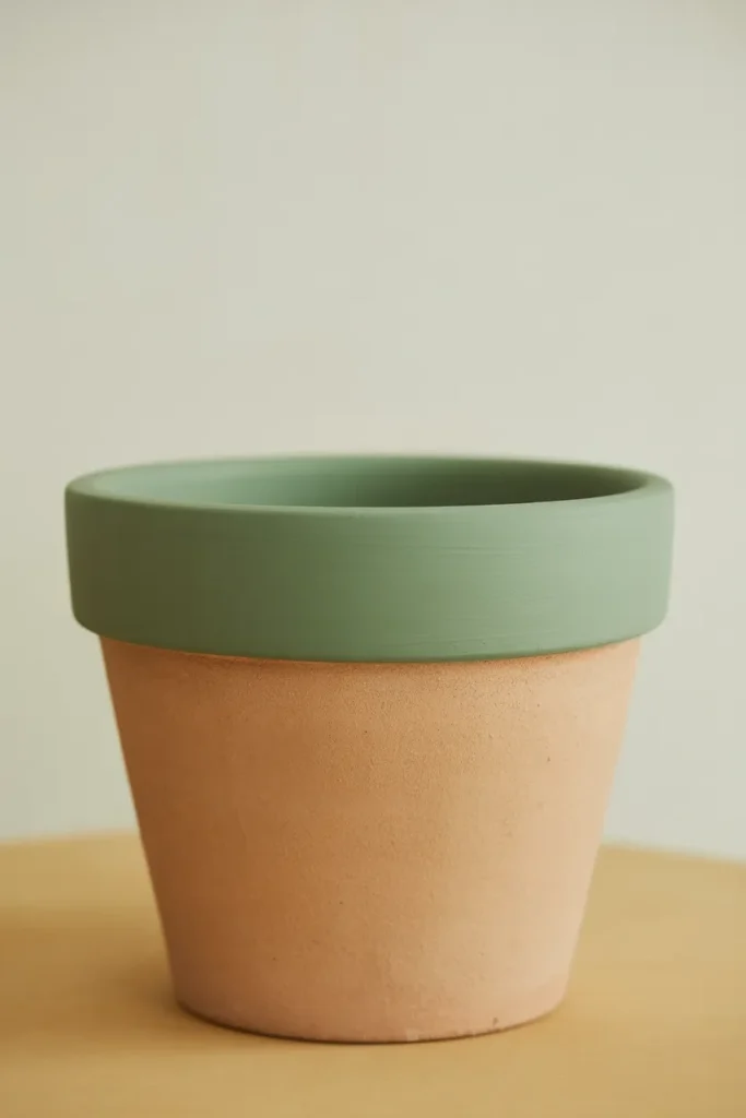
Design Breakdown
This is the most minimal of all the painting terra cotta pots ideas on this list, and that’s exactly the point. You’re using restraint as the design choice.
Expert Tip
Use a level line of painter’s tape around the pot before painting the rim. Even a slightly crooked line is noticeable on a minimal design like this.
Why It Works
Minimalist design draws attention to what’s inside the pot — your plant — rather than competing with it. It’s the perfect choice when the plant itself is the star.
Best For
- Small spaces
- Renters
- Families
- Budget makeovers
Common Mistake To Avoid
Choosing a rim color that clashes with the plant’s foliage instead of complementing it.
Quick Wins
- Fastest project on this entire list — done in under 10 minutes
- Keeps the natural, earthy charm of raw terra cotta
- Works in literally any room style, from boho to modern farmhouse
- Great starter project if you’ve never painted pots before
Here’s where it gets interesting: the two-tone rim dip is consistently the most repinned style in this category, and I think it’s because it doesn’t ask you to commit to a whole new aesthetic. You keep 90% of the pot’s original charm and just add one small, deliberate detail. It’s proof that painting terra cotta pots ideas don’t need to be elaborate to make an impact — sometimes the smallest gesture reads as the most intentional.
Which design would you try first? Let me know — and if you’re torn between two, that’s usually a sign to just paint one pot of each and see which one you reach for more.
Related Garden & Décor Ideas
If painting your pots has you in a creative mood, here are a few more projects worth exploring while you’re at it:
- Front Porch Flower Pot Ideas
- Vintage Garden Decor Ideas
- Houseplant Pot Ideas
- Small Balcony Garden Ideas
- Indoor House Plants Aesthetic Ideas
- Tiny Garden Ideas
- Patriotic Painted Rocks Ideas
- DIY Organization Hacks
Picture yourself enjoying a porch or windowsill that finally looks like it belongs in a magazine — not because you spent a fortune, but because you took twenty minutes to paint something you already owned.
Final Thoughts: Pick One Pot and Start Today
Here’s the recap, stripped down to what actually matters.
The ombre and two-tone rim dip ideas are your fastest entry points if you’ve never painted a pot before. The terrazzo speckle and faux patina techniques are your showstoppers if you want something that looks expensive. And the stenciled and color-block ideas are your best bet if precision feels more comfortable to you than freehand painting.
Don’t try to do all 8 painting terra cotta pots ideas this weekend. Pick one. Just one. Grab a single pot you already have sitting on a shelf or porch step, and give it twenty minutes.
So, which one are you trying first — the bold color-block look, or the quiet confidence of the rim dip?
Once you’ve got your pots looking the way you want, the next natural step is figuring out how to actually style them in your space so they don’t just look good — they look placed. That’s a whole topic on its own, and it’s one that trips up even people with great taste.
Curious what most people get wrong about arranging plants and pots together? That’s exactly what we’re covering next — and it might change how you look at every shelf in your house.