10 Earth Tone Bathroom Designs That Feel Like a Boutique Spa
This article was created in line with Trends Oraa’s research and content standards.
Most people don’t realize this. Their bathroom isn’t “boring” because it’s small or outdated. It’s missing one thing: a color story that actually feels calm.
That’s why their space never feels finished, no matter how many candles or towels get added. You can buy every trendy accessory on the market and it still won’t click.
The good news? Fixing it is easier than you think, and it starts with a palette you already love in nature — warm clay, soft sand, deep olive, weathered wood.
Earth tone bathroom designs are having a real moment right now, and not because they’re trendy for the sake of it. They’re calming. They’re timeless. They photograph beautifully. And they work in almost any size space, from a tiny powder room to a sprawling primary suite.
You might also love our guide on spa bathroom ideas if you’re chasing that quiet, retreat-like feeling in your own home — it pairs perfectly with everything we’re about to walk through.
In this post, I’m breaking down 10 earth tone bathroom designs, what makes each one work, and how to actually pull the look off in your own space — even on a tight budget. Let’s get into it.
Why Earth Tone Bathroom Designs Are Taking Over Pinterest
Here’s where it gets interesting. Scroll through any design feed right now and you’ll notice the all-white bathroom era is fading.
People are craving warmth. Texture. Color that feels grounded instead of sterile.
Earth tones do something white marble simply can’t — they make a bathroom feel lived-in and intentional at the same time. Think about how much easier your morning routine feels when the room around you feels like a hug instead of a hospital.
That’s the appeal in a nutshell. Now let’s look at 10 ways to bring it into your own home.
1. Terracotta Walls With Brushed Brass Fixtures
What You’re Seeing
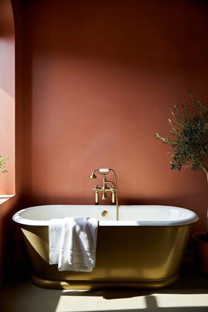
Picture a bathroom where the walls are painted in a rich, sun-baked terracotta — almost the color of a clay pot warmed by afternoon light. A freestanding tub sits against that wall, and brushed brass fixtures catch the light like little flecks of gold.
Design Breakdown
Terracotta is one of the boldest earth tones you can use, but it reads as warm rather than overwhelming because it mimics something we already associate with comfort: sun, clay, warmth. Pair it with brass hardware and it instantly feels collected, not matchy.
Expert Tip
Paint just three walls in terracotta and leave the fourth (ideally the one behind the vanity mirror) in a lighter neutral. This keeps the color from feeling heavy in a smaller room.
Why It Works
Warm hues like terracotta are proven to feel cozier and more inviting than cool tones, which is exactly what you want in a room meant for unwinding. It also photographs beautifully for Pinterest — that saturated color pops against white towels and greenery.
Best For: Luxury homes, large spaces, budget makeovers (paint is cheap!)
Common Mistake To Avoid
Going with a matte finish on all four walls in a humid bathroom. Without proper ventilation or a moisture-resistant paint, terracotta can look patchy fast.
Quick Wins
- Use a bathroom-rated eggshell or satin paint, not flat matte
- Add brass or unlacquered brass fixtures for warmth
- Bring in one dark green plant to echo the “clay pot” feeling
- Keep towels white or cream to let the wall color shine
Would you choose bold color like this, or something a little more subtle? Keep that in mind as we move through the next few ideas — there’s a range here for every comfort level.
2. Warm Sand and Linen Neutral Palette
What You’re Seeing
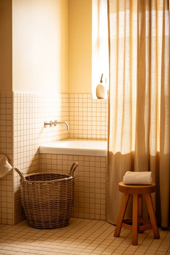
Imagine walking into a bathroom that feels like a linen closet in the best possible way — soft sand-toned tile, a woven basket in the corner, a linen shower curtain, and a wooden stool tucked beside the tub.
Design Breakdown
This look leans on layered neutrals instead of one dominant color. You’re mixing three or four shades of beige, tan, and off-white, all with slightly different undertones, so the room never feels flat.
Expert Tip
Stick to matte and textured finishes here — woven, linen, unglazed tile. Glossy surfaces will fight the cozy, organic feeling you’re going for.
Why It Works
Neutral, low-contrast palettes reduce visual noise, which genuinely calms the nervous system. It’s the same reason spas rarely use bold color. Your eyes have nothing to “work” to process, so the whole room feels restful.
Best For: Renters, small spaces, budget makeovers, families
Common Mistake To Avoid
Choosing every element in the exact same beige. Without variation, sandy neutral bathrooms can look washed out and unfinished rather than serene.
Quick Wins
- Layer at least 3 different neutral tones (sand, cream, taupe)
- Add one woven or rattan piece for texture
- Use a linen or waffle-weave shower curtain instead of plastic
- Swap chrome fixtures for matte black or warm brass
One thing I’ve learned after styling dozens of neutral bathrooms: the secret isn’t the paint color, it’s the texture mix. A sand-colored wall next to a smooth porcelain tub looks flat. That same wall next to a woven basket, a linen towel, and a wood stool suddenly feels expensive. Texture does the heavy lifting that color alone can’t. If your neutral bathroom feels a little “meh” right now, start there before you touch the paint can.
3. Olive Green Vanity With Stone Countertop
Most people waste more space than they realize when they default to white vanities. Here’s an idea that flips that completely.
What You’re Seeing
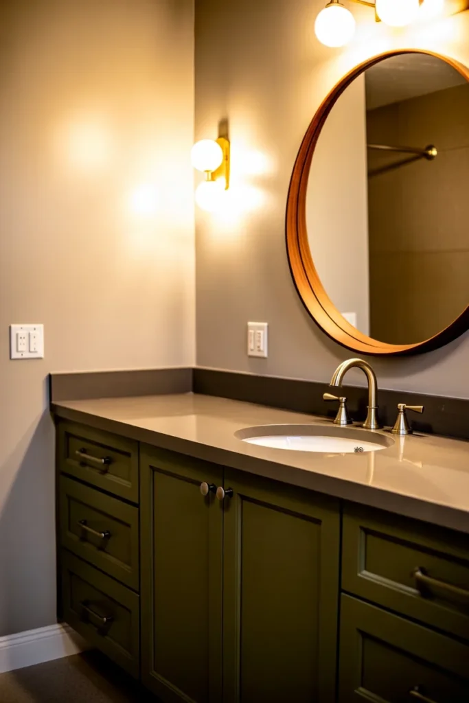
A deep olive-green vanity anchors the room, topped with a honed stone countertop in warm gray-beige. Above it hangs a round mirror in a wood or rattan frame.
Design Breakdown
Olive is one of the most versatile earth tones because it bridges warm and cool. It pairs beautifully with wood, stone, brass, and even black, which makes it a safe “statement” choice for people who are nervous about bold color.
Expert Tip
If you’re not ready to paint walls, start with the vanity. It’s a smaller surface area, it’s often a weekend DIY project, and it delivers almost the same visual impact as a full room repaint.
Why It Works
Green tones are associated with nature and restoration, and even a small dose — like a single vanity — shifts the emotional feel of the entire room. It’s a low-risk, high-reward move.
Best For: Small spaces, budget makeovers, renters (if cabinets are owned, not built-in)
Common Mistake To Avoid
Pairing olive with cool-toned chrome fixtures. It flattens the warmth. Stick with brass, matte black, or bronze instead.
Quick Wins
- Paint an existing vanity instead of buying new
- Choose a stone-look countertop for contrast without cost
- Add a round mirror to soften all the straight lines
- Use warm-toned hardware, never chrome
But here’s the important part: this idea works even better when it’s part of a bigger plan, not a one-off swap. Let’s look at where else you can find inspiration.
You May Also Like:
- Small Bathroom Ideas
- Bathroom Paint Colors Ideas
- Farmhouse Bathroom Ideas
- Bathroom Tile Design Ideas
- Beige Inspiration
4. Clay Tile Flooring With Woven Textures
What You’re Seeing
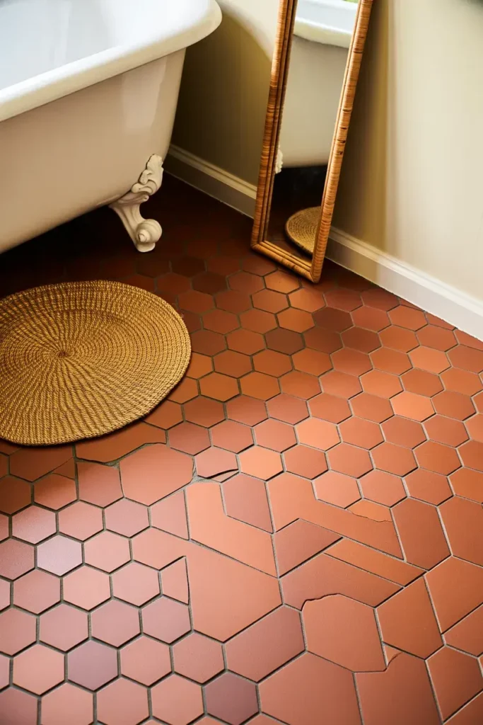
Terracotta-toned hexagon tiles cover the floor, warm and slightly uneven in tone like handmade pottery. A jute bath mat and a rattan mirror complete the look.
Design Breakdown
Clay flooring is arguably the fastest way to make a bathroom feel grounded, literally. Unlike stark white or gray tile, clay tones have natural variation that mimics the imperfections you’d find in a Mediterranean farmhouse.
Expert Tip
Can’t redo the whole floor? Clay-toned peel-and-stick tile has come a long way and can transform a rental bathroom in an afternoon.
Why It Works
Flooring sets the tone (literally) for everything above it. Warm floor tones make white fixtures look softer instead of stark, and they hide water spots and everyday grime far better than white tile ever will.
Best For: Renters, budget makeovers, families, large spaces
Common Mistake To Avoid
Choosing perfectly uniform clay tile. Part of what makes this look so appealing is the subtle variation — flawless, machine-perfect tiles lose that handmade charm.
Quick Wins
- Look for tile with natural color variation, not a single flat shade
- Use a jute or seagrass bath mat instead of plush cotton
- Add a rattan-framed mirror to echo the organic texture
- Keep grout in a warm tone, not stark white
Would you try a full flooring redo, or start with a peel-and-stick shortcut? Either way, this is one of those ideas that changes the entire feel of a room without touching a single wall.
5. Rich Chocolate Brown Cabinetry
What You’re Seeing
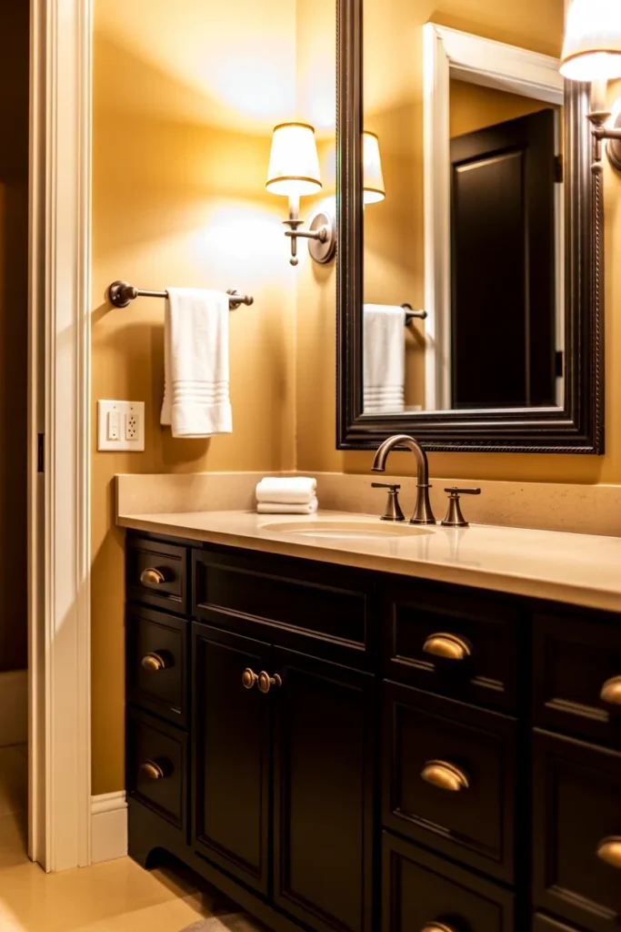
A deep, espresso-brown vanity with brass pulls sits beneath a warm cream wall. The contrast is rich but never cold — more “cozy library” than “dark and moody.”
Design Breakdown
Chocolate brown has quietly become one of the most requested cabinetry colors in 2026, replacing the all-black trend of a few years ago. It’s softer, warmer, and easier to live with long-term.
Expert Tip
Balance dark cabinetry with a lighter countertop and wall color. Too much dark brown in a small room can feel heavy instead of luxurious.
Why It Works
Brown tones read as grounded and stable, which is why they show up so often in high-end hotel bathrooms. It’s a color that ages well and won’t feel dated in five years the way trendier grays have.
Best For: Luxury homes, large spaces, families
Common Mistake To Avoid
Skipping the lighting plan. Dark cabinetry needs warm, layered lighting (sconces plus overhead) or the whole room can feel dim and cave-like.
Quick Wins
- Pair dark brown cabinets with cream or warm white walls
- Add at least two light sources: sconces and an overhead fixture
- Use brass or aged bronze hardware, never chrome
- Keep the countertop light to balance the visual weight
Most people don’t know this, but brown cabinetry actually photographs better than black in natural light — it picks up warmth instead of going flat. That’s part of why it’s dominating Pinterest boards right now.
Here’s where it gets interesting: the number one question I get about dark cabinetry is “will it make my small bathroom feel smaller?” The honest answer is — it depends entirely on your lighting and your ceiling color. Keep the ceiling white or a soft cream, and add warm, layered light, and dark cabinetry will actually make a small room feel more intentional, not cramped. Skip the lighting plan, though, and yes, it can feel like a cave.
6. Sage and Wood Combination Shower
The next idea is one designers secretly love, mostly because it’s deceptively simple to pull off.
What You’re Seeing
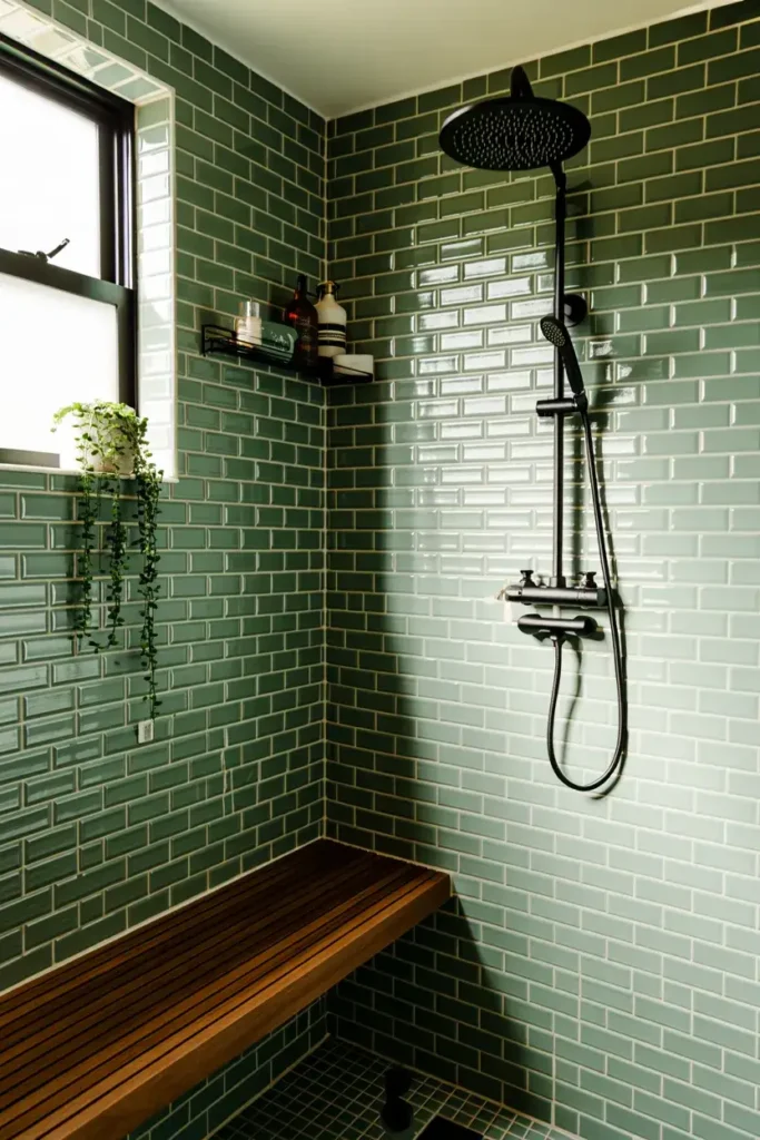
Sage-green zellige tile lines the shower walls, paired with a teak shower bench and a matte black rain showerhead. It feels like a boutique hotel, not a big-box store.
Design Breakdown
Sage is one of the most forgiving earth tones because it sits right between green and gray. It works with warm wood tones and cool metals equally well, which makes it a safe choice if you’re mixing finishes you already own.
Expert Tip
Zellige tile (the handmade, slightly imperfect Moroccan-style tile) is worth the splurge here, even if you only tile one accent wall. The texture is what sells the whole design.
Why It Works
Wood and green together mimic a forest environment, which multiple design studies point to as one of the most universally calming color pairings. It’s why biophilic design has taken off in hospitality spaces.
Best For: Luxury homes, large spaces
Common Mistake To Avoid
Using untreated wood in a high-moisture shower area. Always choose sealed teak or a wood-look composite rated for wet environments.
Quick Wins
- Try sage tile on just one wall if a full redo isn’t in budget
- Add a teak bench or slatted teak mat for texture
- Choose matte black or brushed nickel fixtures
- Bring in one trailing plant for a biophilic finish
Picture yourself enjoying an actual shower, not just rinsing off — that’s the real goal behind this design. Which of these ideas would work best in your home so far? Let me know which one is your favorite as we keep going.
7. Warm Gray-Beige “Greige” Walls With Black Accents
What You’re Seeing
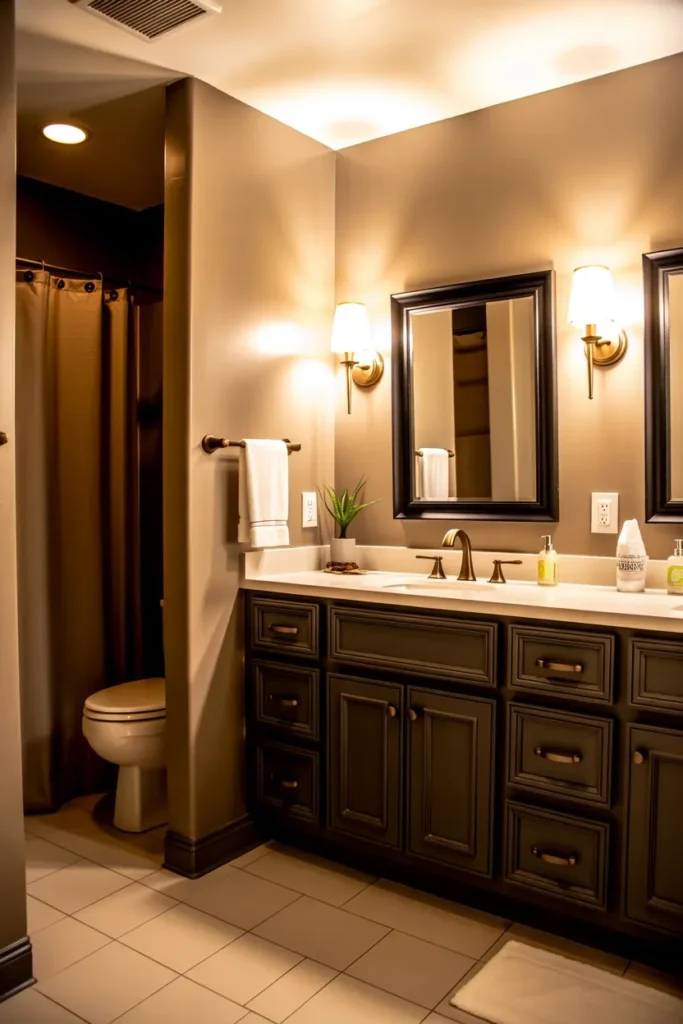
Soft greige walls (that warm gray-beige hybrid) create a quiet backdrop for a matte black vanity, black-framed mirror, and brass sconces.
Design Breakdown
Greige is the ultimate earth-tone gateway color. It’s warmer than gray, more sophisticated than beige, and it plays well with almost any accent color you add later.
Expert Tip
Test your greige in the actual bathroom lighting before committing. Greige shifts dramatically between warm LED and daylight bulbs — what looks perfect on the paint chip can turn pink or green on your wall.
Why It Works
This is where many homeowners make a mistake: they think neutral means boring. Greige with black accents proves the opposite. The contrast keeps it visually interesting while the base color stays timeless.
Best For: Renters, small spaces, budget makeovers, large spaces
Common Mistake To Avoid
Skipping the paint sample step. Greige is notoriously tricky, and repainting an entire bathroom twice gets expensive fast.
Quick Wins
- Sample your greige paint in the actual room for 24-48 hours
- Add black hardware or a black-framed mirror for contrast
- Layer in brass accents to keep it from feeling cold
- Use warm white bulbs (2700K-3000K) throughout
You May Also Like:
- Bathroom Renovation Ideas
- Modern Bathroom Ideas
- Bathroom Interior Ideas
- Bathroom Accessories Ideas
- Bathroom Rug Ideas
Your Earth Tone Bathroom Budget Breakdown
This is where many homeowners get stuck — not on the design itself, but on figuring out what it actually costs to pull off. So let’s break it down honestly, tier by tier.
Don’t skip this part. Even if you’re not renovating right now, knowing where your money matters most will save you from overspending on the wrong things later.
Tier 1: The $0-$100 Refresh
This is entirely about swapping what you already have.
- Repaint one accent wall in a warm terracotta or sage tone ($30-$50 for paint and supplies)
- Swap plastic bath mats for jute or woven ones ($20-$35)
- Add warm-toned towels in cream, rust, or olive ($25-$40)
- Bring in one or two plants for a natural, grounded feel ($10-$20)
Tier 2: The $300-$800 Refresh
This is where hardware and smaller fixtures come in.
- Peel-and-stick clay or terracotta flooring ($150-$300 depending on room size)
- Swap chrome hardware for brass or matte black ($80-$150)
- New light fixtures with warm-toned finishes ($100-$250)
- A statement mirror in wood or rattan ($60-$150)
Tier 3: The $1,500-$5,000+ Full Renovation
This is a true remodel — new vanity, tile, and possibly plumbing changes.
- Custom or semi-custom vanity in olive or chocolate brown ($800-$2,500)
- Full tile redo (clay, zellige, or terracotta) ($1,000-$3,000+ depending on square footage)
- Stone countertop ($400-$1,200)
- Professional installation labor ($800-$2,000+ depending on region)
Common Mistakes People Make With Their Budget
- Spending the entire budget on tile and having nothing left for lighting, which is just as important
- Choosing a trendy paint color instead of a true earth tone that will age well
- Forgetting ventilation upgrades, which matter even more with darker, moisture-prone paint colors
- DIY-ing plumbing changes to save money, which often costs more to fix later
A Few Decision-Making Questions to Ask Yourself
- Are you renting or owning? (This changes whether you invest in flooring/tile or stick to swappable items.)
- Is this a full renovation or a refresh? Be honest about your actual budget before you fall in love with tile you can’t afford yet.
- What’s your biggest challenge right now — budget, time, or knowing where to start?
Whichever tier you land in, the goal is the same: warmth, texture, and a palette that feels like it belongs outdoors just as much as indoors.
8. Mushroom Brown and Cream Layered Look
What You’re Seeing
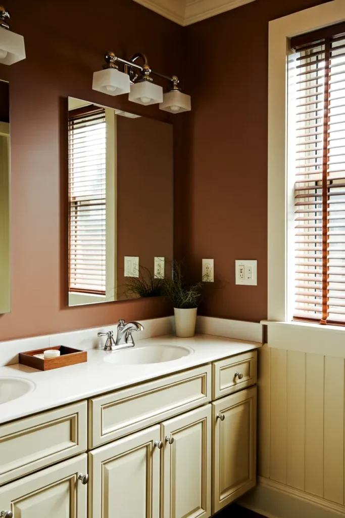
Soft mushroom-brown walls meet a cream vanity and brushed nickel hardware. Everything feels muted and soft, almost like a foggy forest morning.
Design Breakdown
Mushroom tones (a grayish, muted brown) are one of the quieter earth tones, but they’re incredibly popular because they photograph beautifully in both bright and dim lighting.
Expert Tip
This palette works especially well in bathrooms with limited natural light, since the muted tones don’t rely on sunlight to look their best the way brighter colors do.
Why It Works
Muted, low-saturation colors reduce visual fatigue, making this an ideal choice for a bathroom you use every single morning and night.
Best For: Small spaces, renters, budget makeovers
Common Mistake To Avoid
Pairing mushroom tones with cool white trim. It creates an odd, slightly muddy contrast. Stick with warm white or cream trim instead.
Quick Wins
- Choose warm white trim, never bright cool white
- Add brushed nickel or warm pewter hardware
- Use a cream vanity to keep the room from feeling dark
- Bring in a single wood accent, like a stool or tray
Most people don’t know this: mushroom brown is one of the few earth tones that genuinely looks good under any lighting temperature — warm, cool, or daylight. If you’ve been burned by a paint color that looked totally different in your bathroom than it did on the chip, this is the safest earth tone to experiment with.
The following idea surprised me the most, so don’t skip it.
9. Rust Orange Accent Wall With Natural Stone
This simple change can completely transform the room, and it’s proof that you don’t need a full renovation to get the earth-tone look.
What You’re Seeing
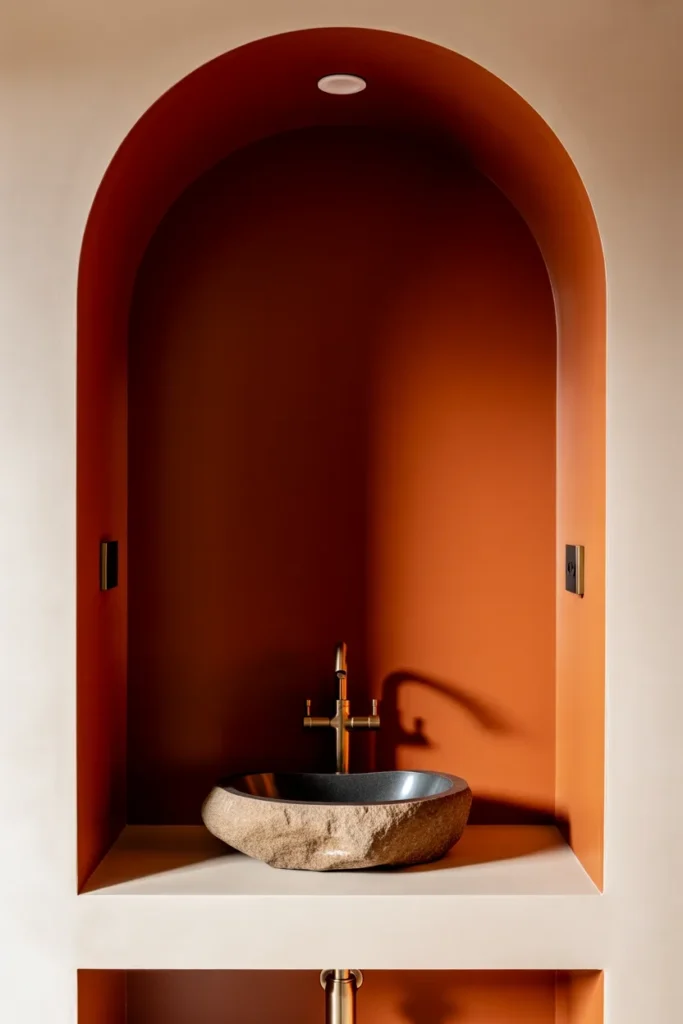
A single rust-orange accent wall sits behind a natural stone vessel sink, with the remaining walls kept in a soft white. It’s bold in one spot and calm everywhere else.
Design Breakdown
Rust is terracotta’s bolder cousin — more saturated, more dramatic. Using it on just one wall gives you all the visual punch without overwhelming a small space.
Expert Tip
Choose the wall behind the vanity or tub as your accent wall. It becomes the natural focal point of any photo and any glance into the room.
Why It Works
One bold wall creates depth and draws the eye, which actually makes small bathrooms feel larger, not smaller, because it gives the room a clear focal point instead of flat, even color everywhere.
Best For: Small spaces, budget makeovers, renters
Common Mistake To Avoid
Choosing rust for all four walls in a small room. It can quickly feel like a cave without enough contrast to balance it.
Quick Wins
- Limit rust or bold orange to one wall only
- Pair with a natural stone or concrete sink for texture
- Keep remaining walls soft white or cream
- Add brass fixtures to tie the warmth together
What’s your biggest challenge right now — committing to a bold color, or finding the right accent piece to build around? This idea solves both at once.
10. Full Warm Minimalist Retreat
What You’re Seeing
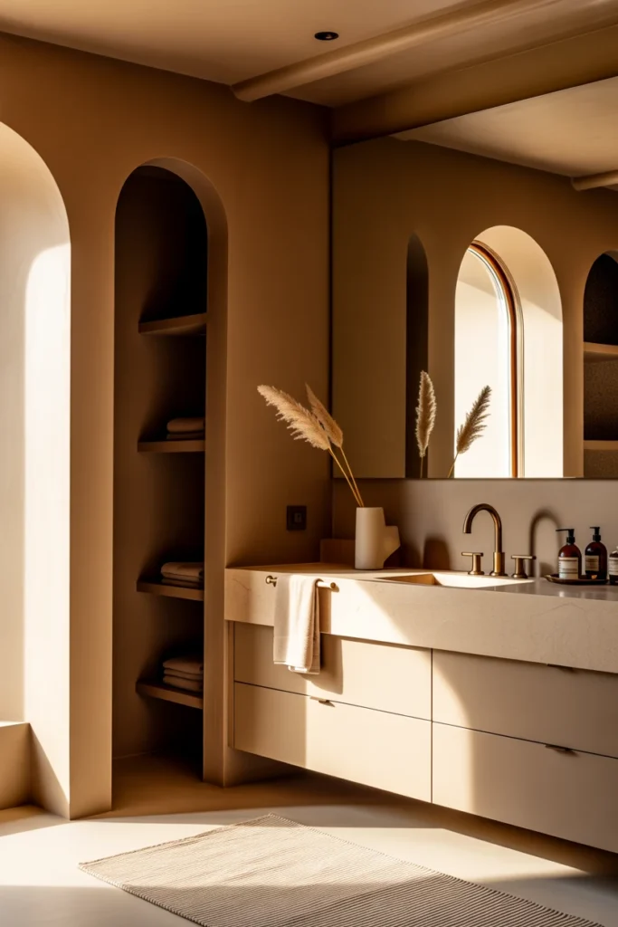
Every element here — walls, floor, vanity, and towels — sits somewhere on the warm neutral spectrum: sand, clay, oat, and soft brown. Nothing competes; everything blends.
Design Breakdown
This is the most advanced earth-tone look because it requires real restraint. Instead of one accent color, you’re building an entire tonal palette that shifts subtly from surface to surface.
Expert Tip
Use the “60-30-10 rule” even within neutrals: 60% of your lightest tone (walls), 30% of a mid-tone (vanity or tile), and 10% of your darkest tone (fixtures or accessories).
Why It Works
Tonal, monochromatic spaces feel expansive and luxurious because there’s no visual interruption. It’s the design equivalent of a deep breath.
Best For: Luxury homes, large spaces, minimalists
Common Mistake To Avoid
Using tones that are too similar in warmth. If everything is warm-beige with zero variation, the room reads flat instead of intentional. Mix at least one cooler, muted neutral in for depth.
Quick Wins
- Follow the 60-30-10 tonal ratio for balance
- Mix in one slightly cooler neutral to avoid flatness
- Use texture (linen, stone, wood) to do the work color usually does
- Keep hardware minimal and in one consistent finish
Visualize the difference between this and a stark white bathroom — same square footage, completely different feeling. That’s the real power of an earth tone bathroom design done well.
Related Earth Tone & Bathroom Ideas
If any of these ten looks caught your eye, here are a few more guides worth exploring next. This is genuinely where the inspiration rabbit hole gets fun.
- Farmhouse Bathroom Ideas
- Small Bathroom Ideas
- Bathroom Tile Design Ideas
- Spa Bathroom Ideas
- Bathroom Paint Colors Ideas
- Mediterranean Bathroom Tile Ideas
- Beige Inspiration
- Earthy Cottage Living Room Ideas
Final Thoughts on Earth Tone Bathroom Designs
Let’s bring this back to what actually matters. The most impactful ideas from this list aren’t the expensive ones — they’re the ones with the most intention behind them. A single terracotta accent wall. Warm hardware instead of chrome. A jute bath mat instead of plastic.
Earth tone bathroom designs work because they borrow something we already find calming: nature’s own palette. Clay, sand, moss, bark. You don’t need to overhaul your entire bathroom to feel that shift. You need one or two changes done thoughtfully.
So here’s my challenge for you: pick just one idea from this list — the accent wall, the hardware swap, the bath mat — and implement it this week. Not someday. This week.
Which of these ten earth tone bathroom designs would you try first? I’d genuinely love to know which one felt most “you.”
If you’re loving this warm, grounded aesthetic, it’s worth exploring beyond the bathroom too. Our guide on beige inspiration carries this same palette into the rest of your home, and it might just be the missing piece your living spaces have been waiting for.
And if you thought terracotta walls were bold, wait until you see what a fully earthy, cottage-style living room looks like — that one might just change your whole renovation plan.
Frequently Asked Questions About Earth Tone Bathroom Designs
1. What colors are considered earth tones for a bathroom? Earth tones typically include terracotta, clay, sand, olive, sage, moss green, chocolate brown, rust, and warm greige. These are colors pulled directly from nature — soil, stone, wood, and plant life.
2. Are earth tone bathrooms still in style for 2026? Yes. Earth tones have moved from a passing trend into a long-term design staple, largely replacing the all-white and all-gray bathroom look that dominated the previous decade.
3. Do earth tone bathrooms work in small spaces? Absolutely, especially when you use lighter earth tones like sand or greige, or limit a bolder color like terracotta to a single accent wall.
4. What’s the cheapest way to get an earth tone bathroom look? Paint is your best friend here. A single accent wall, new warm-toned towels, and a jute bath mat can transform the feel of a room for under $100.
5. What fixtures pair best with earth tone bathrooms? Brass, brushed brass, matte black, and warm bronze all pair beautifully with earth tones. Cool chrome tends to fight the warmth of the palette.
6. Can renters achieve an earth tone bathroom design? Yes. Peel-and-stick tile, removable wallpaper, textiles, and swappable hardware (just keep the original pieces to reinstall later) make this look very renter-friendly.
7. What’s the difference between terracotta and rust as a bathroom color? Terracotta is slightly more muted and orange-clay toned, while rust leans deeper and more saturated, closer to a burnt orange-red. Both work beautifully as accent colors.
8. Do earth tones make a bathroom feel darker? Not necessarily. Lighter earth tones like sand, cream, and mushroom brown keep rooms feeling airy, while layered lighting can offset even the deepest tones like chocolate brown or olive.
9. What flooring works best with an earth tone bathroom design? Clay-toned tile, warm wood-look vinyl, and natural stone all complement earth tone palettes beautifully. Avoid stark white or cool gray flooring, which can clash with warmer wall colors.
10. How do I keep an earth tone bathroom from looking dated in a few years? Stick to true, muted earth tones rather than trendy saturated versions, and lean on timeless materials like wood, stone, and brass. These combinations have stayed relevant for decades because they’re rooted in nature, not trends.